A Fresh Coat

commercial office

Commercial Office Revamp

Commercial DesignJenny SulpizioComment

I adore the opportunity to design and decorate commercially. For me it’s just an extension of what I already do residentially, but with a slight twist.

When it comes to commercial design, different rules apply. What you would normally put in a home to add warmth and an overall “wow factor” doesn’t always work when you’re talking about a place of business.

However, sometimes it does! Sometimes you have clients that spend so much time at work, they want them to be an extension of their own home.

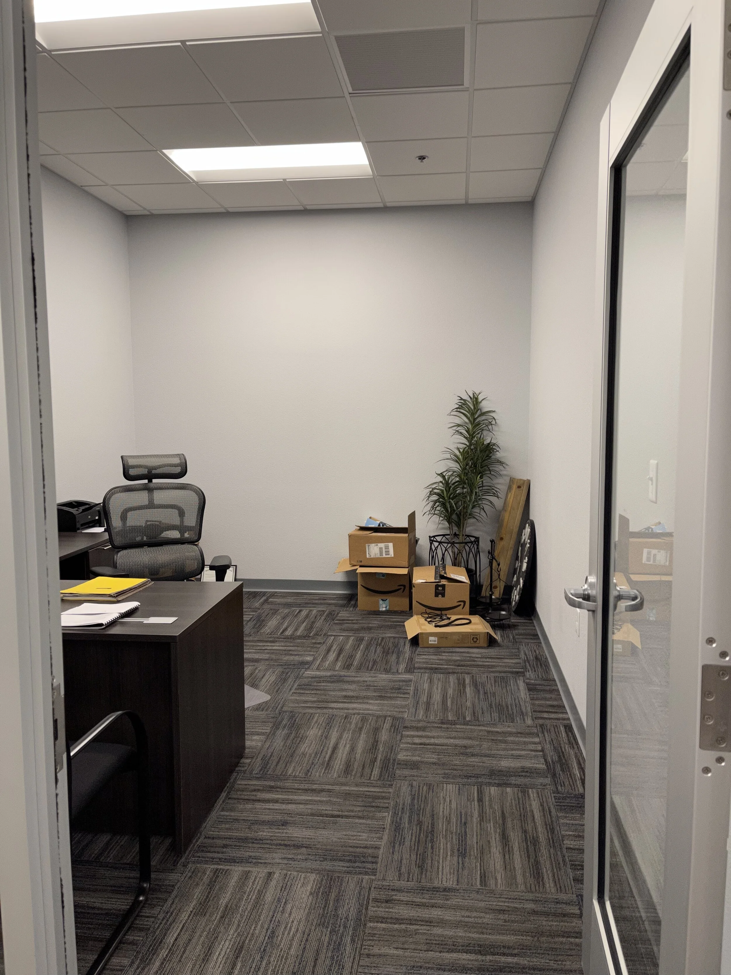
Such is the case. Here is where we started.

IMG_0979 2.jpg

My client, Mr. “H” had just relocated to a new office. He was given this large space to decorate and asked for my help in doing so. With a large room in ALL COOL COLORS, this area just needed some warmth and the following punch list to execute;

-Bookshelves

-Wingback Chairs

-Accent Chairs

-Decor

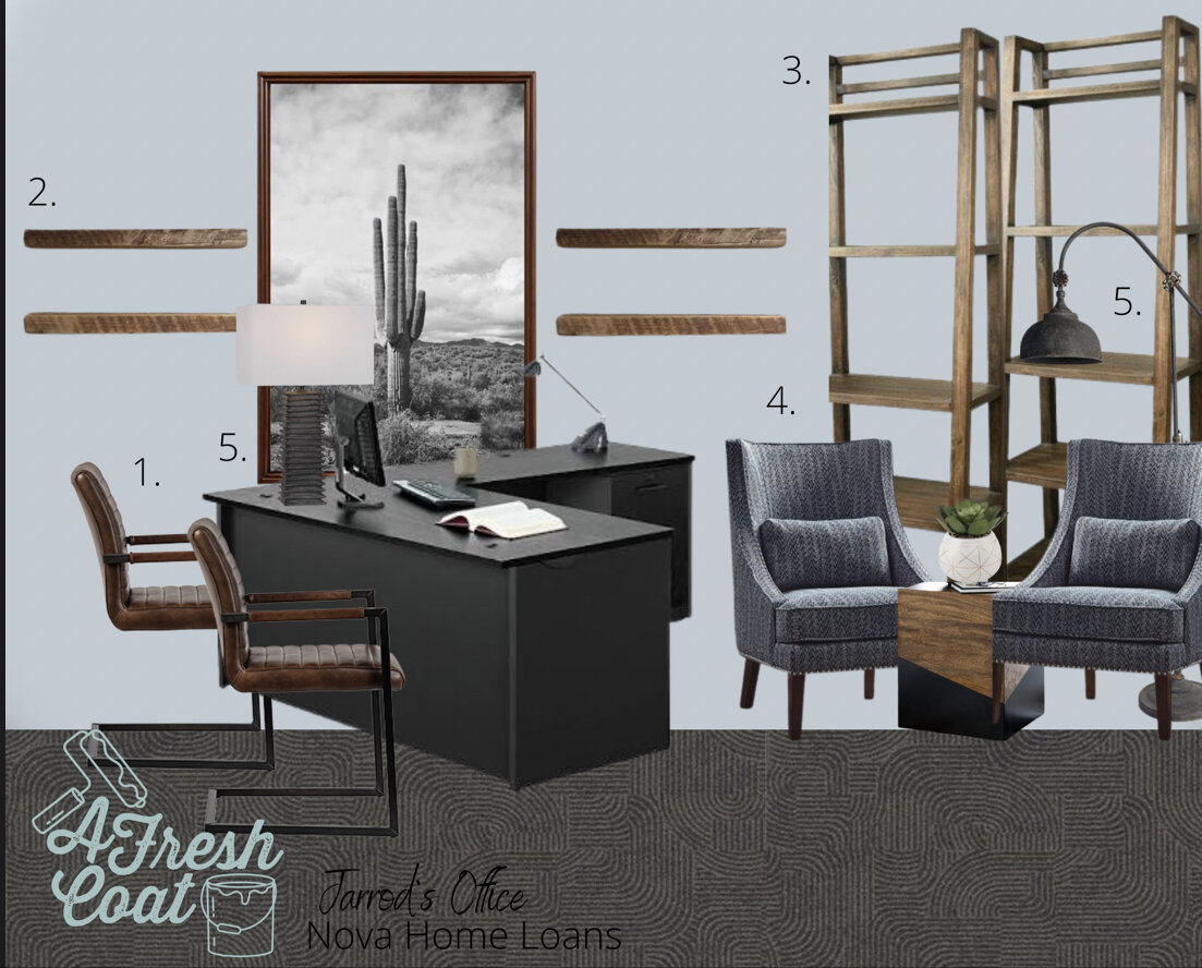
It always starts with a vision board and with full approval and creative liberty, here is what I came up with:

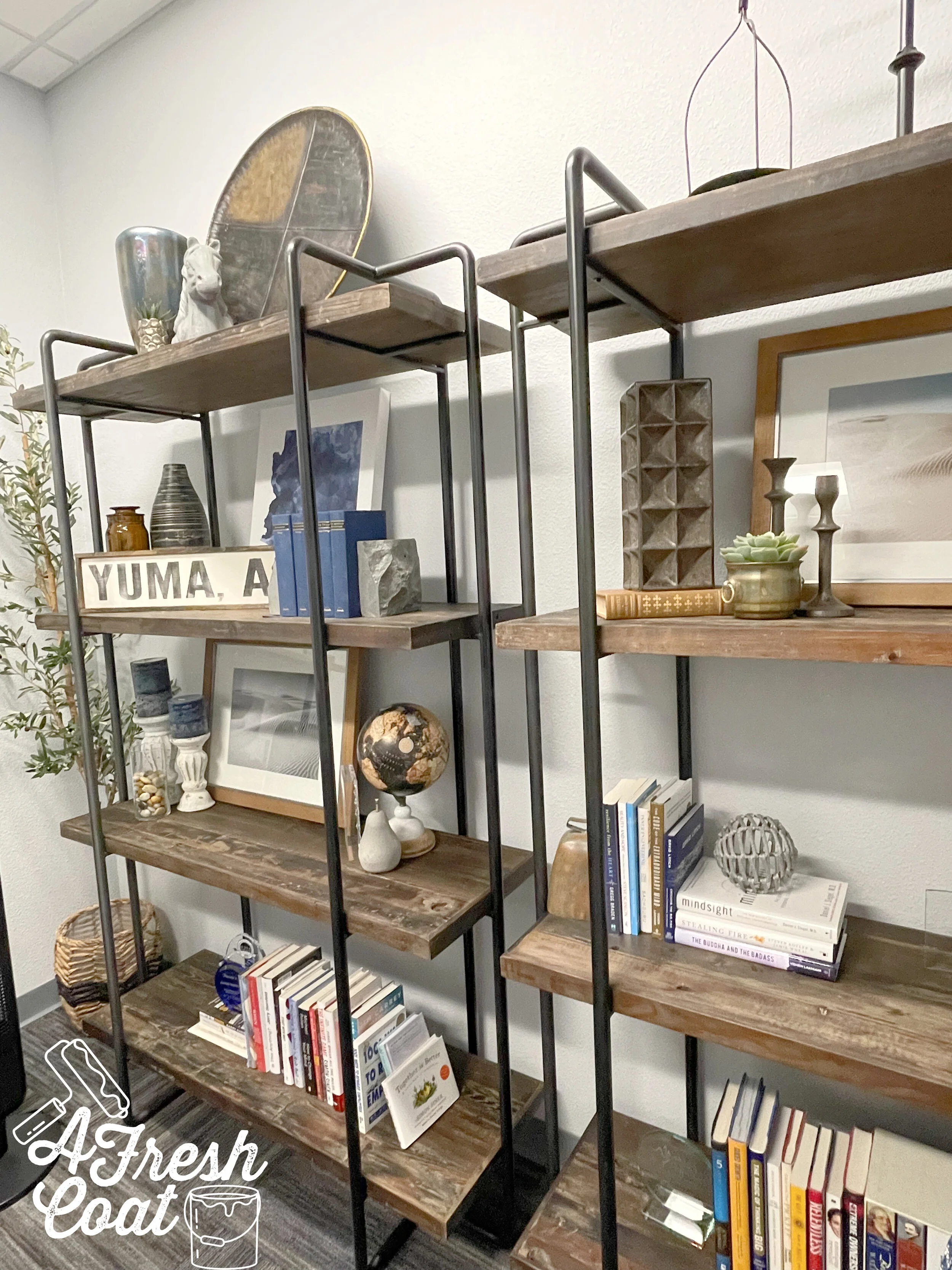
By adding in the elements of wood and leather, warmth is immediately achieved. And with the addition of two wingback chairs in a masculine color and print, this office got a whole new personality…

Nova Home Loans.png
Nova office makeover 1.png
nova office makeover 5.png
nova 3b.jpg
nova 2b.jpg

And one more angle to finish this makeover—-slightly different though. Each client has to make their space work for them and in this case, that meant re-arranging the chairs to create an area that meets their needs. Works for me!

Nova Home Loans 2.png

THE DETAILS

Decor: Dandy Home & Ranch, Goodwill, LCO, Hobby Lobby, HomeGoods, Etsy

Clock: Bellacor

Chairs: Wayfair

Bookshelves: Dandy Home & Ranch

Olive Tree: QVC

Images: Vanessa Brack Photography

Commercial Office Renovation

Commercial DesignJenny Sulpizio1 Comment

This might just be one of my faves.

What am I saying? They’re all my faves! Seriously, each room always gives me the opportunity to create based off of my client’s likes/dislikes, interests, and hobbies. Each and every space caters to my clients and is customized specifically to them.

Such is the case with this complete office overhaul.

With commercial spaces, I find that oftentimes, my clients spend a lot of time in their offices. More than just the 9-5 time frame, in fact. These rooms become their homes away from home and should be designed accordingly.

So when I was contacted to revamp this recently renovated church pastor’s office, I couldn’t wait to get started. After our initial consult, the design became crystal clear, and the creative festivities were immediately underway.

Here is where we started:

Office Remodel 4.png
Office Remodel 5.png

These pictures were snapped right after the flooring was refinished—beautiful LVT with grey hues meant that these walls needed a paint refresh—and that this space once occupied by pastor and church staff—would become soley his.

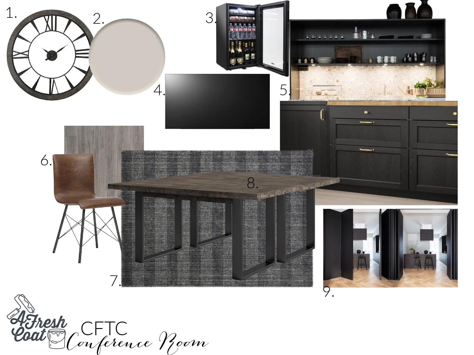
Ready? As always it starts with the vision board, and in this case, two vision boards would be needed: one for the office and another for the green room portion of this space.

Pastor Tyrone's Office.jpg
CFTC Conference Room.jpg

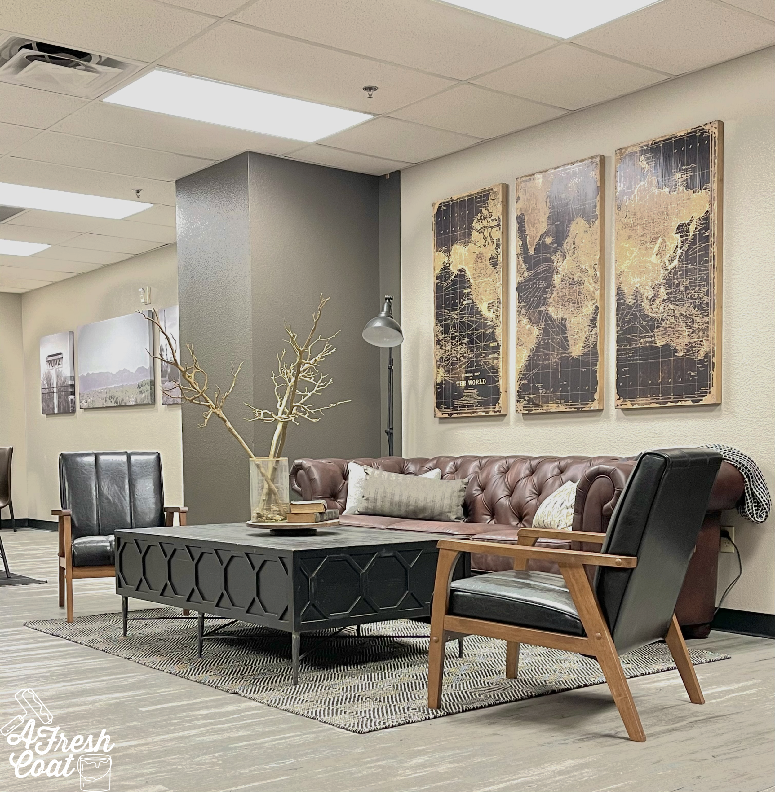
I’ll save the Conference/Green Room reveal of this reno for my next post, but the goal was to obviously tie these two areas together seamlessly…to bring in rich colors and textures, with bold contrast and an overall masculine vibe.

First up? The paint!

Office Remodel 7.png

Sherwin Williams Agreeable Grey was selected for the main walls while Sherwin Williams (Color of the Year) Urbane Bronze was chosen for the accent walls. This color combination together, with the floors and proposed wood finishes, was definitely going to bring this whole space up a notch (or two…or three).

Master Finishes was hired to complete the built-in cabinetry work and while that was in the works, the purchasing of all furniture and decor got underway by yours truly (my favorite part). But here is what I was envisioning post-paint:

Office Remodel 9.png

Alright, let’s just skip to the finished room, shall we? The first space of this two-part blog post is finished:

Office Remodel 10.jpg
Office Remodel 1a.jpg
Office Remodel 1b.jpg
Office Remodel 1d.jpg
Office Remodel 1.png
Office Remodel 1e.jpg
Office Remodel 1f.jpg
Office Remodel 1g.jpg

Such a big change and there is so much warmth mixed in with the masculine overtones here. Most definitely a home away from home.

One more of the before and after.

BEFORE…

Office Remodel 5.png

and AFTER

Office Remodel 10.jpg

Tell me—-do you lean towards cooler grey, or warmer tans when it comes to your home or office?

THE DETAILS

Paint Labor-A Fresh Coat-Yuma, AZ

Paint- Sherwin Williams Agreeable Grey and Urbane Bronze (Satin finish)

Desk-Dandy Home & Ranch

Built-Ins: Master Finishes-Yuma, AZ

Leather Couch-Wayfair

Accent Chairs-Wayfair

Coffee Table: Dandy Home & Ranch

Console Table: Wayfair

Area Rugs: Wayfair/Overstock

Decor: Dandy Home & Ranch, Hobby Lobby, Target, Goodwill, HomeGoods, Marshall’s, Dillards

Florals: Dandy Home & Ranch, Michaels, Hobby Lobby

Desk Chair: Wayfair

Map Art- Kirklands

Clock: Wayfair

Pillows: IKEA, HomeGoods

Scripture Wall Art: Dandy Home & Ranch

Library Lights: Amazon

Lamp: Dandy Home & Ranch

Floor Lamp: Wayfair

Canvas Prints: Easy Canvas

Trees: QVC, IKEA