A Fresh Coat

Kitchens

Rizzoli Remodel

KitchensJenny SulpizioComment

It happens to all of us; we’re either thumbing through a magazine, surfing Pinterest, or running through our social media feeds and we see it: major room inspo! A room that we love so much we want to duplicate every inch of it in our own home(s).

Such is the case with this total great room reno. My client fell in love with the kitchen featured on the television show, Rizzoli & Isles. So much so that we researched the paint colors in an effort to get the same look. Thing is? These rooms boast totally different building styles. Here in AZ, we tend to have numerous nooks and crannies, soffits, and structures indicative of a Southwest vibe. However, the kitchen featured on this popular television show did not—so in an effort to blend the two, here is what we came up with.

As you know, it starts with the mood board.

Kitchen images courtesy of Pinterest

Kitchen images courtesy of Pinterest

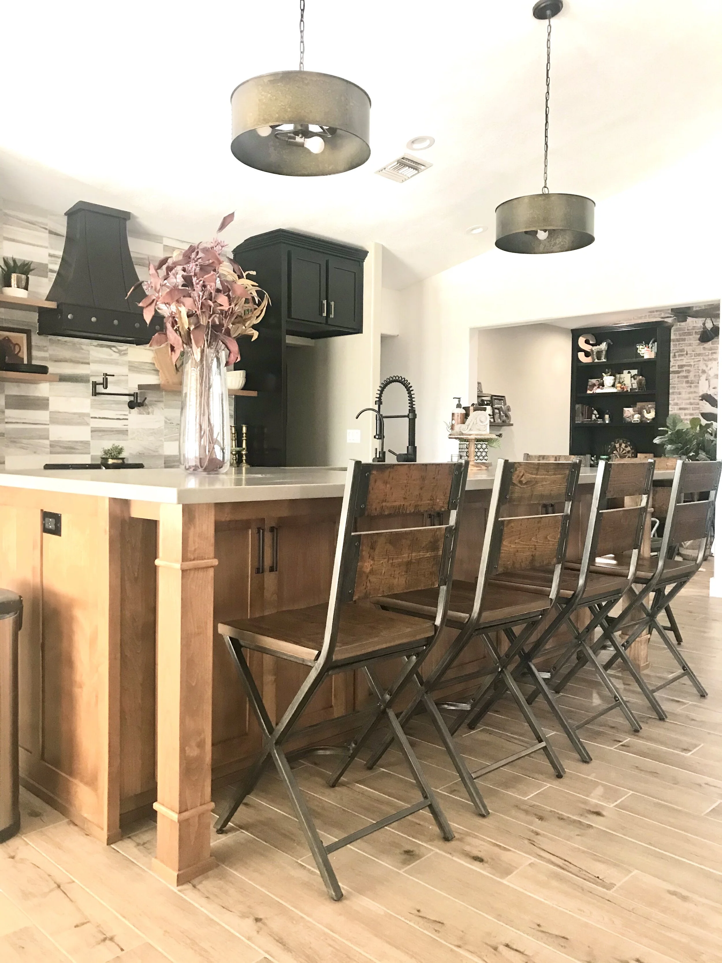
The goal was to bring Southwest elements into a space that would boast deep navy blue cabinetry, contrasting white subway tile, a mix of Cambria white countertops and butcher block, as well as brand new black stainless steel appliances.

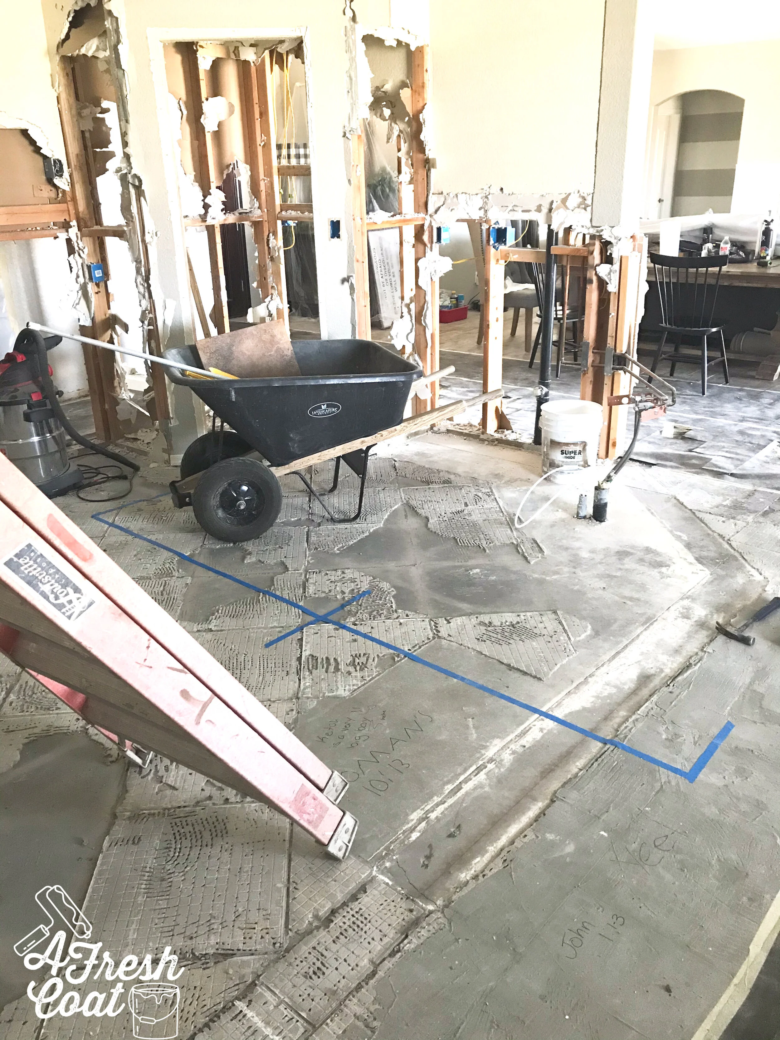
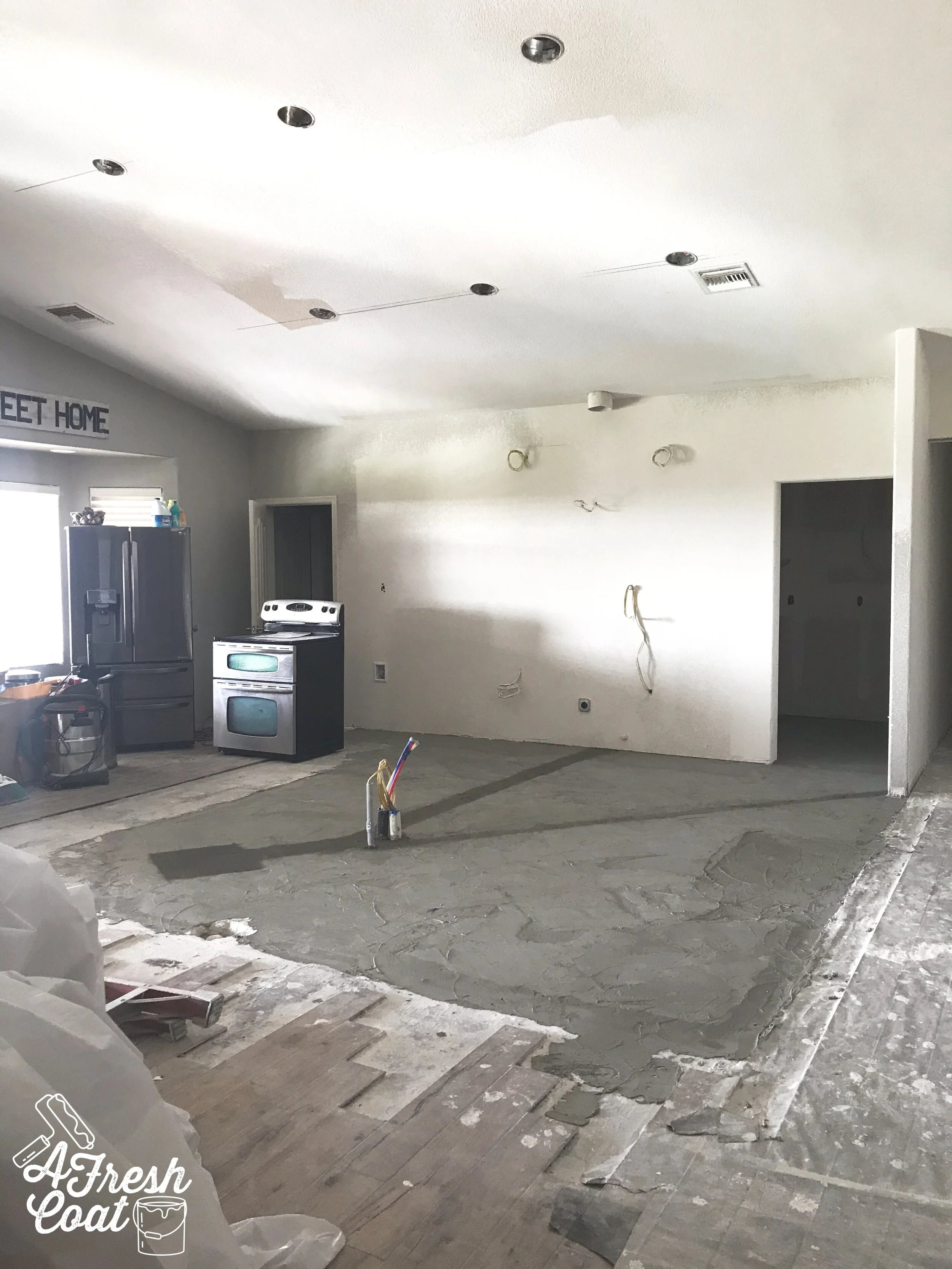
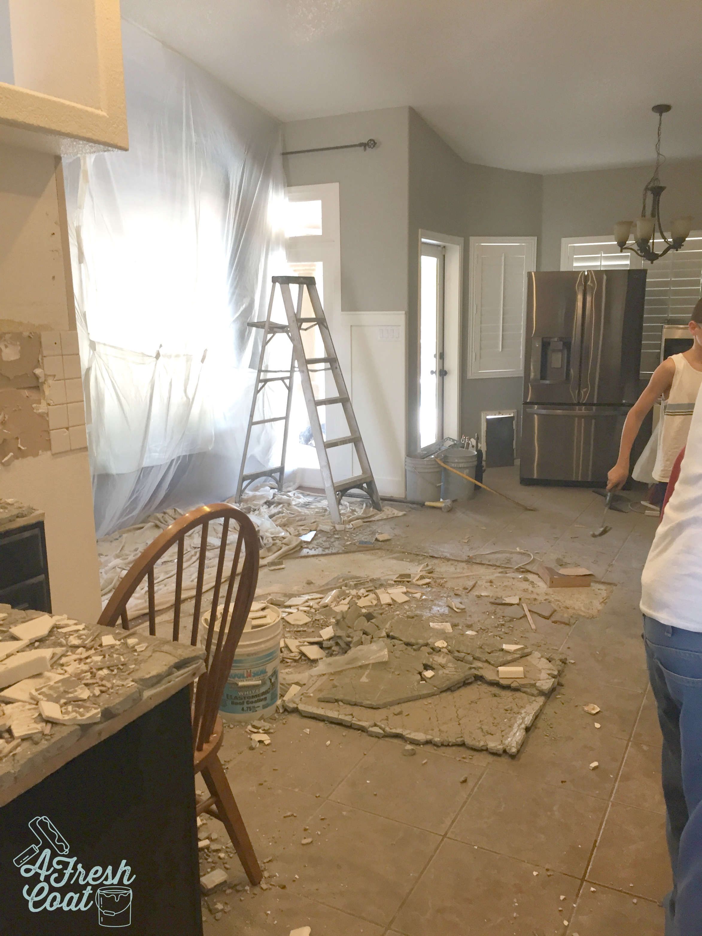
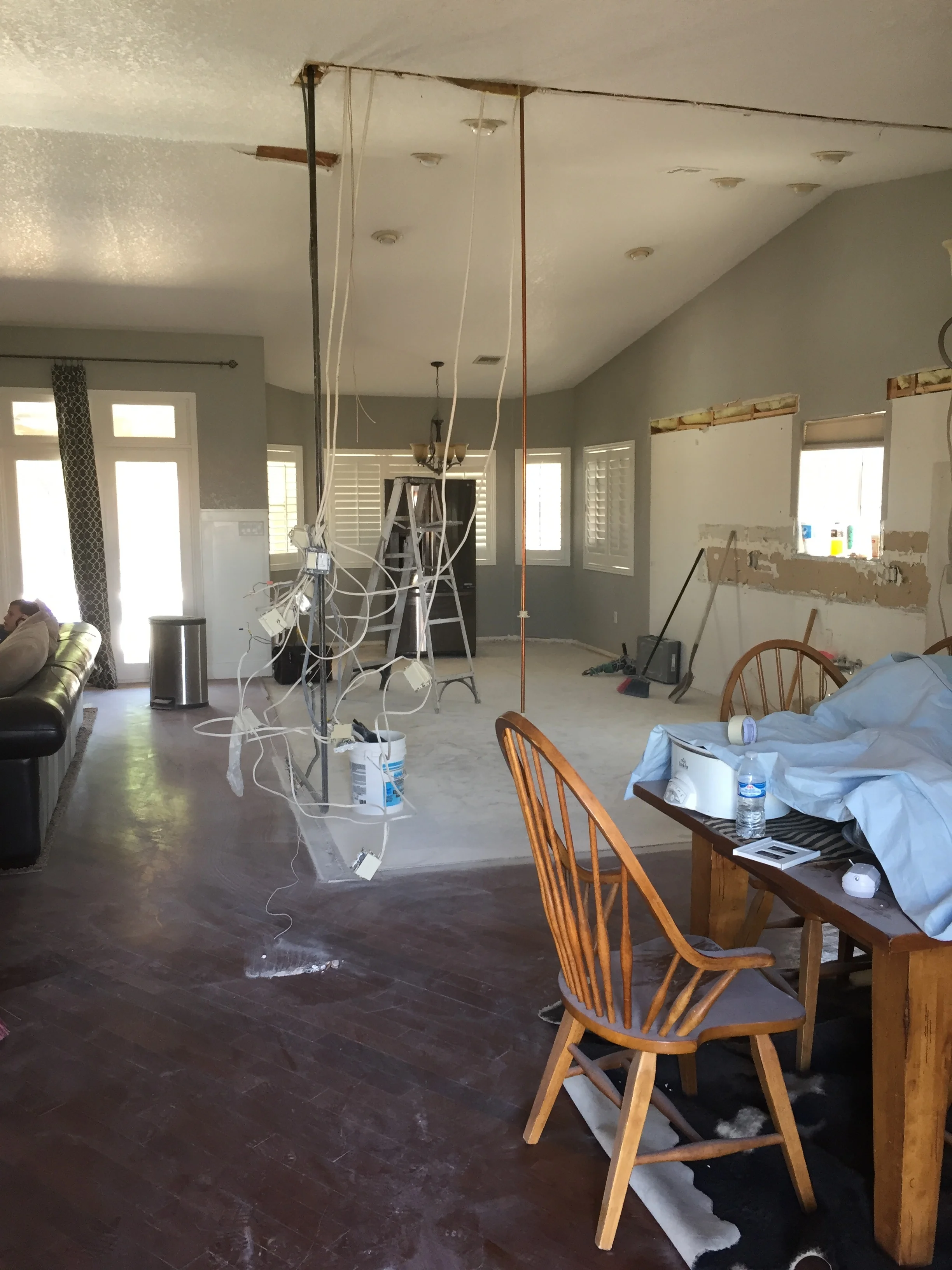
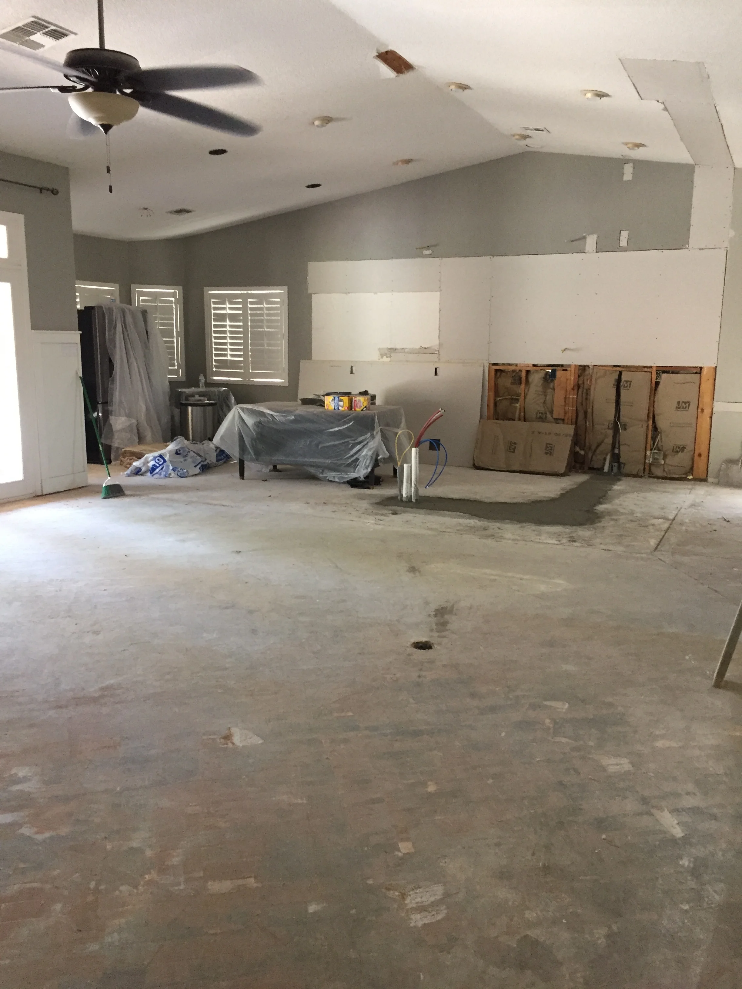
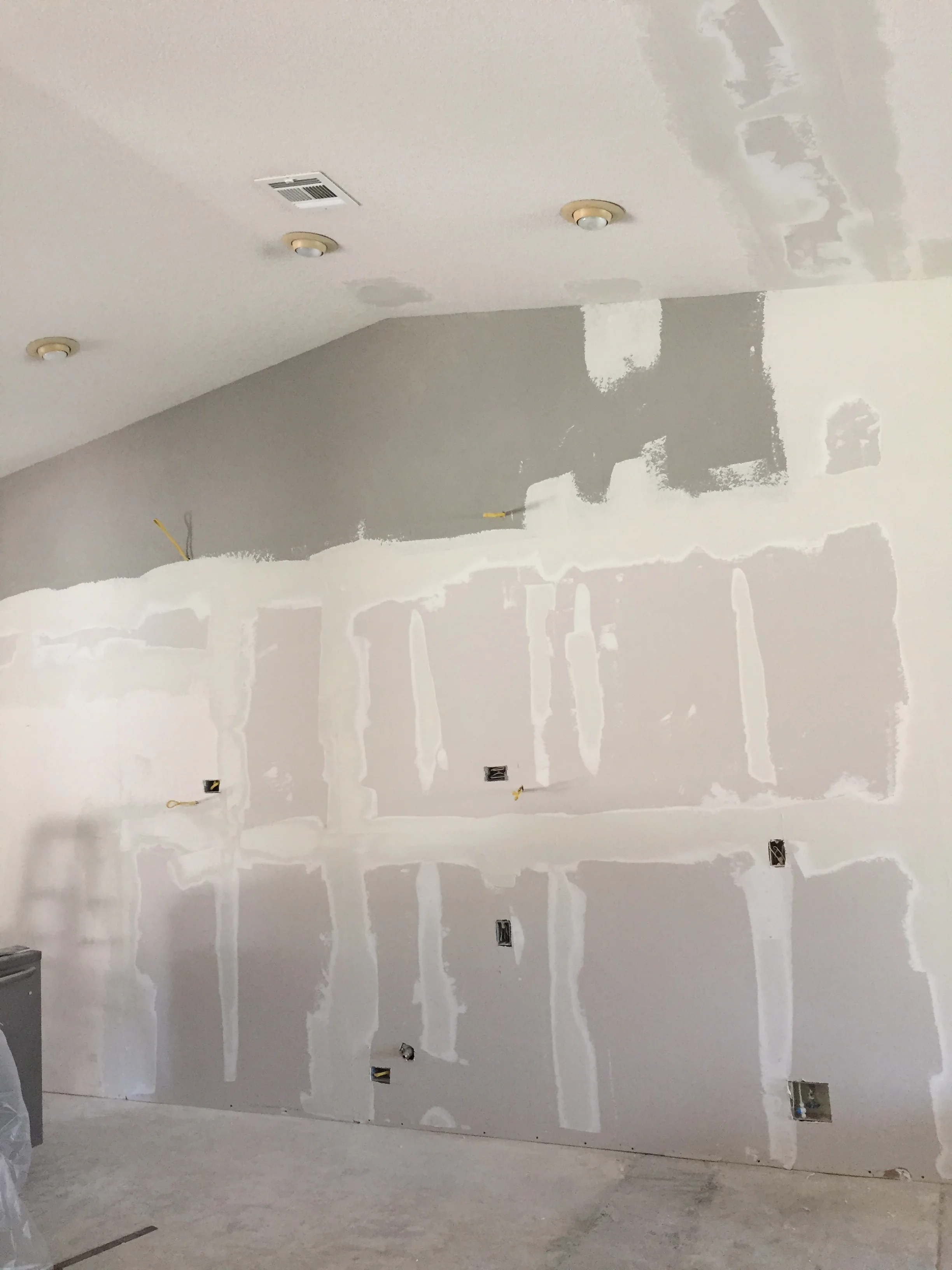
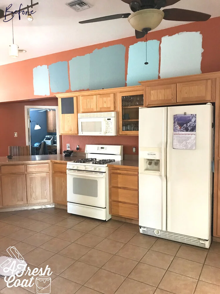
But first things first. Here are the “before” pics:

Rizzoli Remake 1.jpg
Rizzoli Remake 3.jpg
Rizzoli Remake 5.jpg
Rizzoli Remake 4.jpg

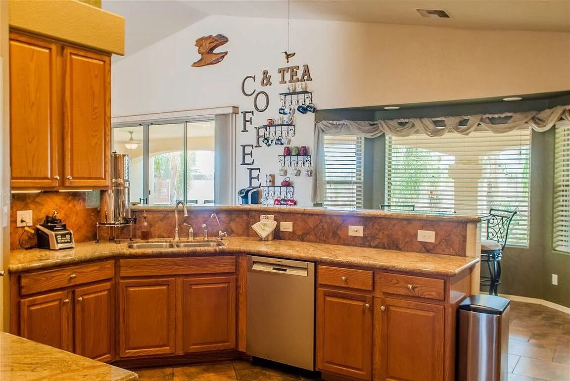
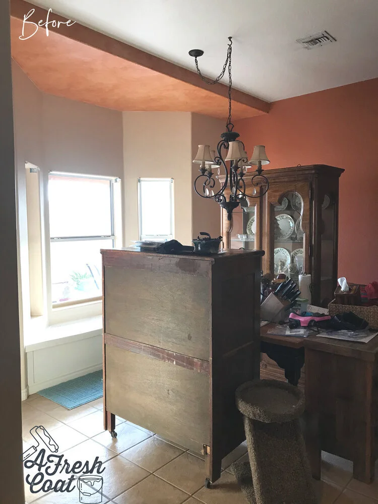
Rust colored accent walls, mixed with a medium tan main wall color, this Southwestern-styled home was about to get a serious makeover. Builder grade oak cabinets along with a southwestern finished fireplace, and laminate countertops were all about to be transformed.

As you know, it all starts with paint. Mrs.”P” garnered the samples I suggested to create the main accent wall identical to the one seen on Rizzoli & Isles. Honestly, it’s rare that the exact color used on one wall (in this case, on TV), will work in another’s home. Lighting always is the key factor with paint selection and since natural light was limited in this space, I was skeptical. However, Behr’s Rainy Afternoon got the nod in both instances. Love that!

Rizzoli Remake 5 copy.jpg

That deep shade of rust is gone(!), and this in-progress pic (the paint is still wet and the bullnose corners haven’t even been addressed), is just that: in progress. Funny thing? When I posted the quick before and after in an IG poll, I got a number of votes letting me know I should change it back to the way it was! I get that though because with oak cabinetry, this color is not one I would recommend…but all that was about to change.

Ready for the “after” shots? Here we go…

rizzoli 21.jpg

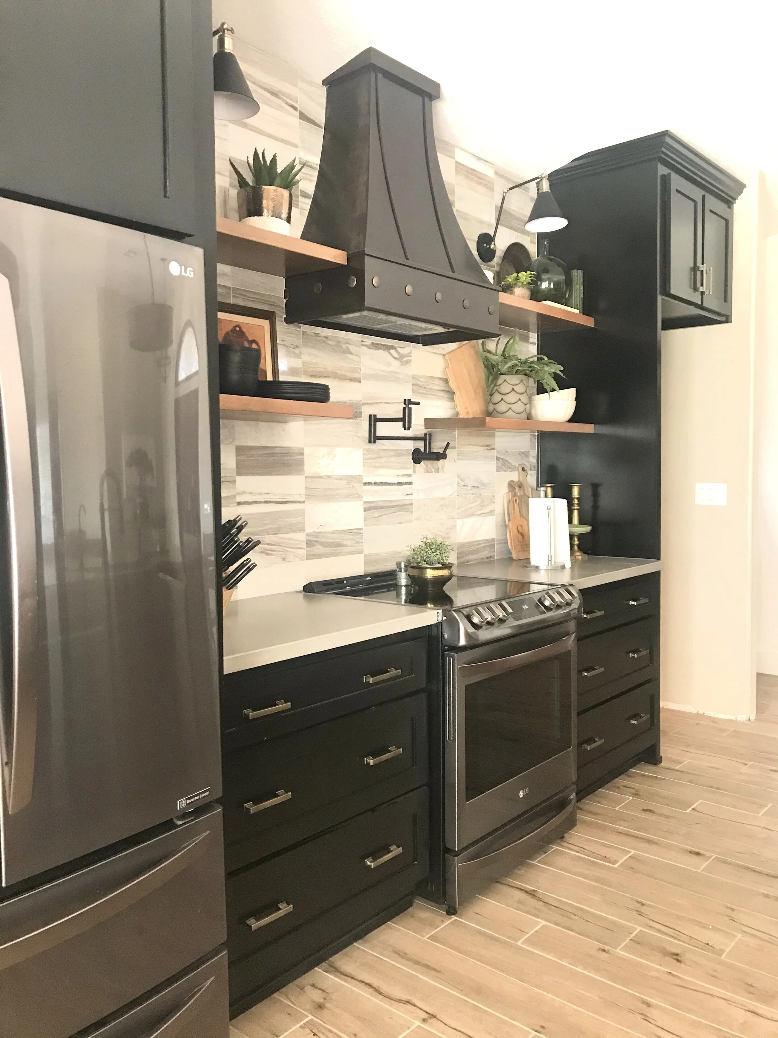
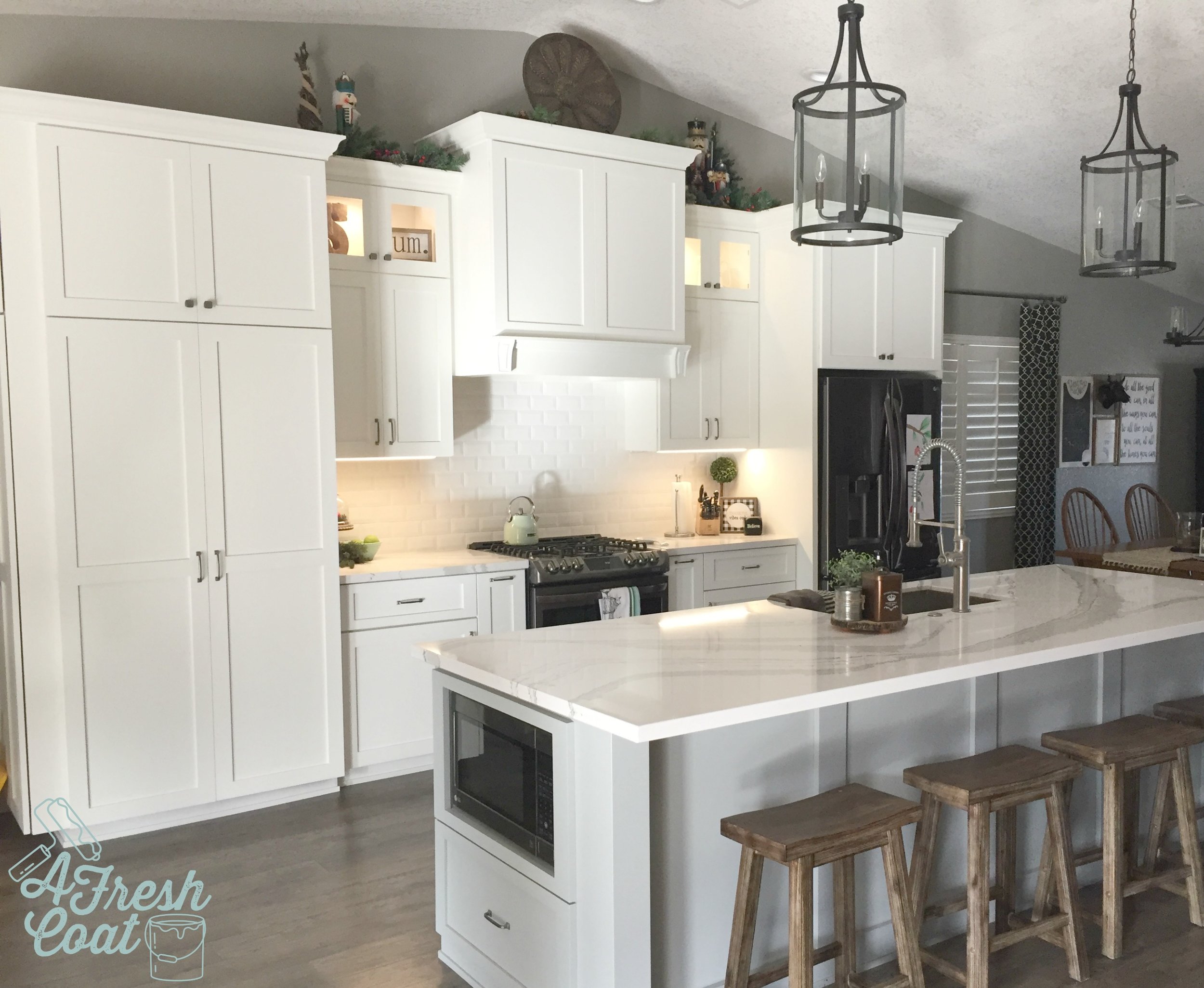
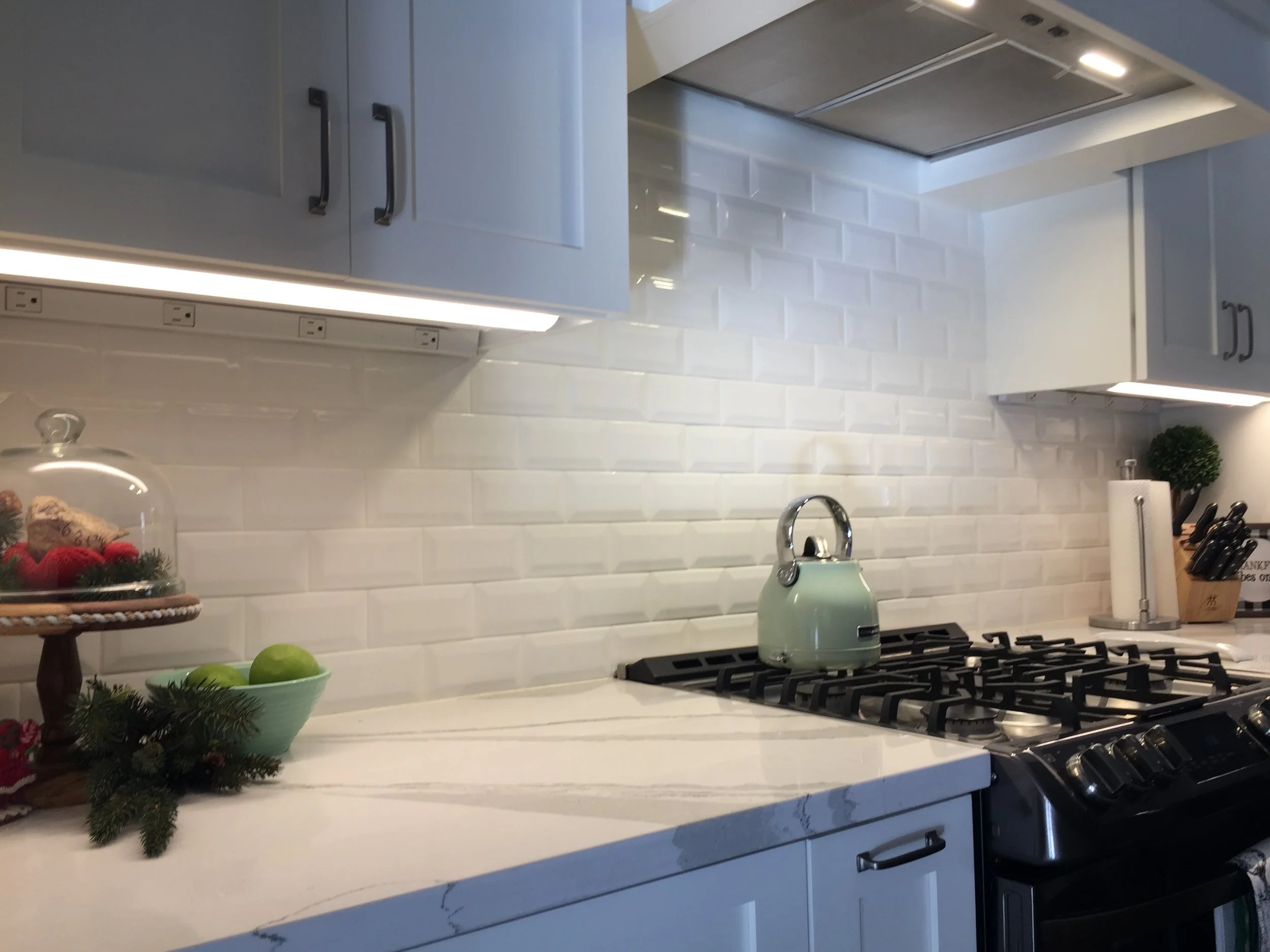
Brand new stainless steel appliances, freshly painted navy blue cabinets, bright white subway tile, brushed nickel hardware, and a newly styled upper cabinet area.This kitchen got a serious makeover.

rizzoli 17.jpg

Scroll up and look at the before pics again of this space. The difference is night and day and I just love how it turned out. If you can’t remove your older cabinetry but want to change the look and color, painting them is a great option.

rizzoli 19.jpg

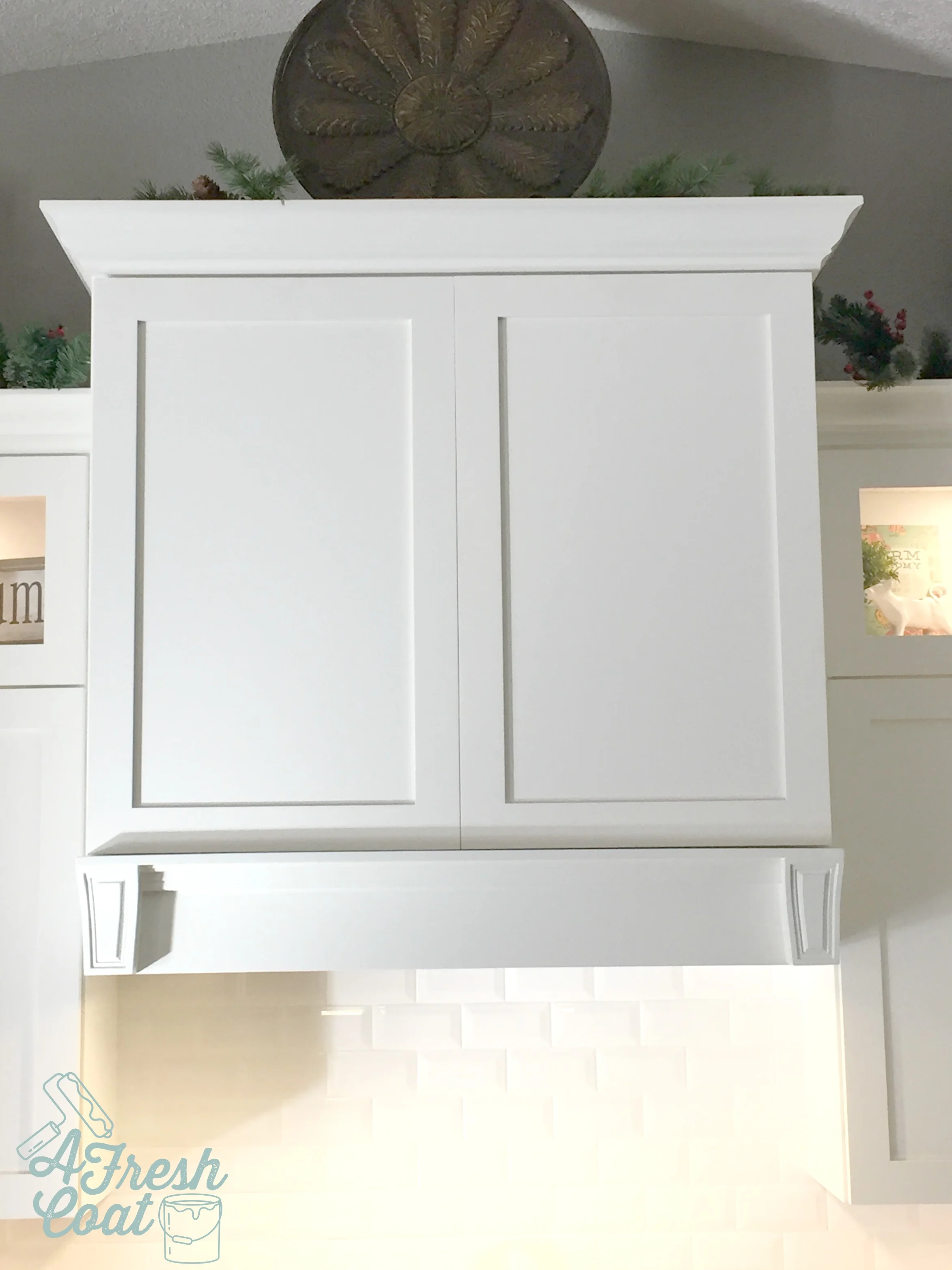
My client and I knew we needed a decorative piece right above the stove, and these framed grouted tiles were the perfect option.

rizzoli 25.jpg

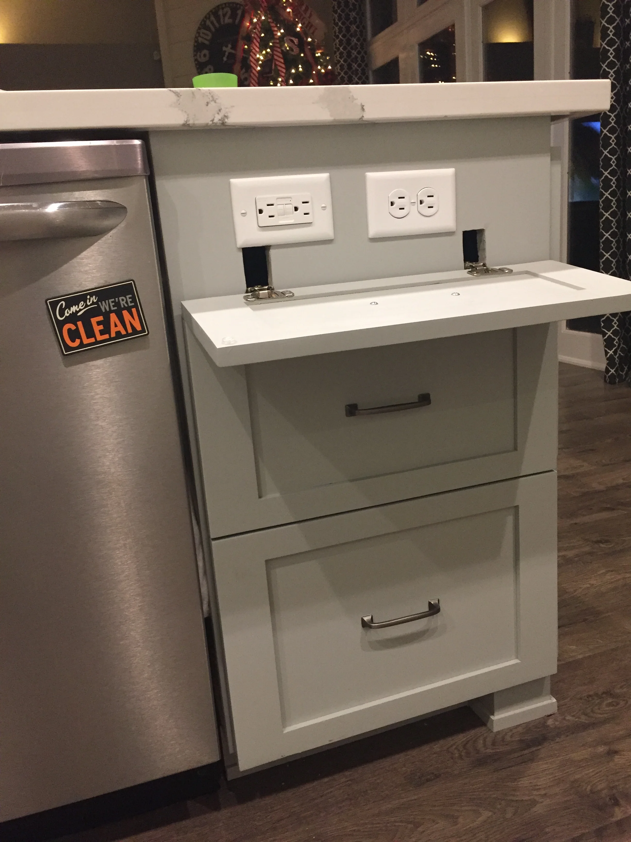
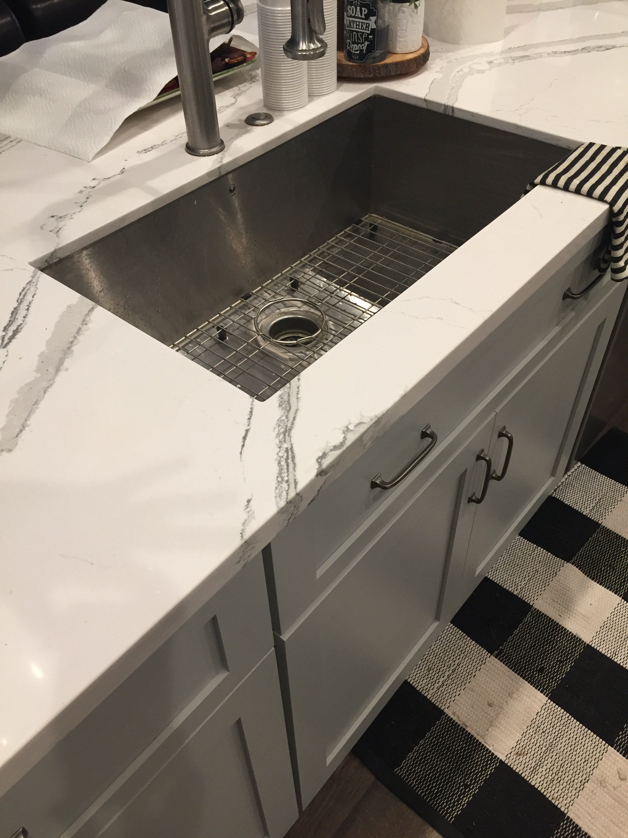
Butcher block was added to the island while white Cambria Quartz was installed on the remaining countertops. A farmhouse sink was also added along with a new sink faucet.

rizzoli 26.jpg

Love the contrast between the navy blue island and the butcher block!

rizzoli 24.jpg

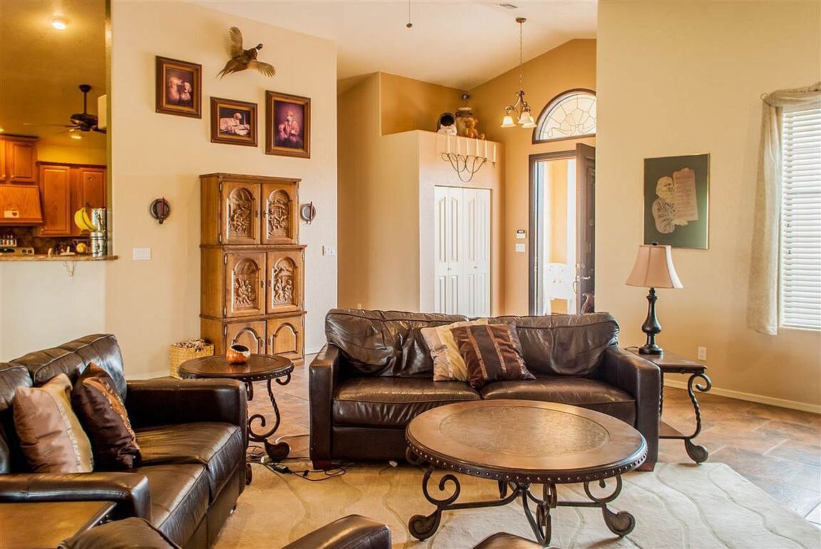
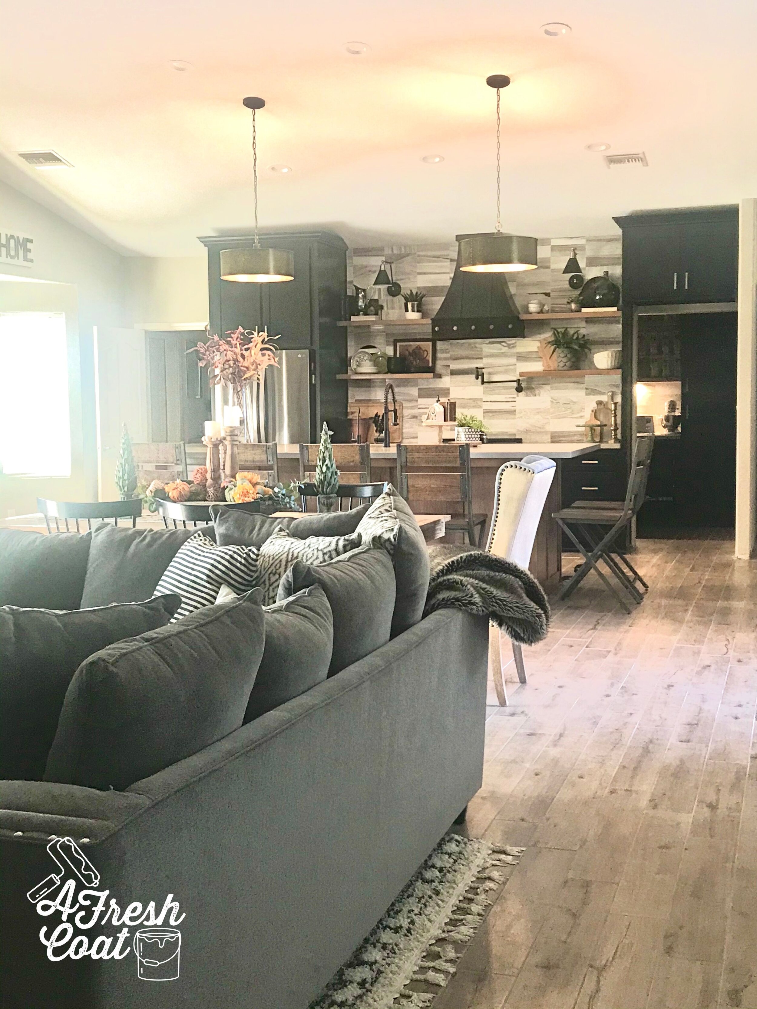
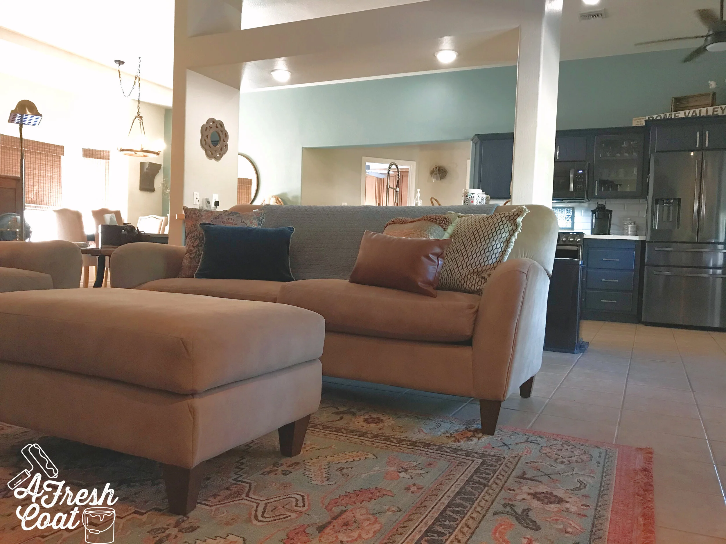
As you know from the pics above, the kitchen wasn’t the only area getting a makeover. Since this is an open concept great room, the dining area and living quarters needed to be addressed. Friends, look at this sideboard! It is stunning and makes the whole space! The intricate detailing on those doors is all sorts of awesome and now I want one of these too!

Rizzoli 10.jpg

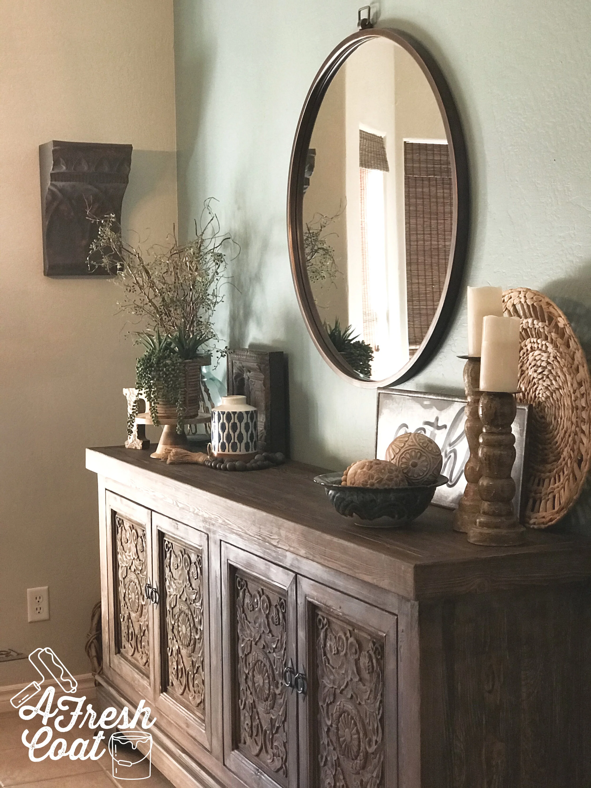
By removing the china cabinet and replacing it with the Amita sideboard, it gave me the opportunity to redecorate the area. I shopped the house for all sorts of serious goodies (there were a ton), and then purchased the rest. We added a 36” round mirror in addition to fresh styling and I thinkit all works together beautifully.

rizzoli 16.jpg

Mixing old with new, rustic with modern, and even hints of Boho and Spanish…

rizzoli 18.jpg

it all came together.

rizzoli 22.jpg

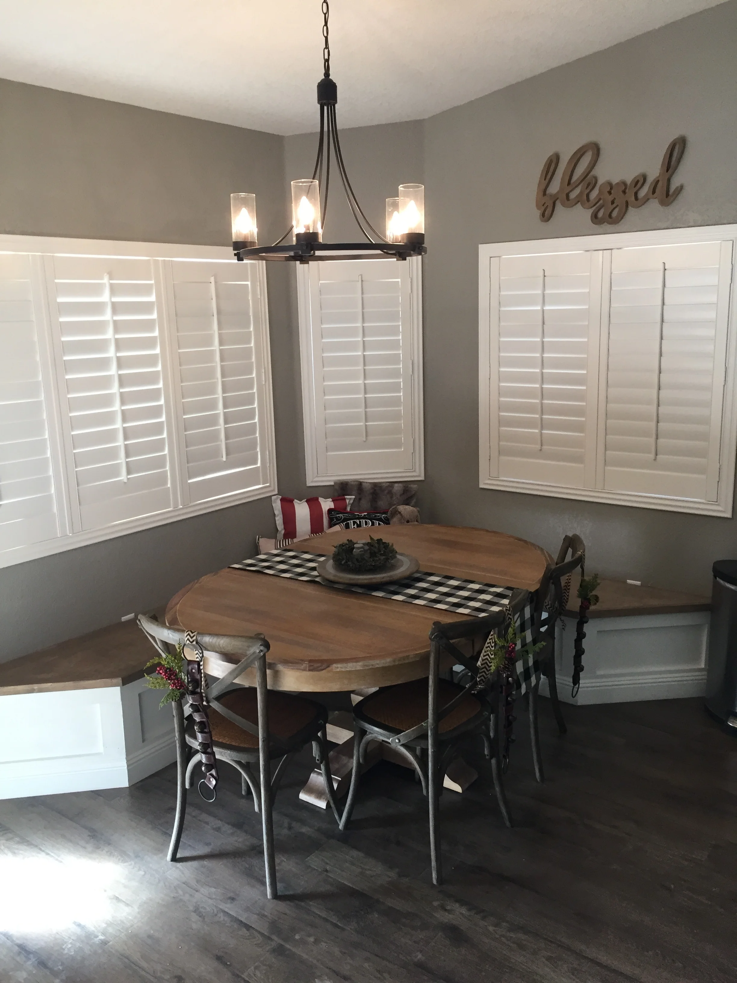
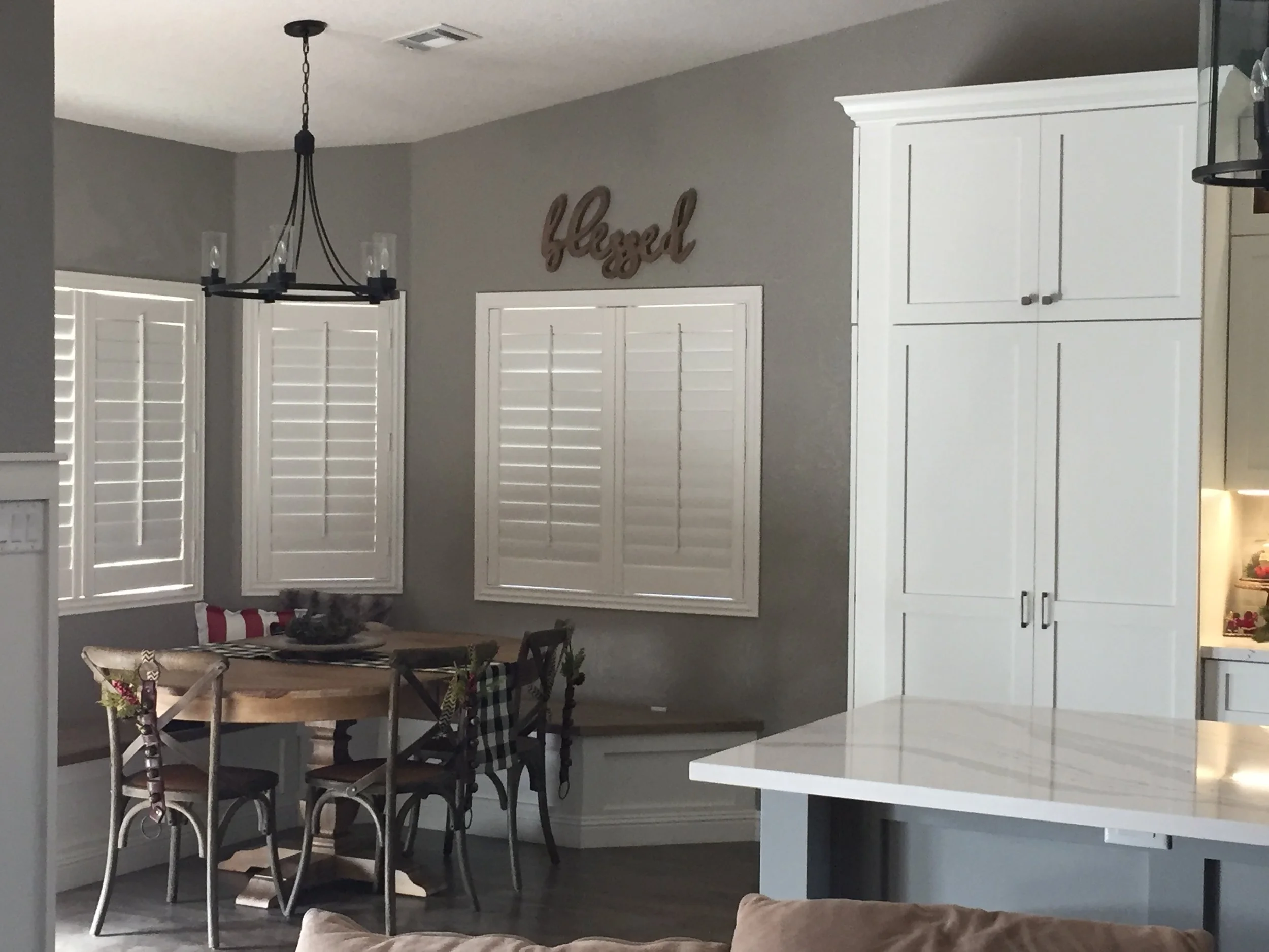
Next up? This beautiful bay window and seating area. The windows got light filtering bamboo shades that add a ton of texture and warmth to this area. A navy patterned fabric was used to cover the window seat and tie in the kitchen cabinets in order to create a cohesive space throughout.

rizzoli 13.jpg

And let’s not forget about the pillows! So many beautiful patterns, fabrics, and textures. Look at these?! I’m in love.

rizzoli 15.jpg

More pretty!

Scroll up again to check out the before pics because this place looks like a while new home with all its changes.

rizzoli 11.jpg

The fireplace also received a mini makeover by using some of the client’s existing decor and mixing it with some fresh elements.

rizzoli 20.jpg

Drapes, bamboo shades, and rustic decor makes this home officially revamped and upgraded. Just look from where we started to where we ended up:

Rizzoli+Remake+5.jpg
rizzoli 17.jpg
Rizzoli+Remake+1.jpg
rizzoli 24.jpg

As always, here are the details…

THE DETAILS

Paint Labor: A Fresh Coat Yuma

Amita Sideboard: Dandy Home & Ranch

Mirror: Wayfair

Chandelier: Wayfair

Bamboo Shades: Lowe’s

Ceiling Fans: Home Depot

Throw Pillows: Etsy, Wayfair

Decor: Hobby Lobby, Dandy Home & Ranch, Kirkland’s

Fabric: Hobby Lobby

Hardware: Amazon

Subway Tile: Lowe’s

Butcher Block/Quartz: DW-Yuma, AZ

Tile Installation: Julio Martinez

Area Rug: Target

Love, J


MY KITCHEN MAKEOVER (ROUND 2)

KitchensJenny SulpizioComment

If you follow my IG stories then you know how long I’ve been itching to rip out my kitchen. Okay, so maybe it’s only been two years since we moved into our home, but the outdated orange tile and builder’s grade oak cabinetry had seen better days. Plus, it just wasn’t my style and this early 2000’s home definitely needed some 2020 updating.

Here is where we started.

PC: Andrew Knizley

PC: Andrew Knizley

PC: Andrew Knizley

PC: Andrew Knizley

See that wall? Or half wall with wrap-around bar? Just from viewing these pictures online (prior to touring the home), I knew I wanted to rip it out. It was screaming for it (like, loudly).

PC: Andrew Knizley

PC: Andrew Knizley

Can you hear the screams? From the wall, to the soffits, to the pantry and everything inbetween, this baby needed some TLC…

ISesixkn5cse1w1000000000.jpg

…and an appointment with a sledge hammer. My kids and I were happy to oblige. They love demo work and they had their fill of it this time around. Once we got the green light, these walls were goin’ down.

They quickly got started on “the wall,” whacking that thing as much as they could until they had a ton of holes.

round 2 1.jpg

Then they moved on to the pantry, followed by the entryway closet.

round 2 3.jpg

And then we let the pros take over. They ripped out the cabinets, the tile, and everything in between. George supervised.

IMG_4788.jpg


round 2 8.jpg

Whoa!

round 2 5.jpg

Double Whoa.

round 2 6.jpg

It was seriously all sorts of messy…and dirty-dusty. But I totally didn’t care because that wall was G-O-N-E.

round 2 7.jpg

And I was happy.

But you see that big black pole and all those wires behind me? Those babies needed to go somewhere since that wall was no longer a thang. So underneath the ground they went.

Let the trenching begin!

round 2 9.jpg

Once the floor was trenched, and the electricity and plumbing were all redone, it was time to level the floor and connect the flooring (we had been tiling in stages up until this point). It was like finally adding the last few pieces to a 2,000 piece puzzle you’d been attempting to finish for like, ever.

round 2 10.jpg
round 2 11.jpg
round 2 12.jpg

And George was happy.

It’s at this point that all the pretty started making its way in. Cabinetry, lighting, shelving and all of the selections made months prior to. This kitchen and all of its finishes were something I spent months and months putting together and visualizing. And as you already know, it all started with the vision board.

Sulpizio Kitchen.jpg

Industrial vibes mixed with the warmth of wood, open shelving, and concrete-looking countertops were all pieces I planned to incorporate in this remodel. Traditional? Not by any means which is why I was excited to introduce elements that were anything but standard.

round 2 13.jpg
round 2 15.jpg

George also had fun making selections along the way—especially when it came to choosing the stain finish for the island. Oh, and I got a whole bunch of help from my ‘Gram and Facebook friends too.

round 2 14.jpg

Let the pretty begin!

Now, I have to say that this remodel went through a lot of changes along the way. The Butler’s pantry totally had to be reconfigured, as did the laundry closet (that thing can’t constitute as a “room”), along with the island as well. Did this add stress? Absolutely! However, in the end, it all worked out. But before I provide the reveal, here are more progression pictures…afterall, this was a twelve week remodel. Yah, twelve!

With my countertops, I really wanted the look of concrete without the maintenance involved with actual concrete. See this pic below? This is my Fossil Grey quartz slab waaaaay hiiiiigh up in the air, almost ready to make its debut in my kitchen.

PC: Master Finishes

PC: Master Finishes

IMG_5641.jpg

And here’s that baby in our home, along with the introduction of our base cabinets…

IMG_5818.jpg

and most of the Butler’s pantry—but more on that later.

Ready for the reveal? After twelve long weeks, this baby is fully functional and I’m ecstatic!

round 2 20.jpg
round 2 21.jpg
IMG_6593 2.JPG
IMG_7422.JPG
IMG_9373.JPG

And one more before and after…

PC: Andrew Knizley

PC: Andrew Knizley

round 2 22.jpg

I’m not going to lie, this was a long process. Real long. Not only did this remodel take place during the hot, hot summer, but also during a Pandemic which meant my kids were not only hot, they were bored and annoyed. However, it was worth it….sooooooo worth it.

Were there hiccups? Yes. Were there times where I was beyond over it? Yup. But we got ‘er done…and done she is.

Stay tuned for the Butler’s pantry reveal. That’s coming up next.

In the meantime, tell me—what’s one thing that keeps you from remodeling your home (other than the ginormous price tag)?

THE DETAILS:

Flooring: Lowe’s Home Improvement; Natural Oak

Flooring Labor: Julio Martinez

Wall Color: Tanglewood by Behr

Paint Labor: A Fresh Coat-Yuma

Contractor: Master Finishes

Cabinetry: C & R Cabinetry via Master Finishes

Quartz Countertops: MSI Fossil Grey via Master Finishes

Cabinet Color: Tricorn Black/Custom Stain

Backsplash: by Golden Valley Maravalla Floor & Decor

Backsplash Labor: Julio Martinez

Counter Stools: Ashley Home Furniture Store

Decor: Hobby Lobby, Dandy Home & Ranch, Goodwill, HomeGoods, Kirklands, Target, Crate & Barrel

Sconce Lights: Lamps Plus via Walmart

Drum Pendants: Dandy Home & Ranch

Kitchen Faucet: Build.com

Kitchen Sink: Build.com

Pot Filler: Build.com

Hardware: Amazon

Electrical Work: Specialty Electric—Yuma, AZ

Plumbing: Mission Plumbing—YUma, AZ


THE Kitchen Makeover

KitchensJenny Sulpizio8 Comments

I love room makeovers. I think most people hooked to home improvement shows like myself, do. There's something incredibly fun in seeing a room transform into something totally new and amazing. Especially when the "before" space was outdated and just plain ugly. 

Sooooo, imagine my excitement when it was finally time to renovate the kitchen of our 1990's home. Pure elation! And we're not talking about a little room redo here either. This was a full gut job. We took out walls, removed windows, trenched under concrete, and ripped up 2000 square feet of flooring...all during the summer months...when my kids were off from school. Yah, slightly crazy but totally worth it. I love our new space and how open the kitchen and great room feel. But before I reveal our new digs, check out where we started:

kitchen remodel/ A Fresh Coat Yuma 6.jpg
kitchen remodel/ A Fresh Coat Yuma .jpg

Look at these "before" pics above. Those soffet "dust shelves" took away from the overall design of the house, making the vaulted ceilings less grand and just plain awkward. The tile? Oy. Those grout lines still give me nightmares and the almond ceramic squares were way outdated, not to mention um, plentiful. They were everywhere!. While this kitchen was big, it just wasn't functional at all. And not to sound ungrateful (in any way), but it was ugly...seriously ugly. In fact, I'd spent four years waiting for the opportunity, scheming, planning, and pinning all the ways I could change it. 

It started with this design.

kitchen remodel 4.jpg

Followed by the gut job. #demodays

Hardin Construction, LLC of Yuma, AZ did an awesome job ripping this bad boy up and then putting it back together. They were fast, efficient, and made all of those ideas I'd been dreaming up for years a reality. They even let my boys in on the action during demo day as we all got the chance to deconstruct that 20+ year-old kitchen.

Ready for the reveal? Eek!

kitchen remodel/A Fresh Coat Yuma 20.jpg
kitchen remodel/A Fresh Coat Yuma 15.jpg

The kitchen is now a place where I totally want to hang out with my family and friends. The cool thing? After this remodel we can now house seventeen people in this space! Not only that but it's fresh, clean, and totally functional (even after removing over half of the cabinetry). 

Here are just some of the details:

1. Cabinetry: It had to be efficient and pretty! White shaker custom cabinets in SW Alabaster White. Pantry and pots and pan cabinets all have sliding drawers, while the two long cabinets on either side of the stove house gadgets galore. There's plenty of storage space found in the hood and above the pantry and refrigerator.

2. The Hood: I wanted the hood to be grand and Hardin Development, LLC achieved the exact look I was going for. The cool thing? They took two black corbels I purchased from Hobby Lobby (for just $17.99 each), cut them down to size, added molding up top and down below, and painted it white. Amazing!

kitchen remodel/ A Fresh Coat Yuma .jpg
kitchen remodel 18.jpg
kitchen remodel 25 / A Fresh Coat Yuma

3. The Backsplash: I knew from the very beginning of this project (and even before that) that I wanted white subway tile for my backsplash. I had the opportunity to splurge on materials here because the backsplash of my kitchen consumes a very small space. However, I found just what I wanted at Lowe's for around $.89 per tile. Not bad and I really love the boldness it adds to the kitchen and the depth it provides. The only thing I would do different? Add a pot filler. I debated and went back and forth with the idea. I guess I can still add one but for now, I'm good. ;)

Kitchen Remodel/ A Fresh Coat Yuma

4.) Electrical: This may sound weird but I did not want any outlets interfering with my backsplash and disrupting the flow of the pattern. When it came to the center island, same thing. I asked that all outlets appear hidden as to not mess with the design on the end caps.

kitchen remodel/ A Fresh Coat Yuma 2.jpg
IMG_3098.JPG

5. The Island: This nine foot behemouth of a piece was exactly what I had hoped for. It's big, stout, fully functional, and I dig it. I really dig it. However, I knew that once I implemented the hood cabinet, our microwave would have to be housed in the island. This presented a problem as far as drawer space goes since two of my island drawers would have to be dummies/fakes/faux. Only the bottom drawer (pictured above) actually has contents within it. But it works!

The other thing? I didn't want to spend a ton of money on a new microwave. The built-in models are pricey. Like, koo-koo pricey. Instead I bought an LG model intended for a counter, and had the island constructed around it. My options as far as finishing touches included a flush mounted piece I could buy (for the same price as the microwave--um, no thank you). Instead, I headed to Pinterest and here is what we came up with. Wood moldings. They're awesome...and much less expensive.

Kitchen Remodel/ A Fresh Coat Yuma

6. The Countertops: Two words: Cambria Britannica. It's Quartz which means there is no variation in pattern of slabs like there is with granite. This piece was pricier than other Quartz options but I'm so glad I went with it. It's stunning and incredibly durable. 

kitchen remodel/ A Fresh Coat Yuma

7. The Breakfast Nook: This area of the kitchen screamed "nook" from the moment we first looked at this home. Thanks to master carpenter, Nate Koogle, he made it happen. He created the banquette and it blended in perfectly with the rest of the kitchen. The wood tops can be removed for extra storage as well (yay for storage!), The table (purchased at Pier One) and chairs (Dandy Home and Ranch Boutique) made it all come together.

Kitchen Remodel/ A Fresh Coat
Kitchen Remodel/ A Fresh Coat Yuma

That's it! Lots of work, tons o' planning, a decent amount of moola, and it's complete. Next up? The master bath. Once I come up for air! ;)

The Details:

Flooring--Lowe's

Lighting-Joss & Main

Faucet/Sink-Home Depot

Subway Tile-Lowe's

Cabinetry Hardware-Amazon

Black Stainless Steel Appliances-Lowe's

Stools-Target

Kitchen Table-Pier 1

Kitchen Table Chairs- Dandy Home & Ranch--Yuma, AZ

Trinkets/Monograms/wood platters/succulents/hand towels/etc--Dandy Home & Ranch Boutique, Hobby Lobby, Marshall's, Home Goods, Kirkland's