Like so many of us tend to do, my master bedroom found its way at the very bottom of the ole punch list. There were (and are) so many other projects I needed to address before this room, that this space was basically forgotten.
Until now.
This past summer I got bored (this can be dangerous), and decided to paint our master bedroom. About half-way through I decided I could no longer stand the carpet in there either. After talking to my husband, he (surprisingly) gave me the verbal “OK” to go cray-cray, and by the middle of the day, this room was half-painted and carpet-free.
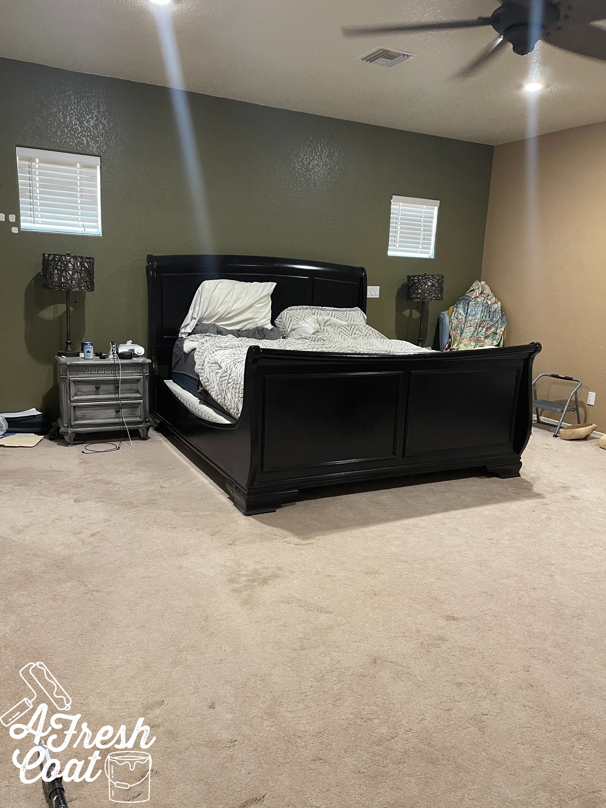
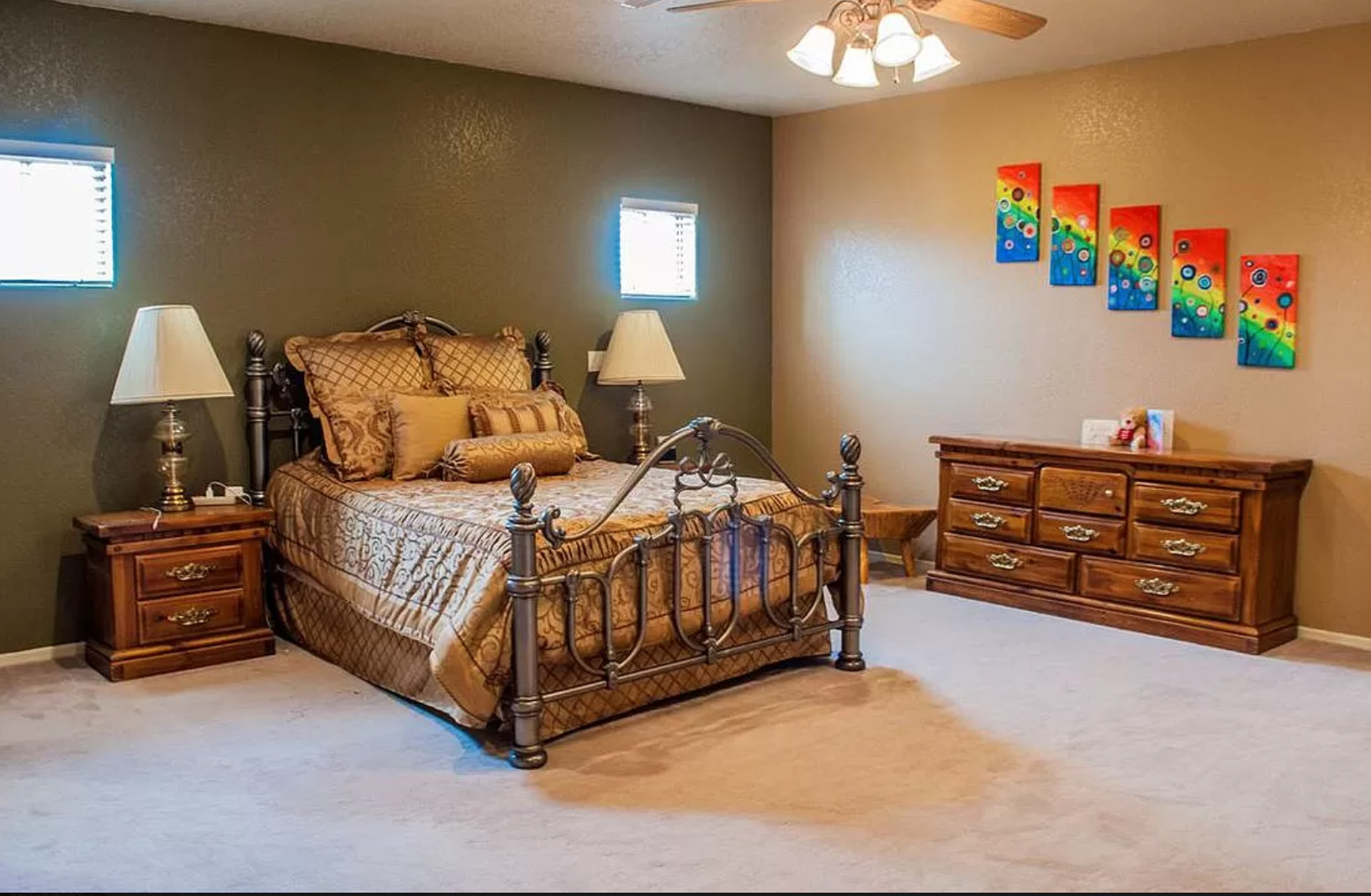
But before I get too far ahead of myself, here’s a glimpse of where we started:
I know, I know—not attractive in the least. The paint colors were outdated, as was the furniture, and well, basically everything in this room. The poor thing had been neglected for way too long.
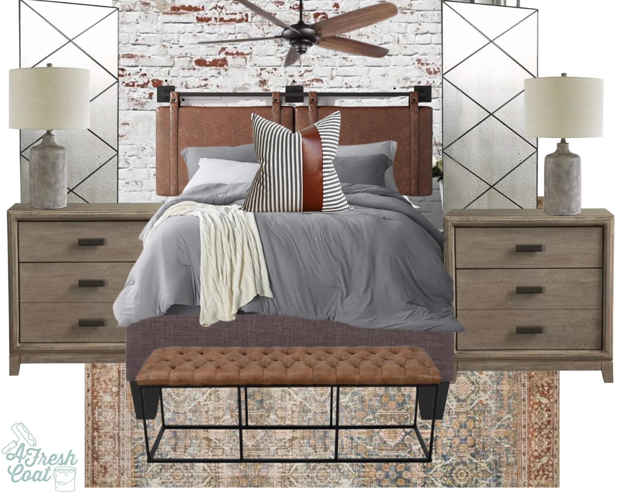
She needed to be rescued…and revamped…and I had just the plan to do exactly that!
The goal was to take this space from drab to fab with a crazy small budget.
Initially I decided that I would JUST repaint this room in an effort to get rid of the ugly wall colors left by the previous homeowner.
I should take that back. I shouldn’t say another’s style is ugly. Let’s go with unattractive color choice. Much better.
After testing colors, I decided on Sherwin William’s Moderate White. And this is where my youngest son came in—however, after painting for a whopping two whole minutes, he was over it. D-O-N-E!
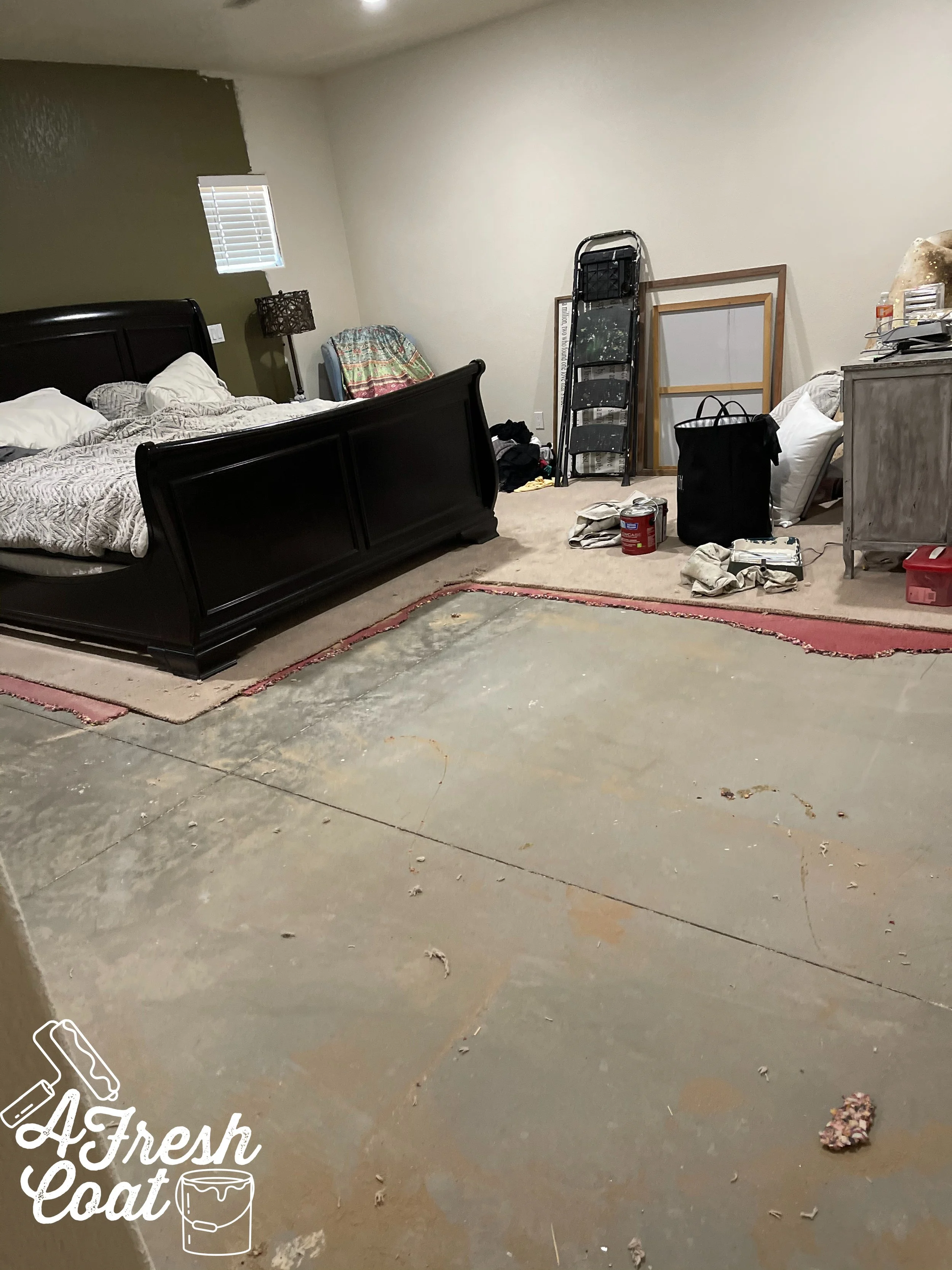
Once the walls were almost finished (by yours truly,) I decided I really hated the carpet. Well, one thing led to another, and the next thing I knew—the carpet was being ripped out.
Which escalated quickly…
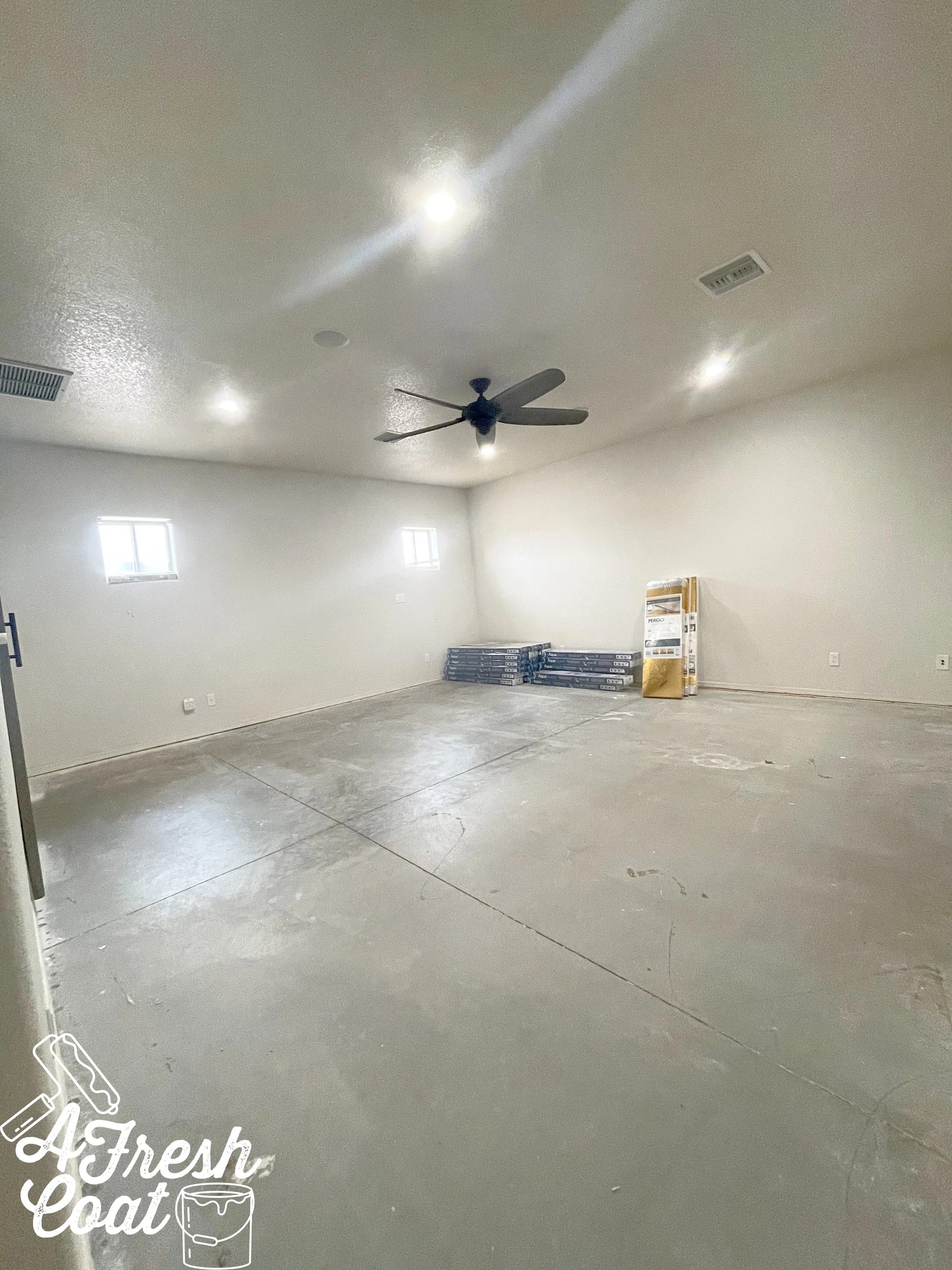
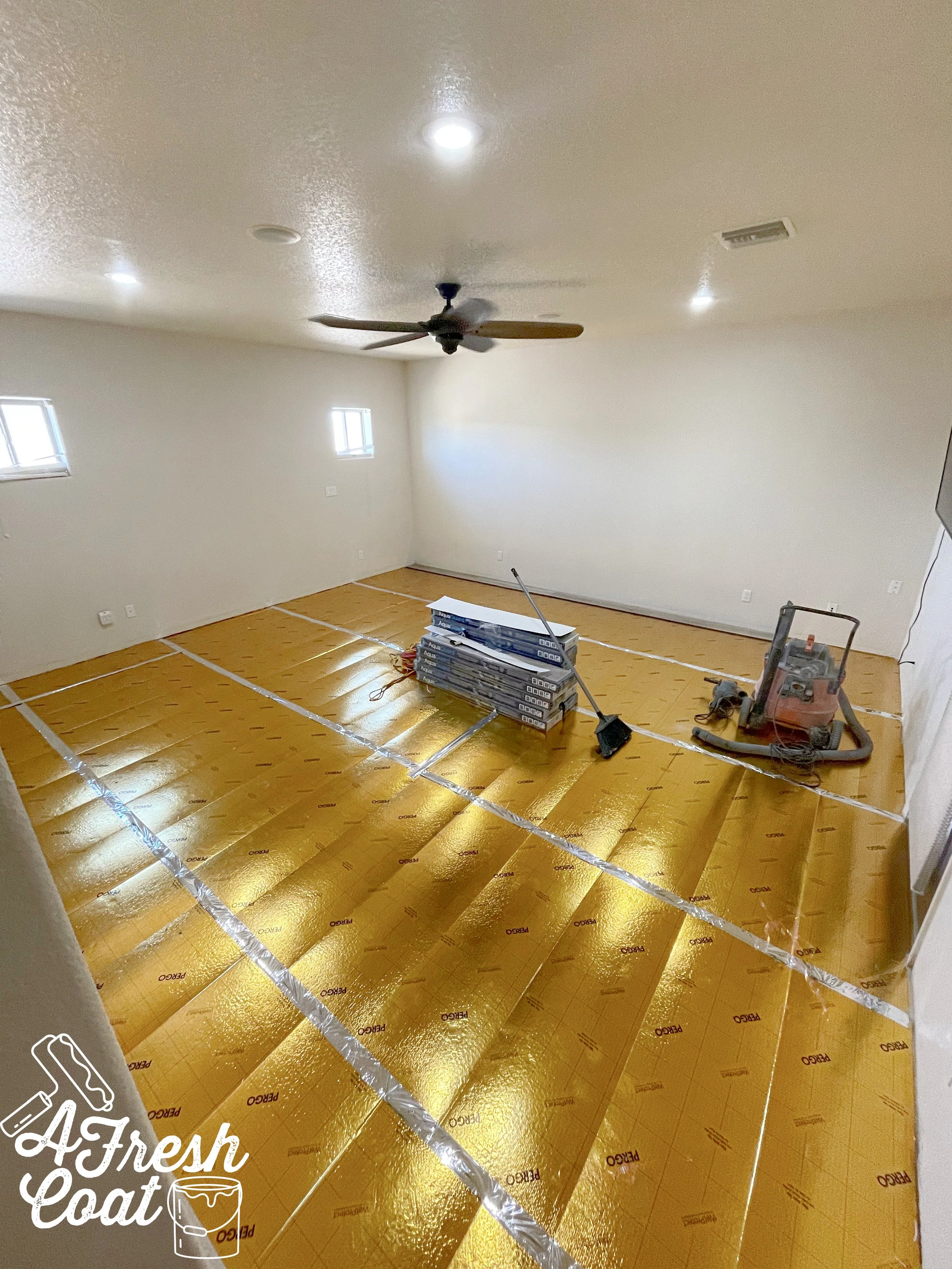
And see those boxes in the corner? This was the next dilemma we faced—what flooring should we choose? Our clearance wood tile flooring that we used out throughout the rest of our home wasn’t an option. We hadn’t planned on re-flooring this room, and so we didn’t order as much as we should have. Plus, it was no longer available (the dreaded “D” word: discontinued).
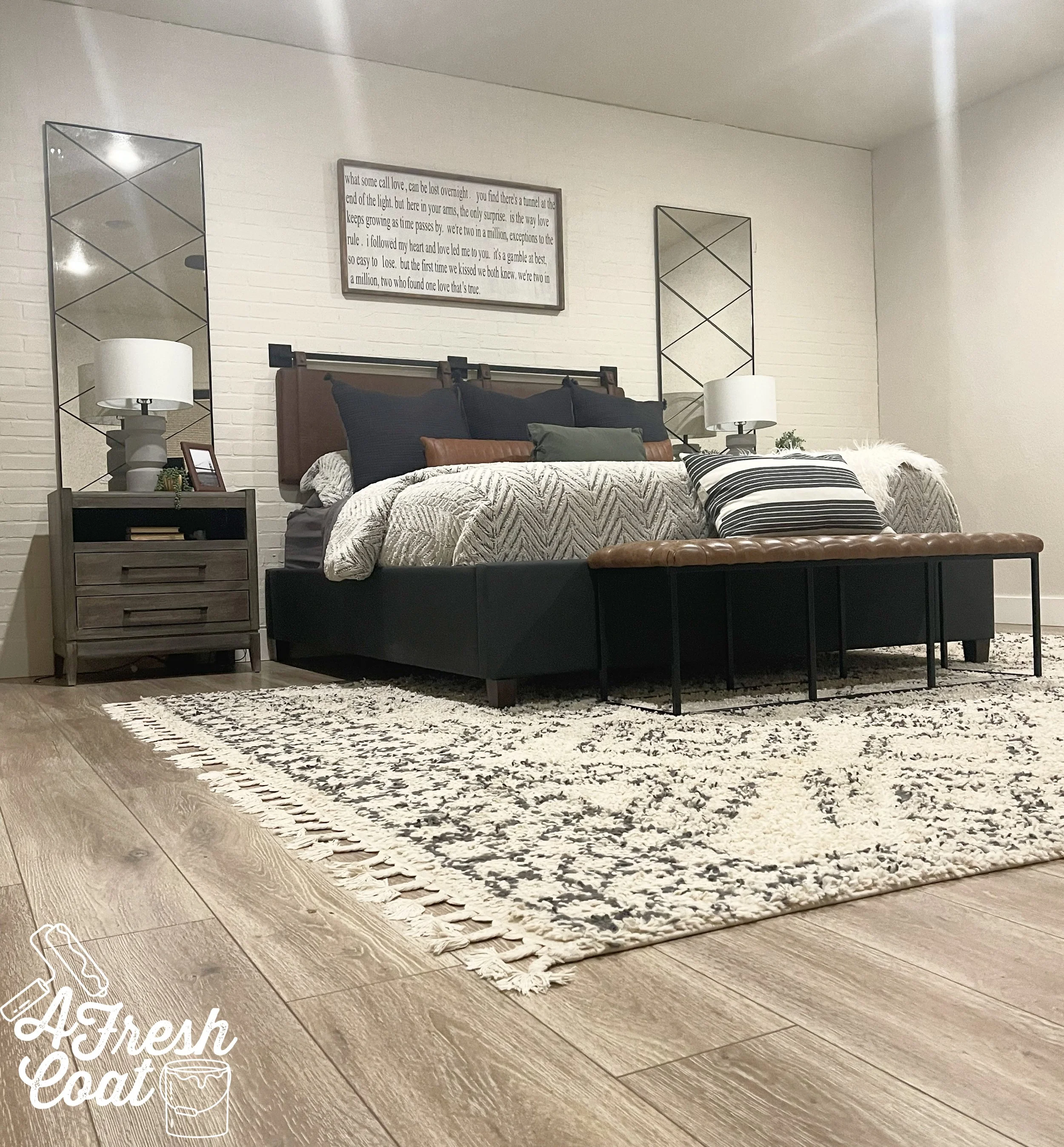
Luckily, we found an identical flooring option in laminate (not my fave), and ran up to Phoenix to grab it.
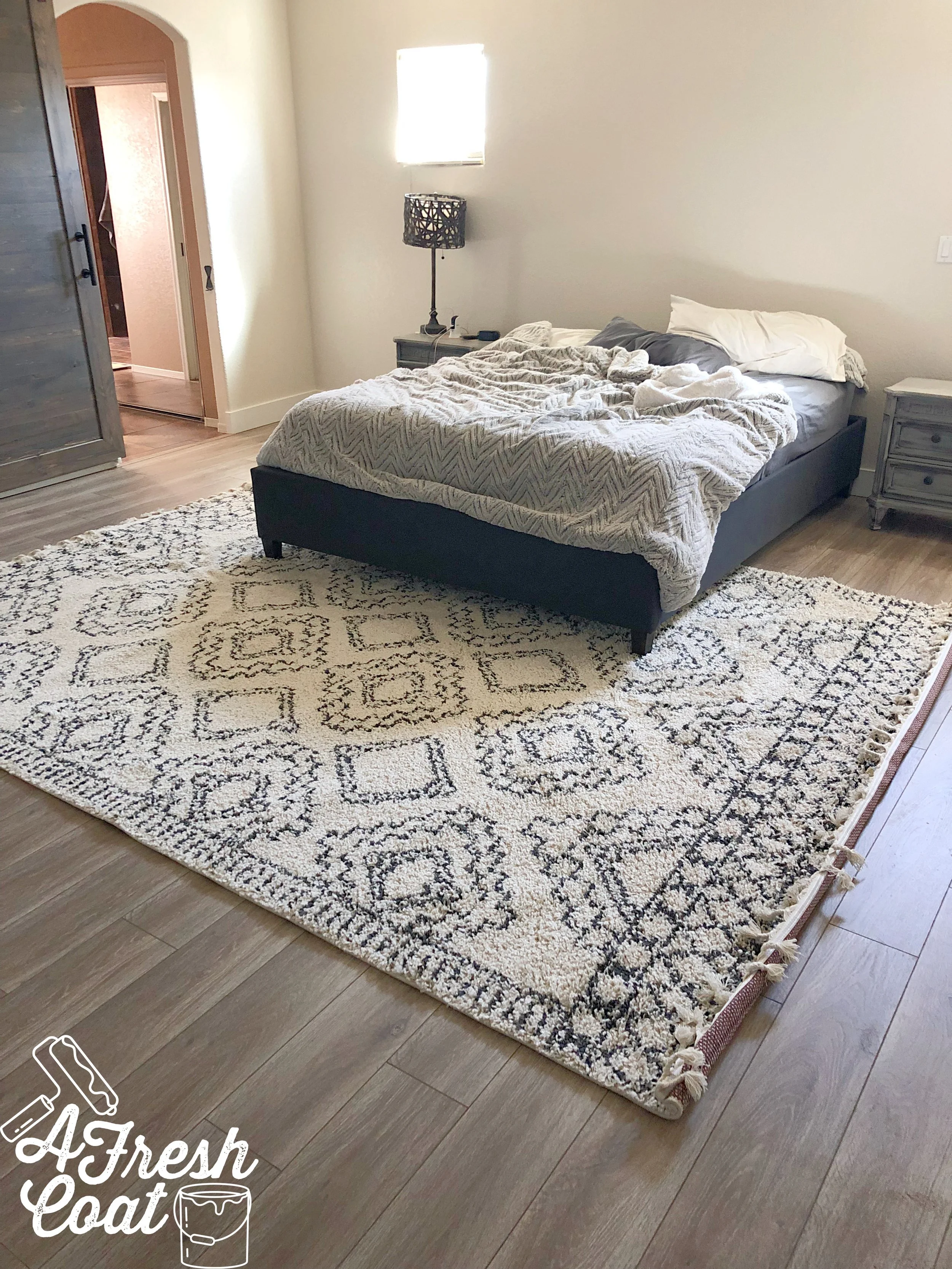
Already ten (thousand) times better…
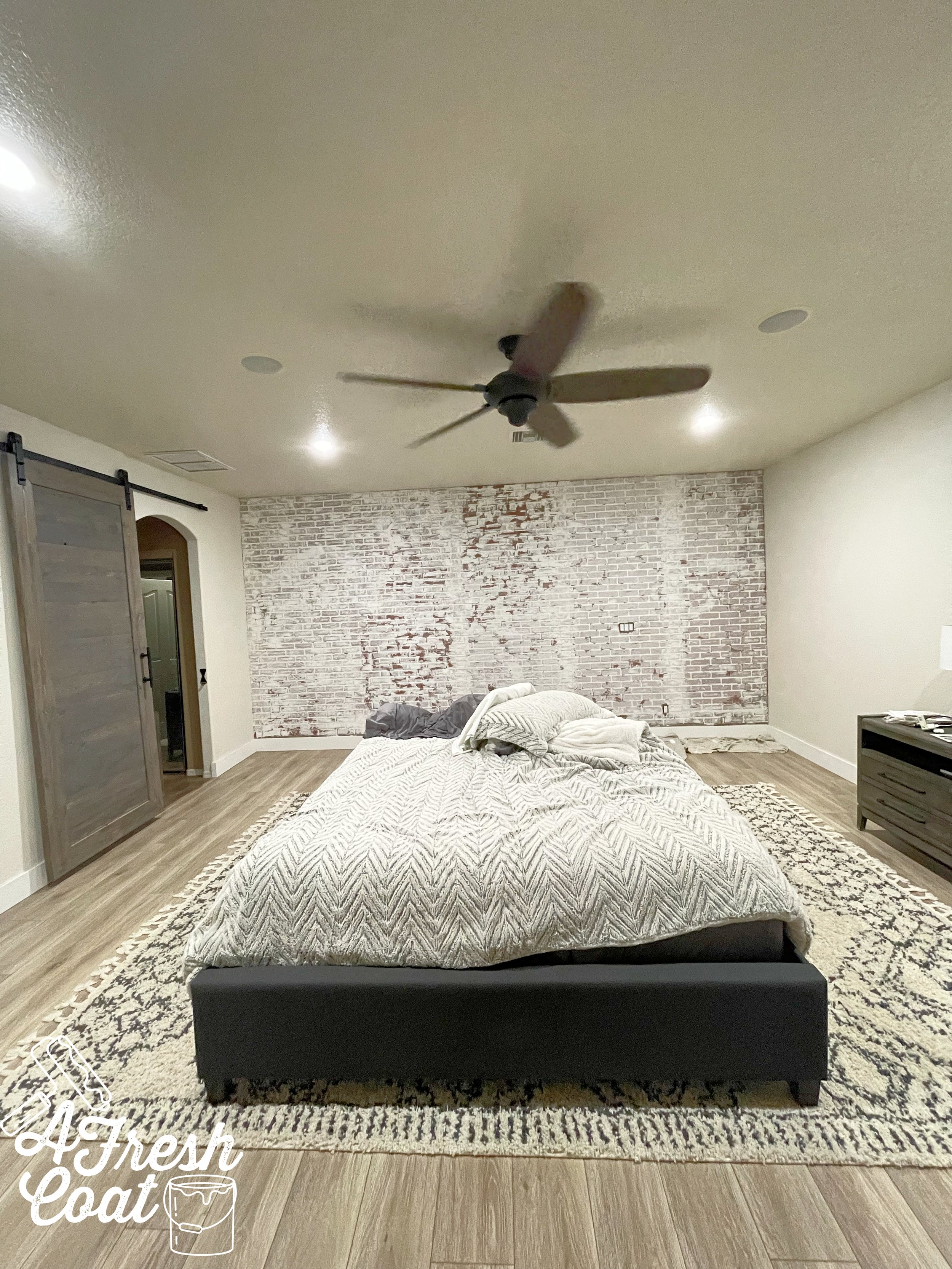
Progress! New flooring and a new rug, along with lighter and brighter paint made all the difference…but this space was far from done. F-A-R!
Now this is where it gets a bit controversial (LOL), because in this next step, you’ll see that we covered up the windows. When I mentioned this in my stories on the ‘gram, I got a bunch of questions as to why I would do such a thing. The answer? The windows were a really weird size. Like, weird-weird. As in—unattractive, non-functioning, can’t-do-anything-with-them kind of weird. They also weren’t spaced evenly. Besides, I had ideas of what I wanted to do in lieu of said windows, so away they went.
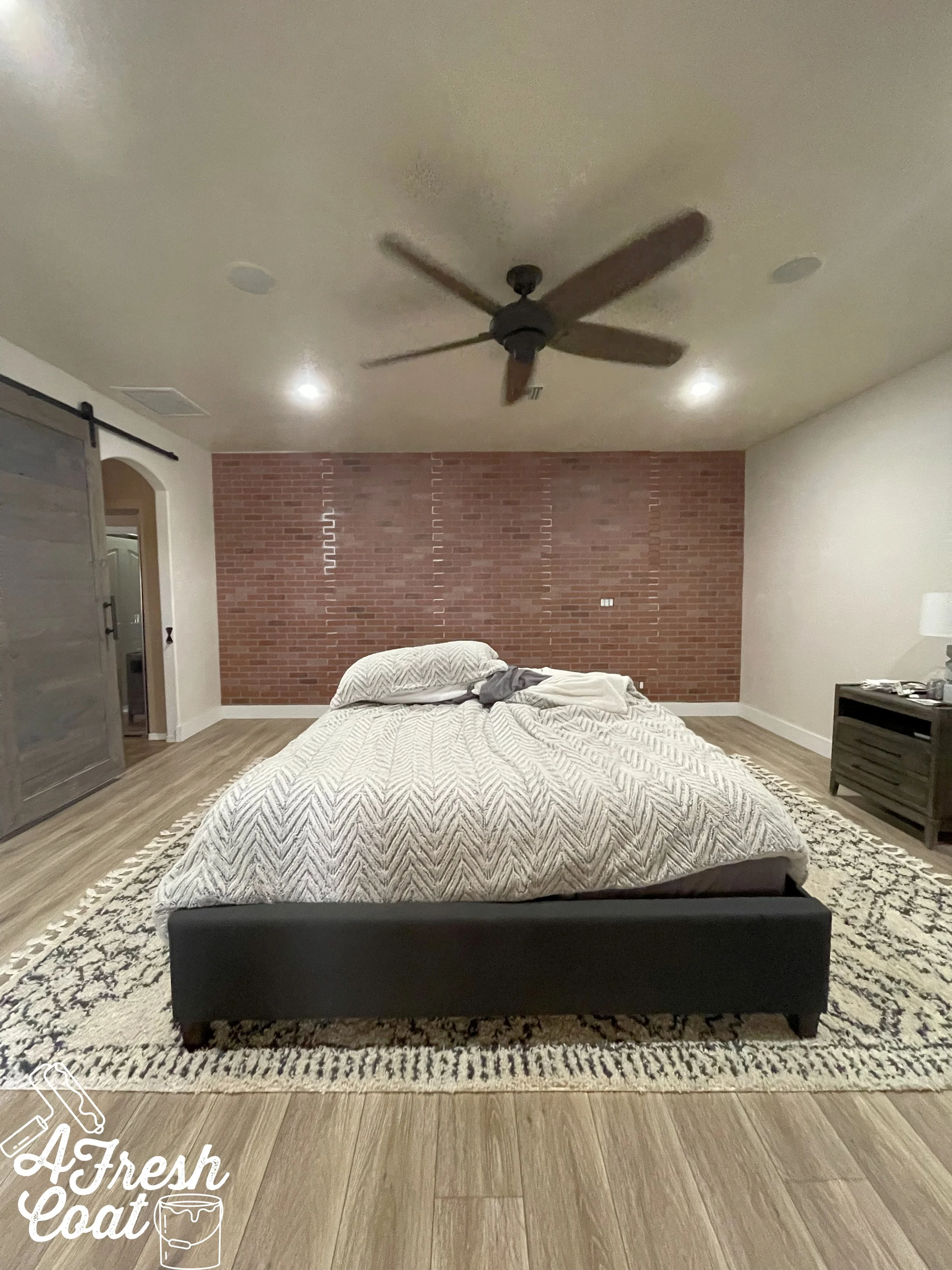
Brick wall panels for the win! Thanks to FSM Construction here in Yuma, this feature wall was up and looking stellar…but it still wasn’t done…not yet.
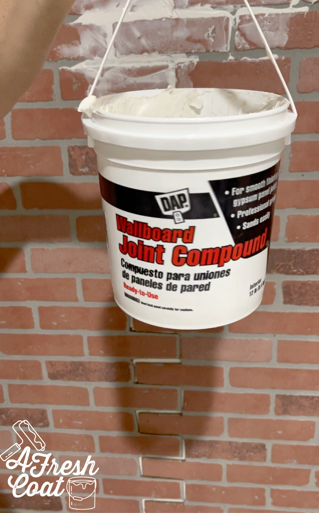
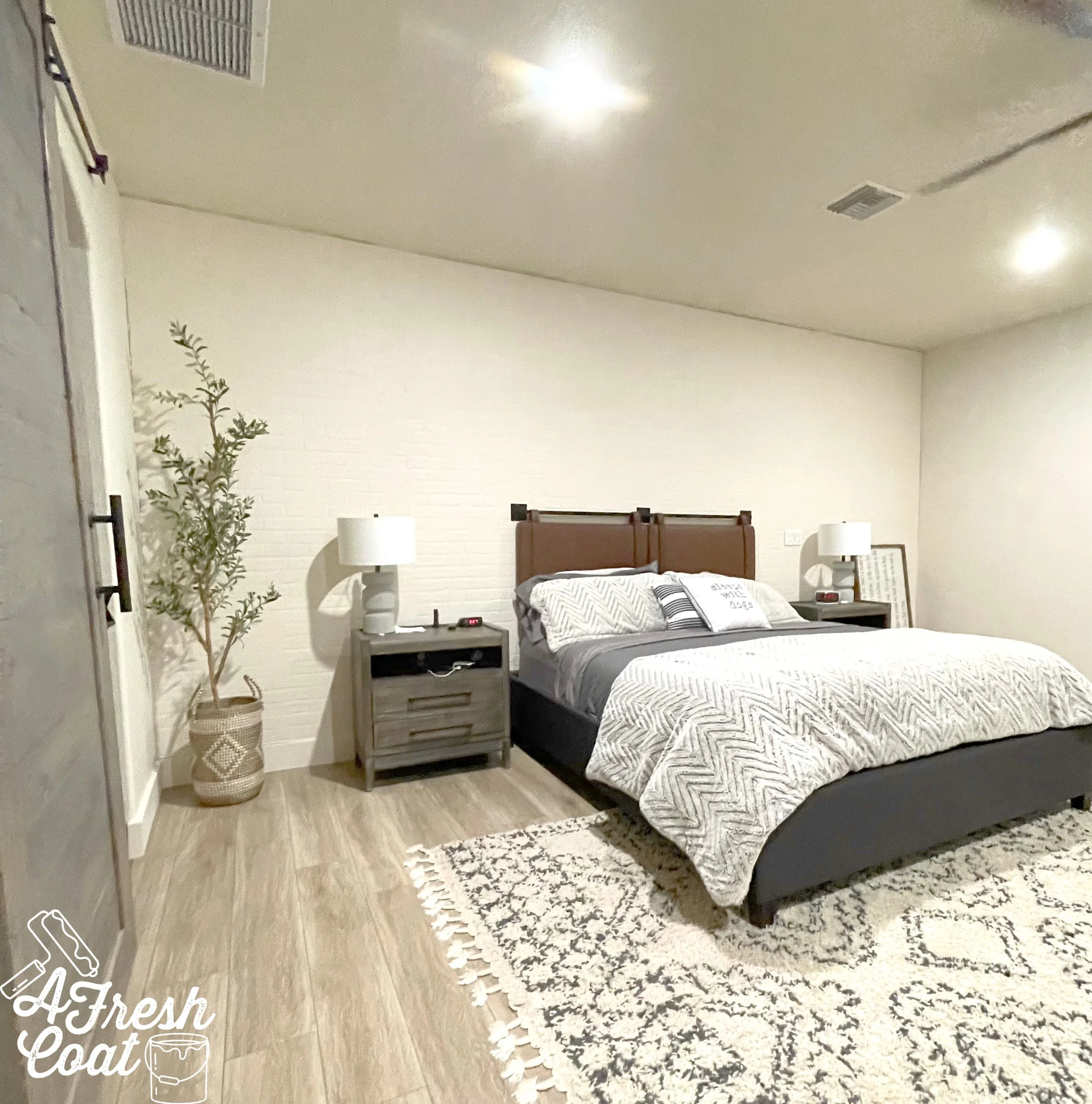
Next up? Joint compound…followed by paint. I wanted this accent wall to have texture and appear less urban, more modern farmhouse with a side of some desert flair. The joint compound helped to create a more uniform look and make the seams of the paneling disappear.
For the paint, I needed a creamy white as opposed to a bright white in order to achieve a warm overall feel to the room. Sherwin Williams Moderate White in Eggshell finish did the trick.
Almost there. Almost!
Now the waiting began—for the mirrors. After doing lots of homework and sourcing, I found the perfect pieces in the dimensions I needed…and the antiqued style I wanted.
But before the big reveal, here is the room exactly how it looked right before we moved into our home:
Photo courtesy of www.zillow.com
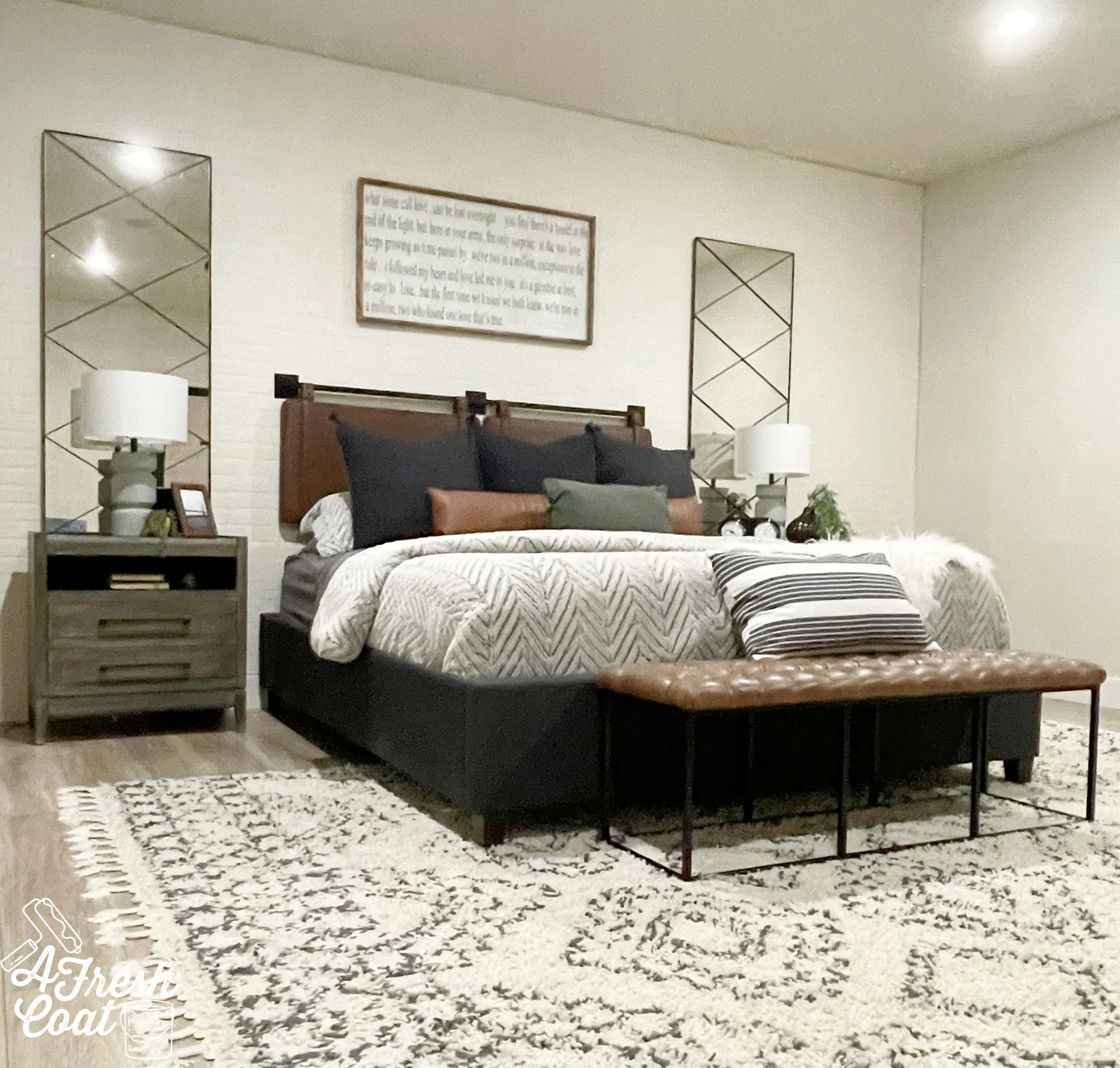
And now…
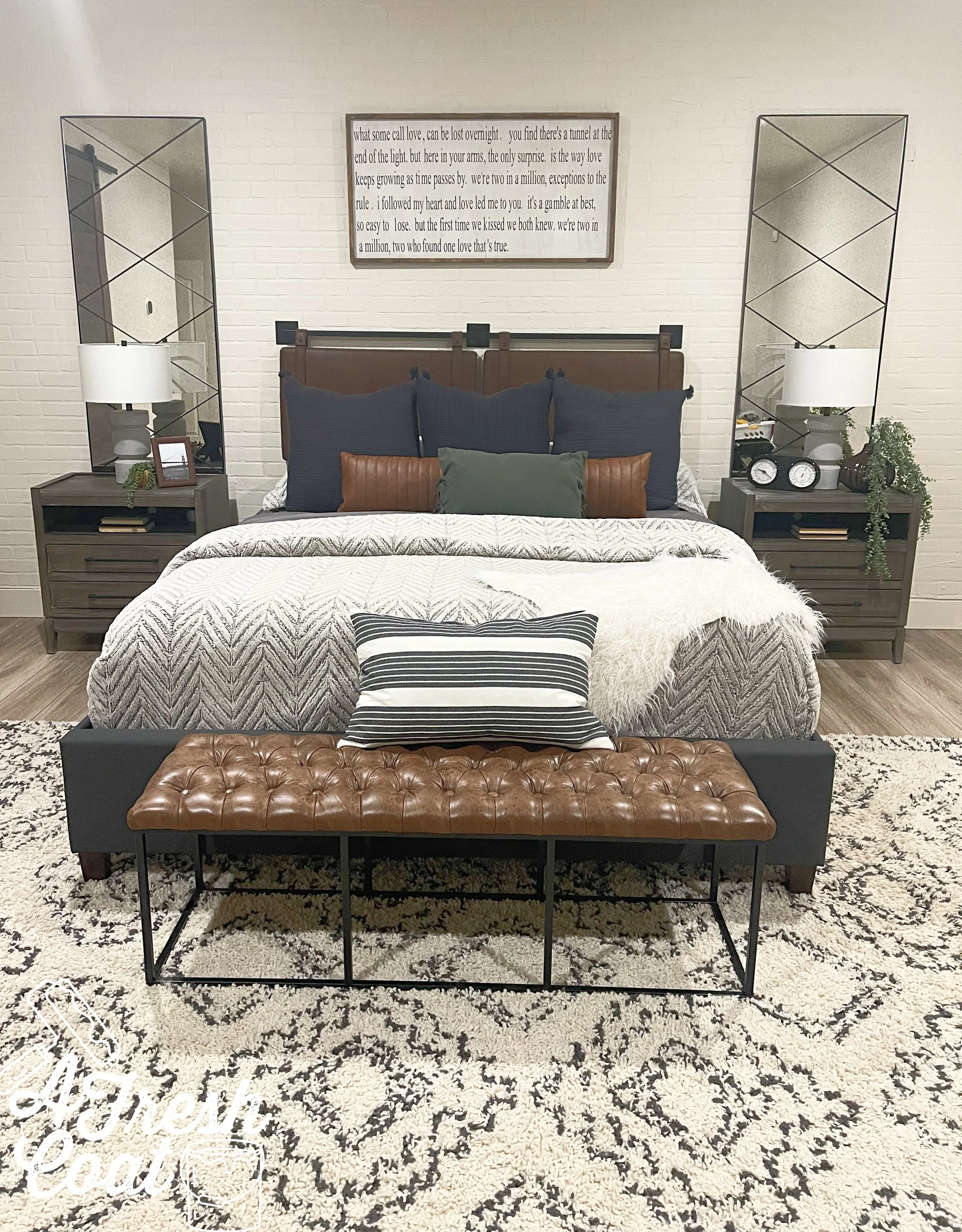
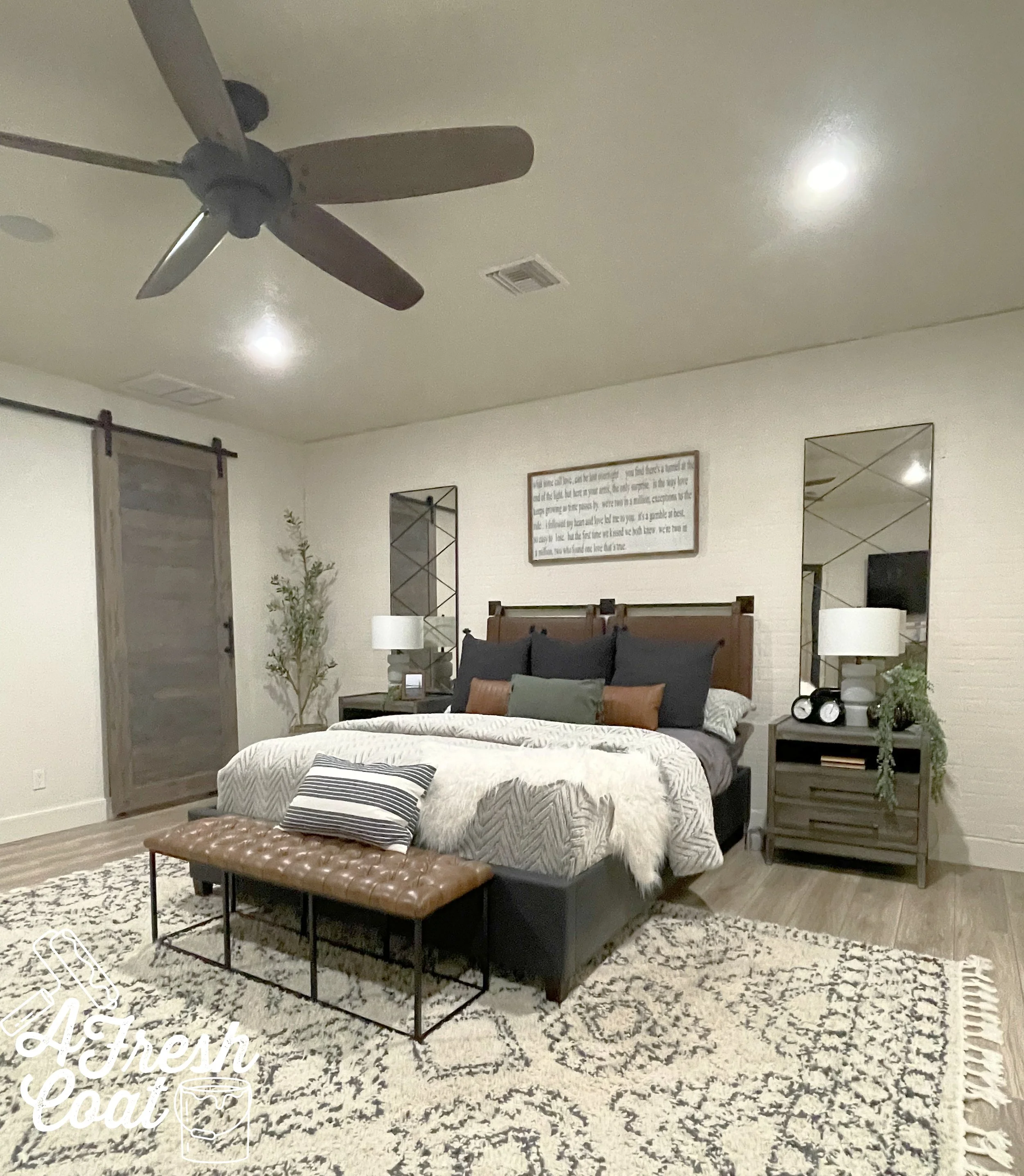
Bringing in new furniture, antique/distressed mirrors in lieu of our former windows, a brick textured wall, new bedding, and some added decor…and it’s D-O-N-E!
Tell me-is your Master Bedroom last on your list of to-do’s?
THE DETAILS
Paint: Sherwin Williams Moderate White
Paint Labor: A Fresh Coat Yuma
Design: A Fresh Coat Yuma
Brick Paneling: FSM Construction
Custom Barn Door: FSM Construction
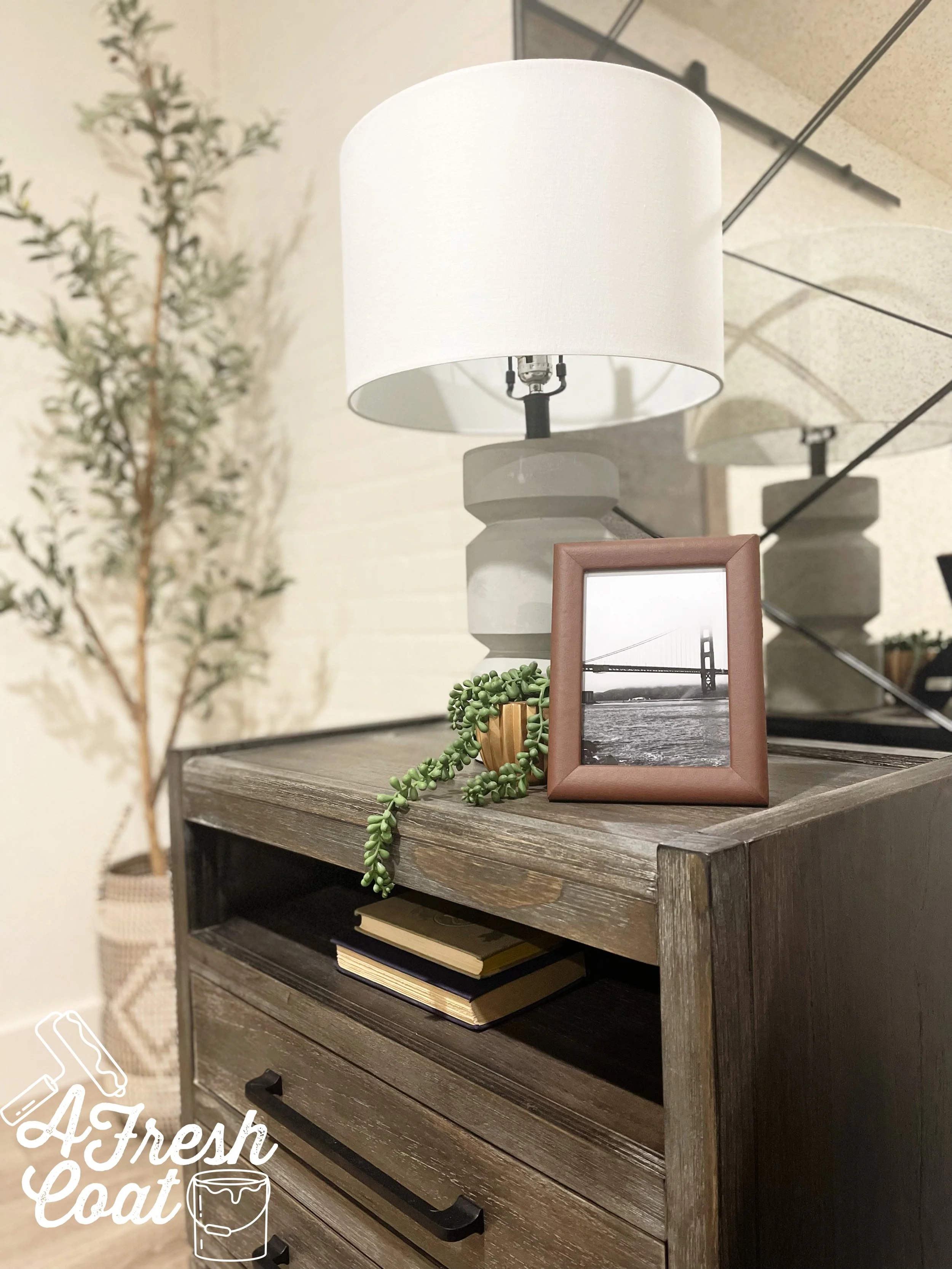
Nightstands: Oak Tree-Yuma
Headboard: Amazon
Bed: Wayfair
Area Rug: Wayfair
Lamps: Wayfair
Mirrors: Dandy Home & Ranch
Bedding: Kohl’s/Target/Boll & Branch
Bench: Wayfair
Olive Tree: QVC
Decor: Goodwill/Target/Hobby Lobby

