Whoa! It’s been a long time since I’ve posted here but a number of projects are still underway, while others are wrapping up, and some are just getting started. It’s busy but awesome and I can’t wait to share what AFC has been up to.
For instance, this bathroom—my bathroom, actually. Well, make that the full guest bathroom that sits right off our kitchen and the one that everyone uses. The problem? It was majorly ugly. As in: “it got beat by the ugly stick too many times to count and then came back for more,” kind of ugly. It needed help and was at the top on the list of priorities of projects that needed tackling.
Currently, my daughter claims this bano as her own but since she’s already sixteen and a junior in high school, I didn’t feel the need to fully personalize it or gear it towards her. Instead, I wanted to keep it more of a neutral space, yet give it a modern farmhouse feel.
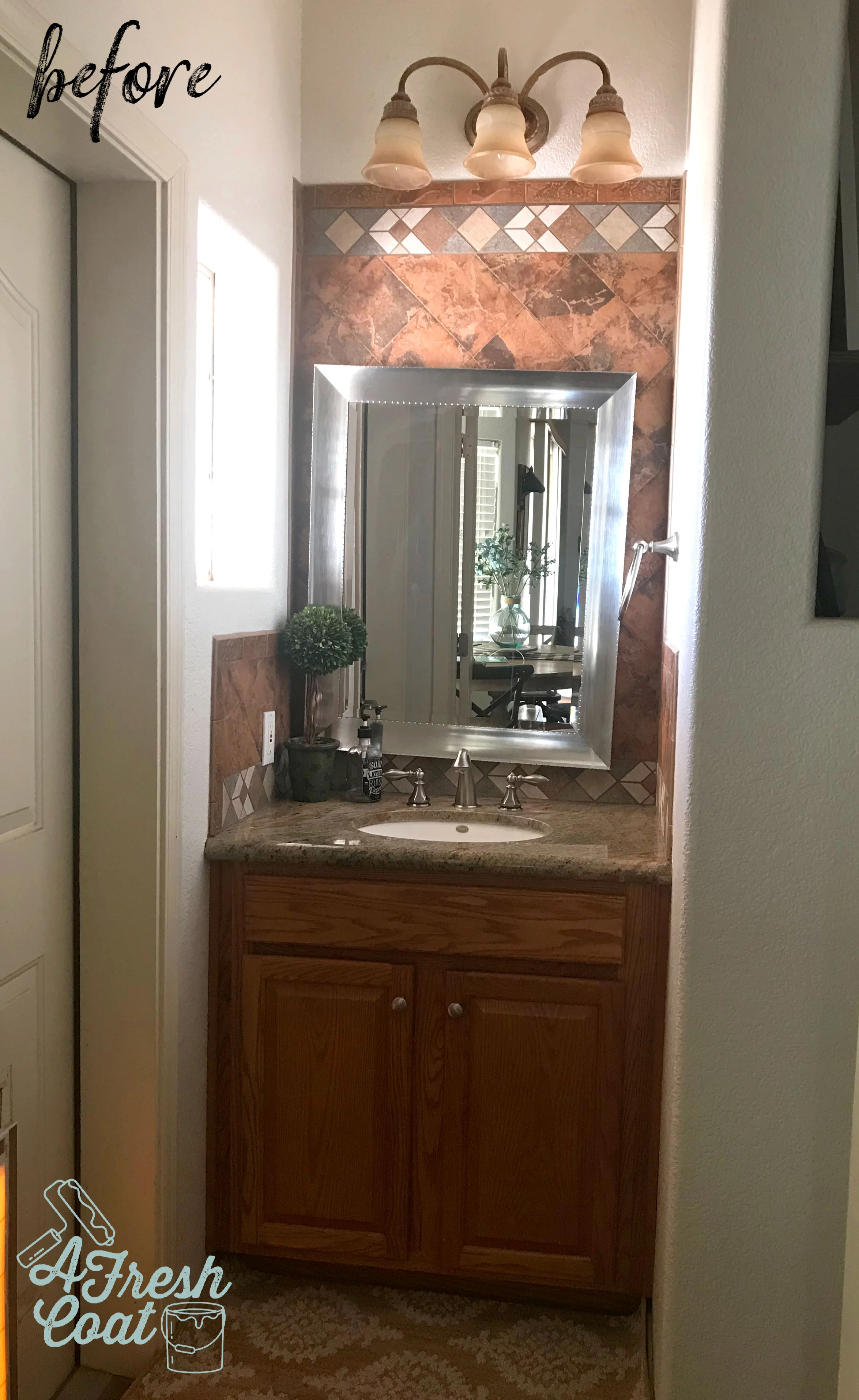
Here is where we started:
When we first looked at this home, one thing was for certain: the previous owners really liked orange tile. So much so that they placed it up the walls, in the showers, encased mirrors with it, created backsplashes with it, and selected this same tile to serve as the flooring for the whole home. That’s commitment for sure. But it’s also what I dislike most about my home. Not only is it NOT my signature color, but it totally dates and darkens our space, and doesn’t fall in line with my design style…like, at all.
Looking at the pic above, there were a number of issues I wanted to address right off the bat. They are as follows;
Rip out the orange tile (given).
Remove that vanity sconce light and re-route the electrical to the ceiling.
Close off the ice block window with a more functional option.
Update the sink/granite countertop and faucet.
New mirror.
Paint the vanity cabinetry instead of replacing.
Redo the tile flooring and shower areas (future project).
One of the main issues I wanted to tackle in this space was storage. My daughter only has the limited area under the sink for all of her toiletries, makeup, and hygiene items. Not good. I decided that rather than hold on to the ice block window that was originally installed, I would close it off with a medicine cabinet instead. This would take away all natural light coming into the space but it really didn’t bother me. I was much more excited at the prospect of a frameless recessed storage cabinet than I was a window.
See what I mean?
This area just screamed “close me off and give me storage.” So I did.
Ready for the reveal? Now keep in mind—as I was planning this room in my head, I wanted to marry traditional farmhouse elements with a more modern feel, yet provide masculine AND feminine touches.
I know, I know—I got in the pic by accident, but still. Isn’t she pretty?!
Here’s another angle. Not the best but the space is so narrow that it’s hard to get a high quality image without yours truly front and center..
This bathroom was completed in a number of steps. First, I busted out the tile (side backsplash) on both the left and right walls. It was therapeutic for sure but left gaping holes that needed to be patched and drywalled. I left the back wall of tile in place since that was going to be shiplapped over.
Next came the painting of the vanity (SW Tricorn Black), along with the construction of the concrete sink. I’ve always wanted to implement concrete into a bathroom or kitchen surface and thought this would be the perfect space to test it out. Look at this baby up close ( thanks to Kyle Hardin of Hardin Development):
Mind blown.
I then implemented a modern black matte faucet (Jacuzzi). Simple and yet super sleek and pretty.
Shiplap was next. Kyle Hardin attached the panels and added the trim, and then hung the mirror that I’ve had in storage for over a year (Kirkland’s).
Last but not least, the pendant light. This is one of those feminine touches I was mentioning before. With bold selections in both color and elements throughout this makeover, a bit of feminine was needed to balance it out. This was achieved in the shape of the glass pendant and the element of glass itself.
You can find this exact one on Wayfair. Her name is Nadine. Go get ‘er.
Oh! And I almost forgot: knobs! The knobs on the vanity needed to be changed out and honestly, one of the best places to find really fun knobs (aside from Amazon) is Hobby Lobby.
Just what I wanted. Kind of a muted copper (like an old penny), and at $3.99 with 50% off this past week, it was meant to be.
Ready for the before and after shots one more time? Always so fun to see.
THE DETAILS:
Vanity Re-paint: My guy, Robert—SW Tricorn Black, Satin finish
Concrete Sink: Kyle Hardin (Hardin Development)
Faucet: Jacuzzi brand found at Lowe’s
Pendant Light: Nadine Schoolhouse Pendant Light—Wayfair
Knobs: Hobby Lobby
Mirror: Kirkland’s
Shiplap: Lowe’s. Installation-Kyle Hardin
Frameless Medicine Cabinet: Wayfair
Electrical Work: Mike Fredricks


