No, really. Paint can transform a room--both good and bad. Last week I received a call from a local realtor whose clients were eager to list their home, but before that could take place, a serious paint overhaul/makeover needed to happen.
See for yourself.
Let's start with the Red Room.
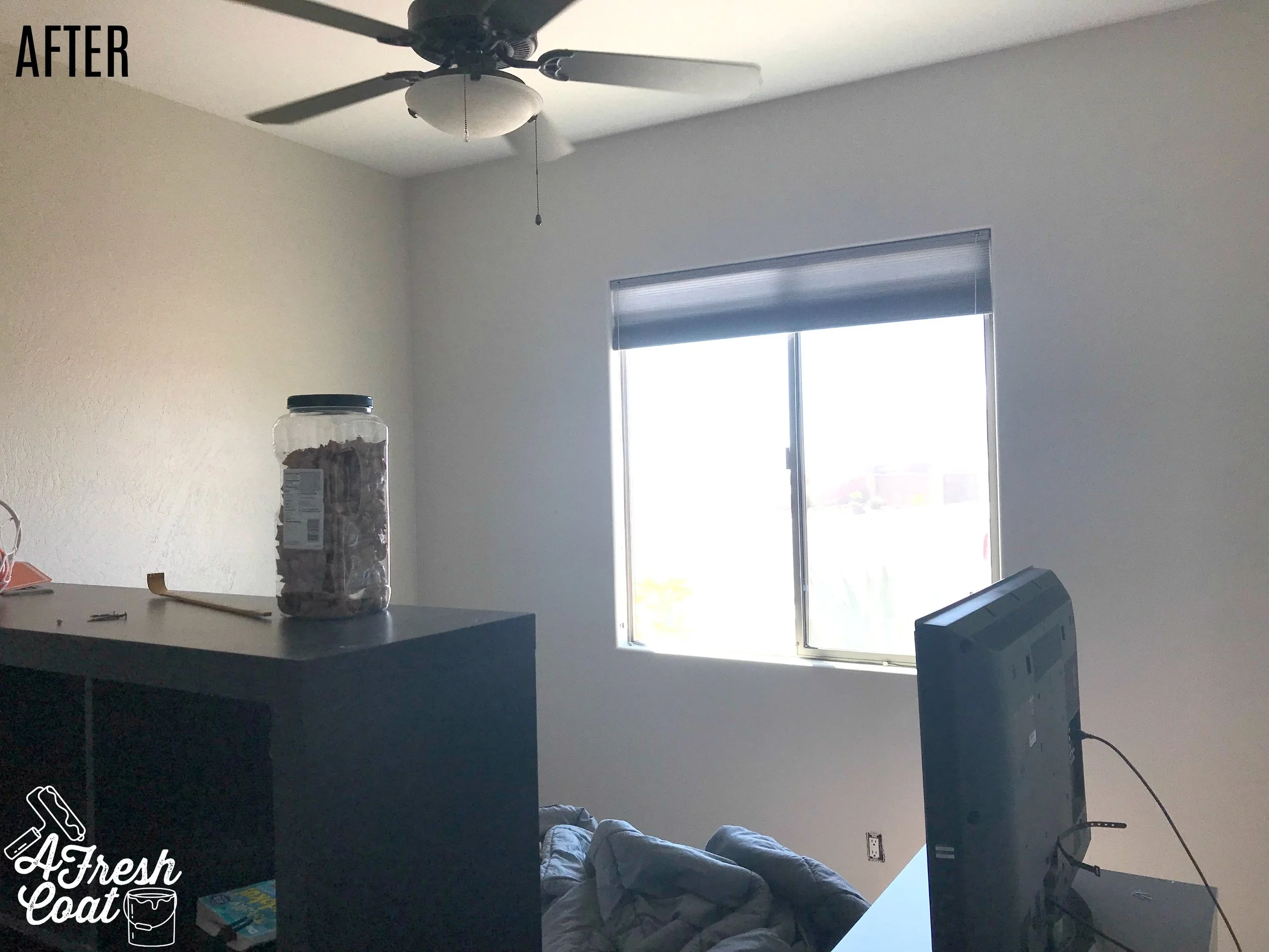
The Red Room had two red feature walls (along with a door frame) painted in a very deep, yet bright shade of red. However, when applied, the color was not distributed evenly. I selected Sherwin Wiliiams's Agreeable Gray (using Valspar Reserve paint with primer) to cover up the red and accompanying grey walls. AFC painted over the closet doors, the back of the main door, all that trim, walls, and finished with touch-ups to the ceiling in a bright white.
Boom. No more red and instead, this room now boasts a nice, clean, refreshing look. Don't those pretzels look good too?
Ahhhh. So. Much. Better! That red felt like it was shouting at me the entire time I was painting and was anything but calming--whereas this grey is soothing, cool, and relaxing.
Next up? The Purple Room.
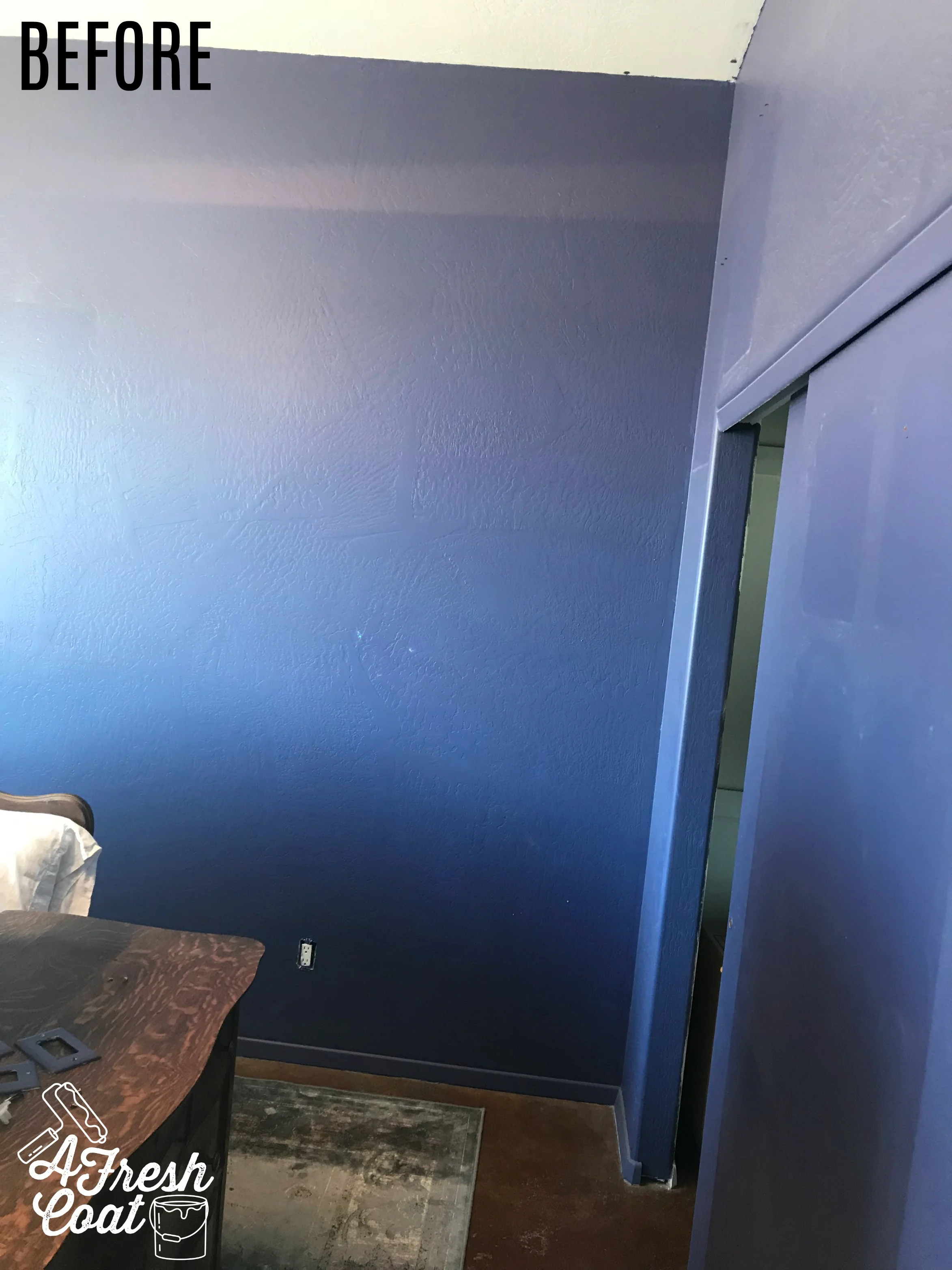
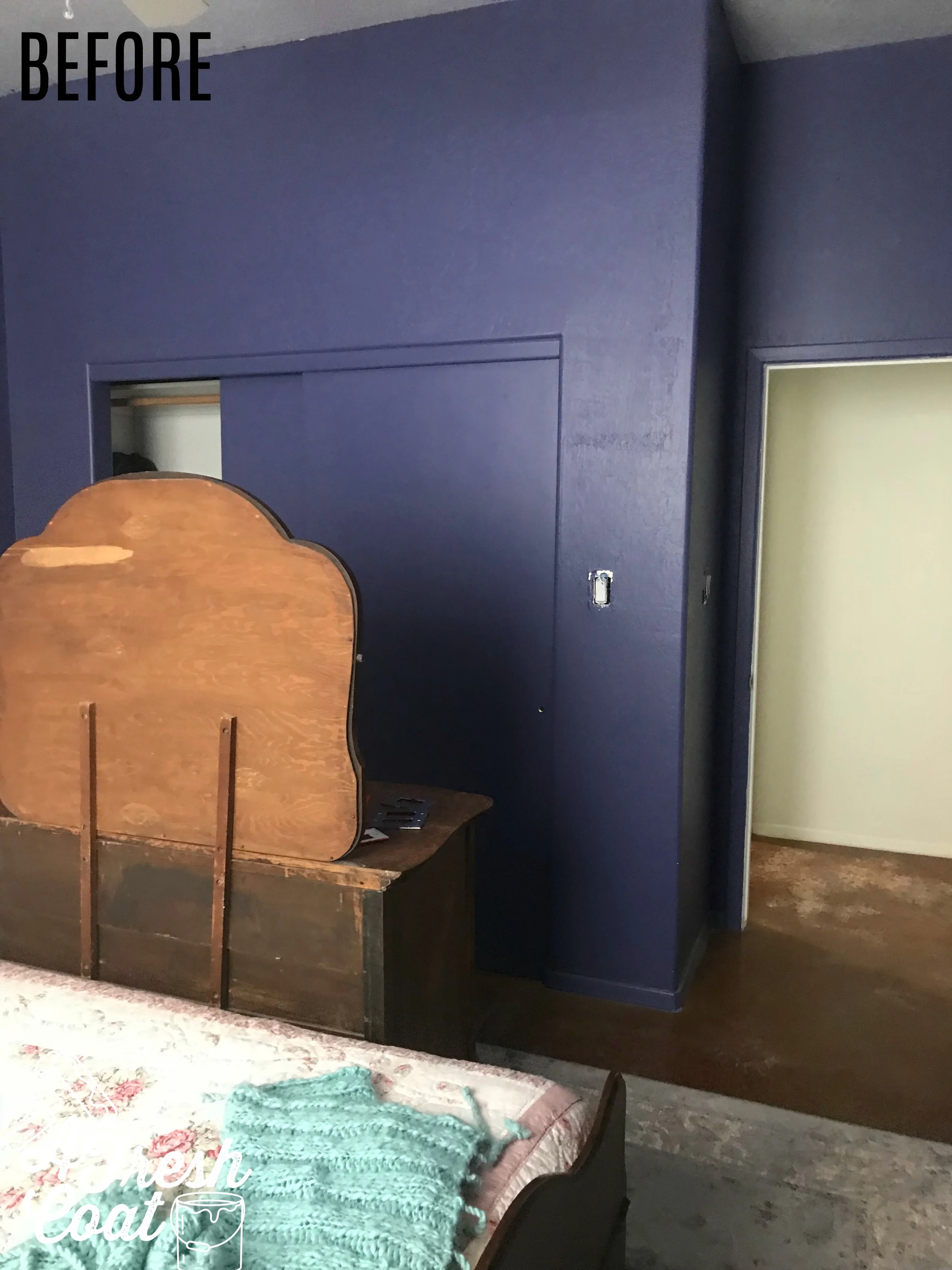
As I began painting Agreeable Grey (hey, it's a great color) yet again, I noticed that this room had previously been painted royal blue and yes, red before it's current lavender hue. This room was very dark and did not compliment the antique furniture it contained.
See what I mean?
Such a deep, dark color that was actually closing this space in. There's a misconception that dark paint will in fact make a room appear smaller, however, dark colors can make the right space look bigger--unfortunately that wasn't the case here.
After painting all of the walls, trim, closet doors, main door, and tending to the ceiling for some clean-up work, this room is transformed!
Better, right?! The neutral color not only compliments the furniture but buyers won't be distracted by that deep, dark color on the walls. Win-win!
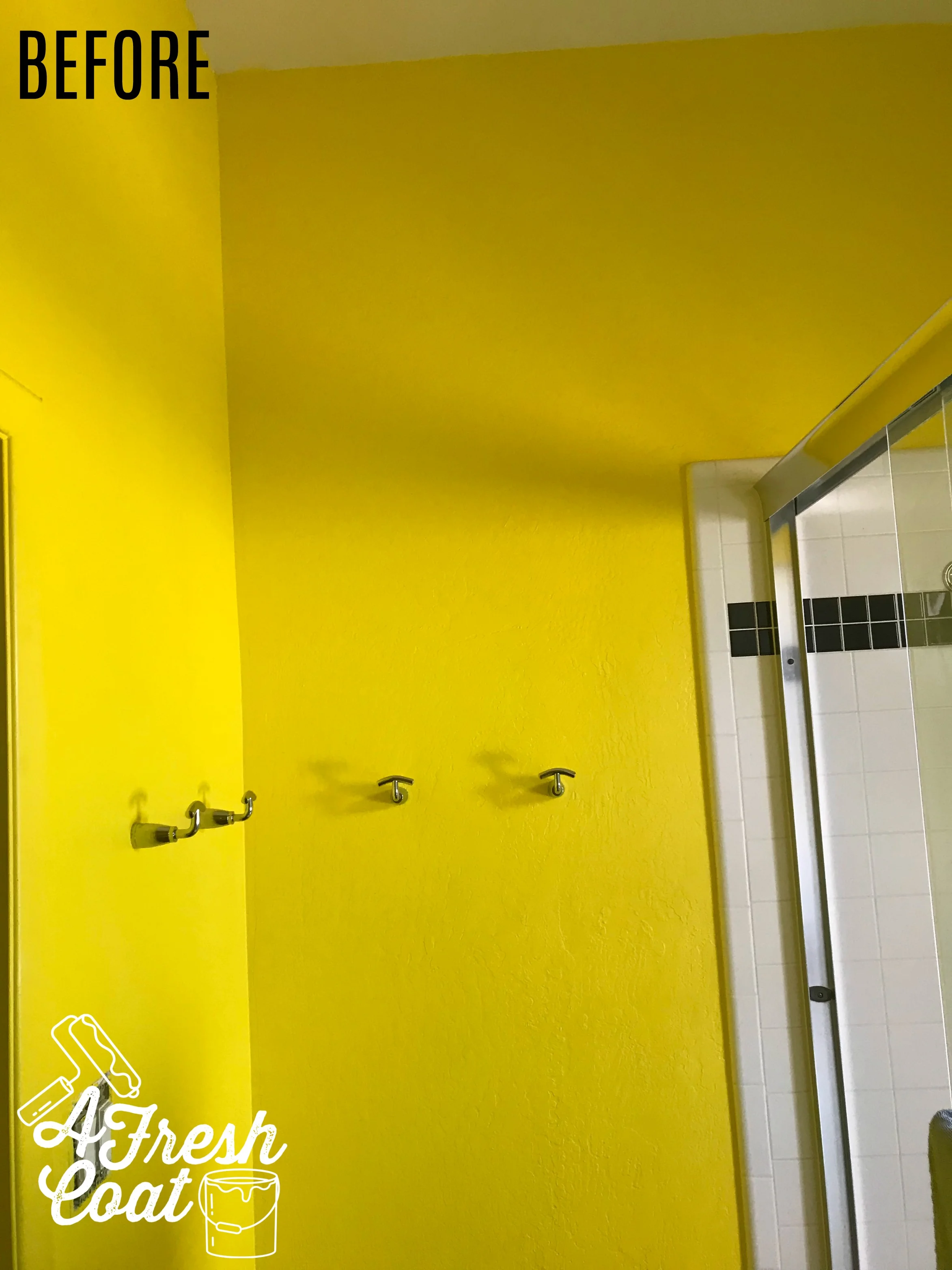
Okay, here's the last room we took care of. Ready?
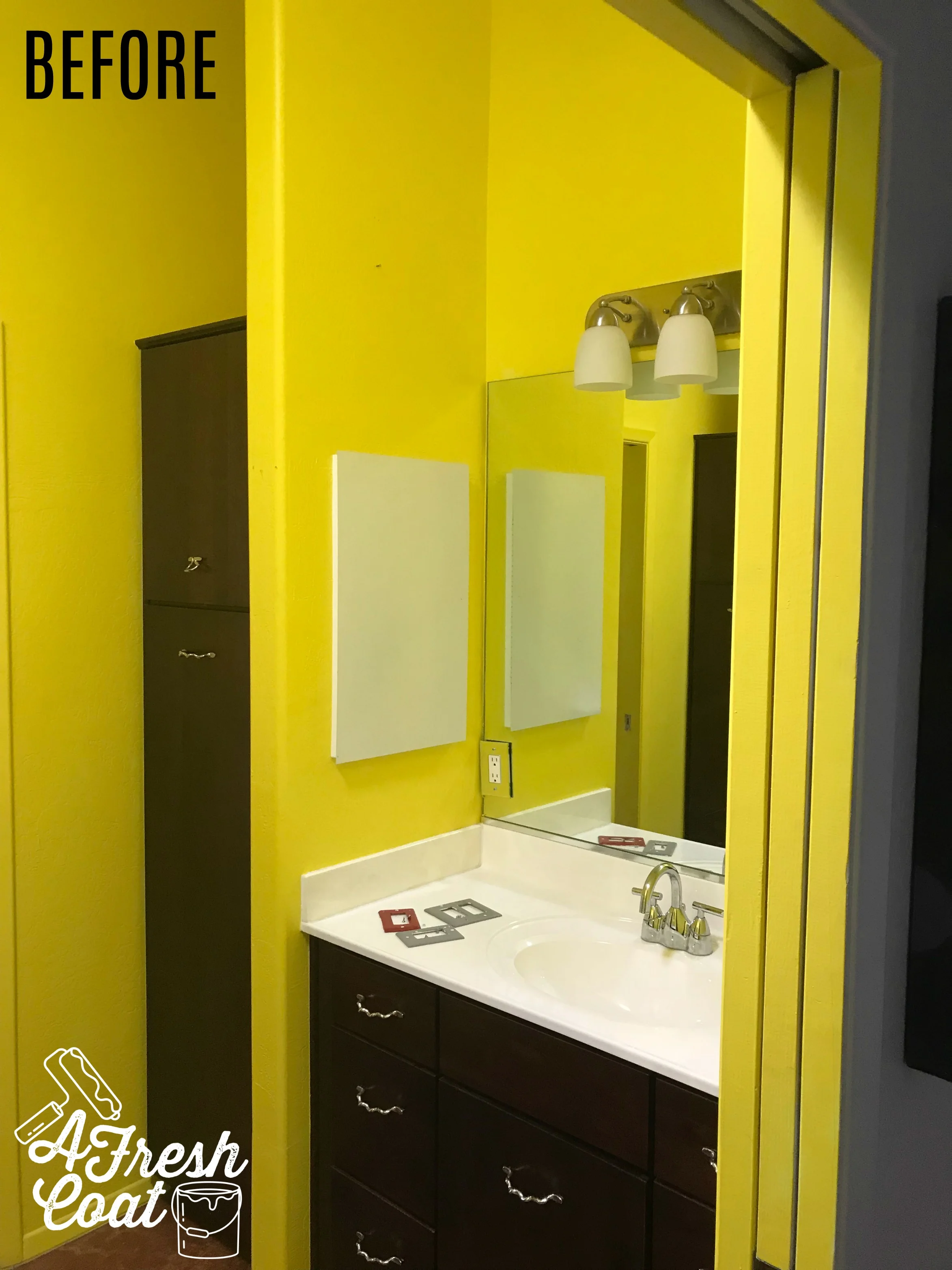
This yellow was extremely bright. In fact, you couldn't see past the color in this bathroom. The yellow just consumed you. The beautiful espresso cabinets and vanities were non-existent up against all that saffron. Agreeable Grey (yet again) to the rescue.
Paint definitely made all the difference when it came to this home--in the colors that were originally selected as well as the color used to cover them up. Now buyers will be able to look past the paint on the walls and take in the true size of each of these spacious and beautiful rooms. The high ceilings and skip trowel wall finishes (they may have otherwise missed) will now stand out.
The investment will be well worth it.
Love, J


