A Fresh Coat

House of Hockey...Room #2

Teen Boys RoomJenny Sulpizio26 Comments

Happy Thanksgiving! I am so greateful for all of my clients, past and present! I plan on consuming copius amounts of food today but in the meantime, here’s the second room makeover in the hockey home. Enjoy!

It’s time for little brother, “T’s” room reveal in the second installment of the House of Hockey dual room makeovers.

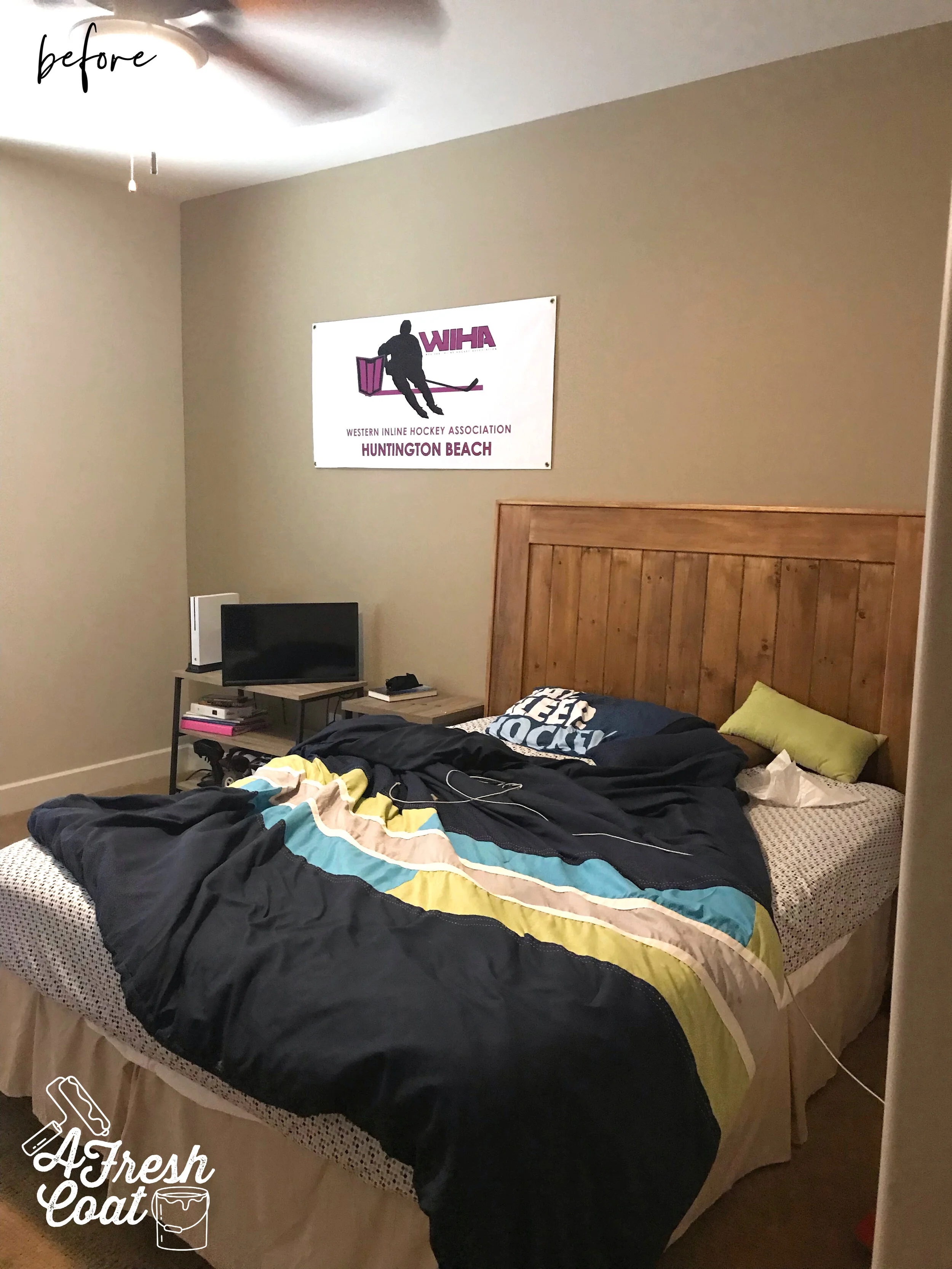
“T” is thirteen, a bit more reserved than his older brother, prefers neutral tones over color, loves hockey, and was in need of a room with more storage and a bit more style.

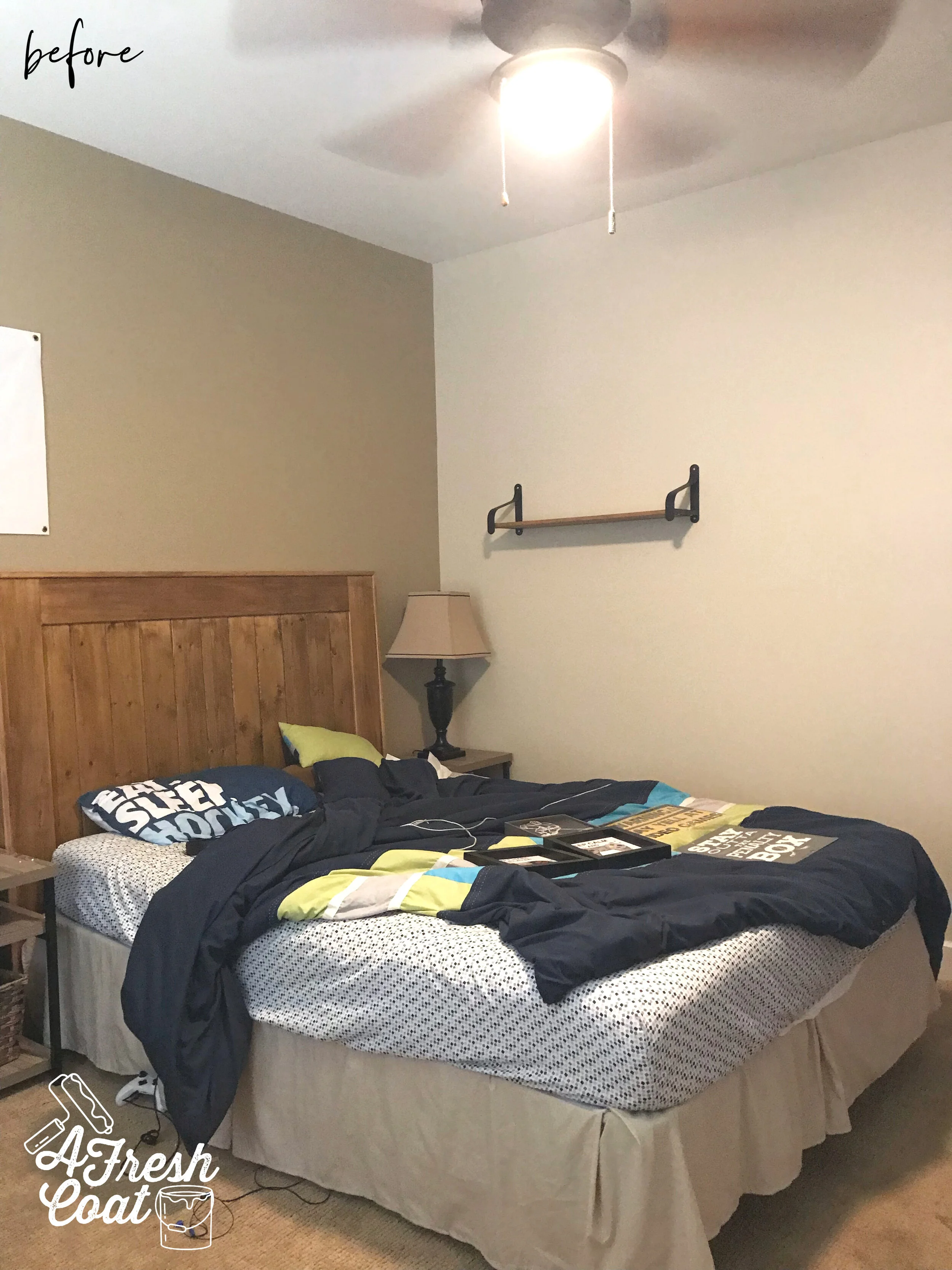
Here is where we started:

House of Hockey Room 2 1.jpg
House of Hockey Room 2 2.jpg

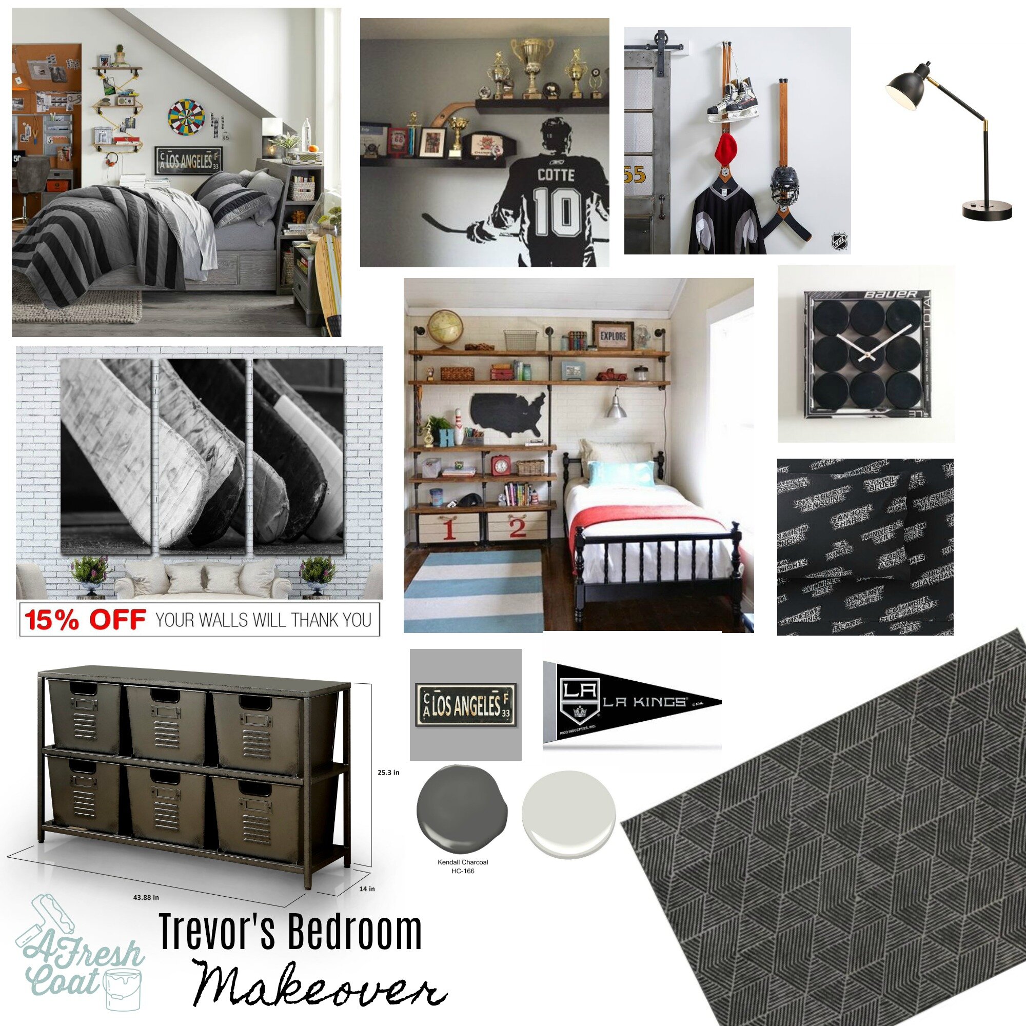
Another great space that just needed a bit more character. Here comes the vision board. Paint, wall decor, hockey accents, a sweet built-in storage unit, and new bedding would take this room to a whole ‘nother level.

Trevor's Bedroom.jpg

Using images from Pinterest to serve as inspiration, bedding from Pottery Barn Teen, and the colors of “T’s” favorite team—The L.A. Kings—this room was about to get redone.

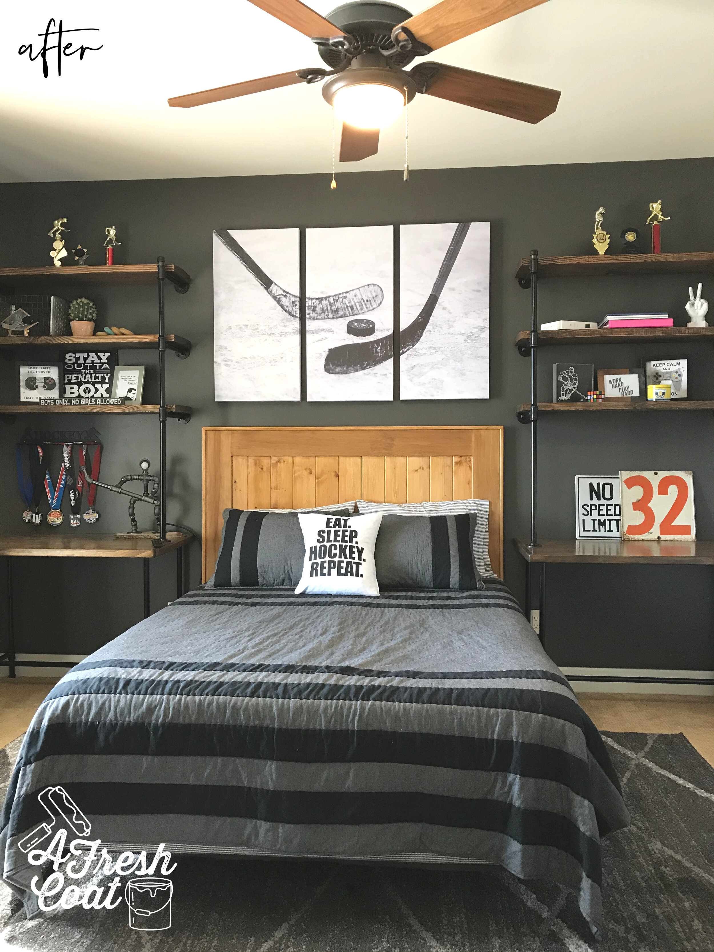
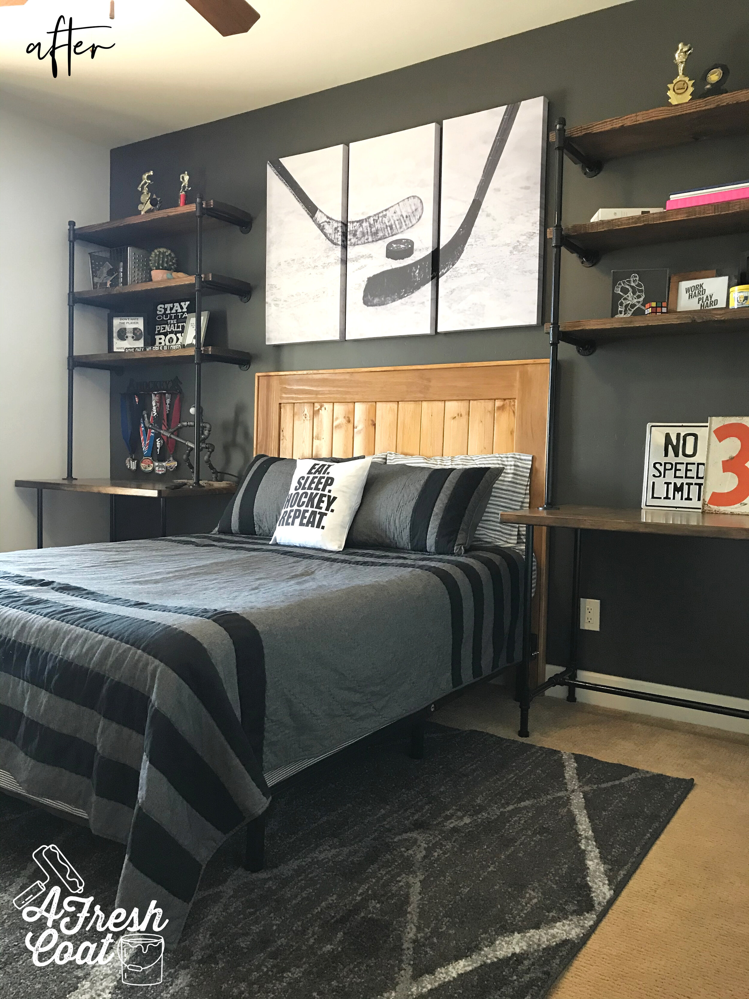
My first thought was to create an accent wall in this room as well, but with a slightly lighter hue of black called Iron Ore. It’s pretty much a charcoal color with a hint of brown added to it. This is quite possibly my new favorite color.

What do you think?

House of Hockey Room 2 3.jpg
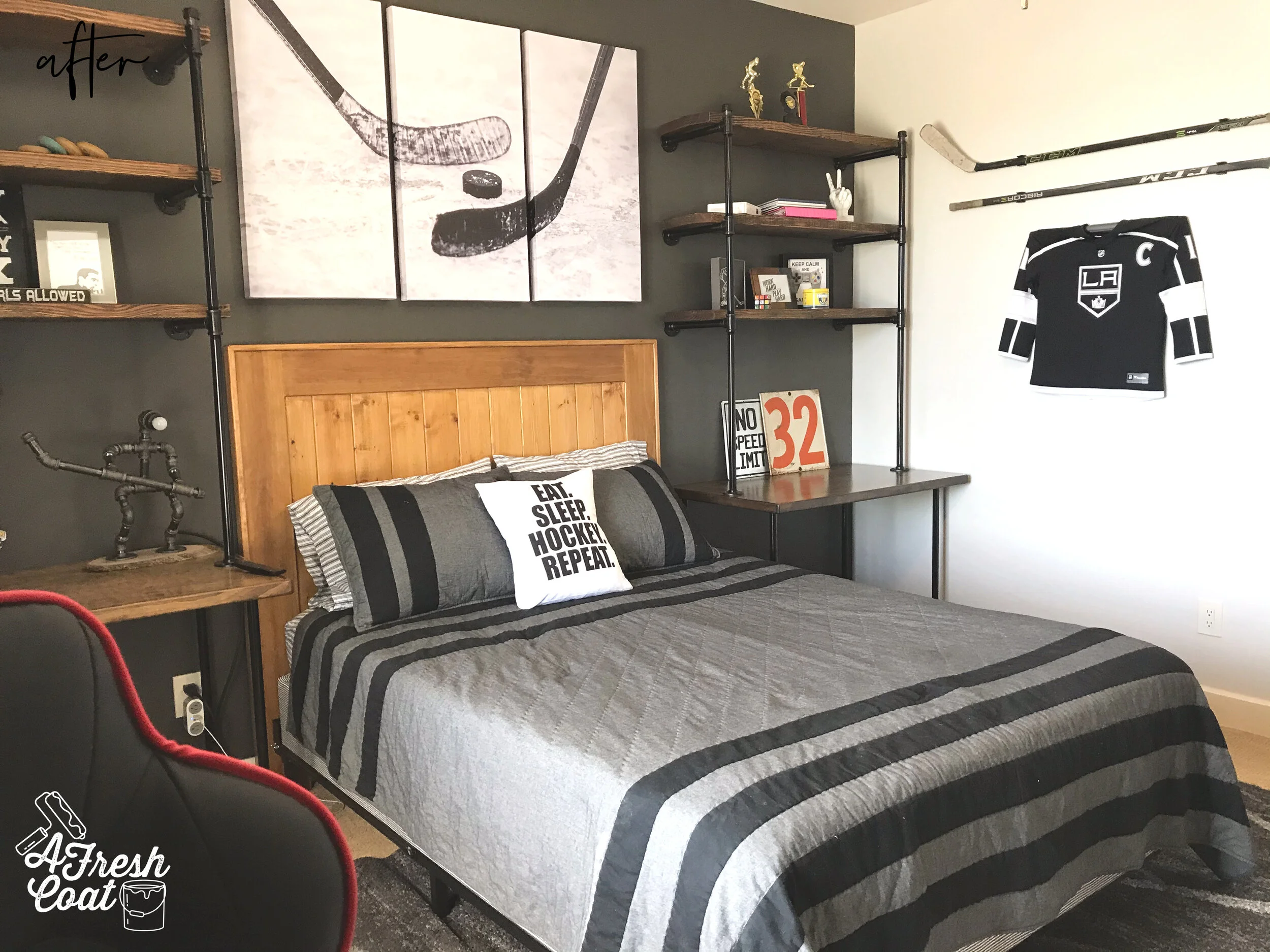
House of Hockey Room 2 4.jpg
House of Hockey Room 2 5.jpg

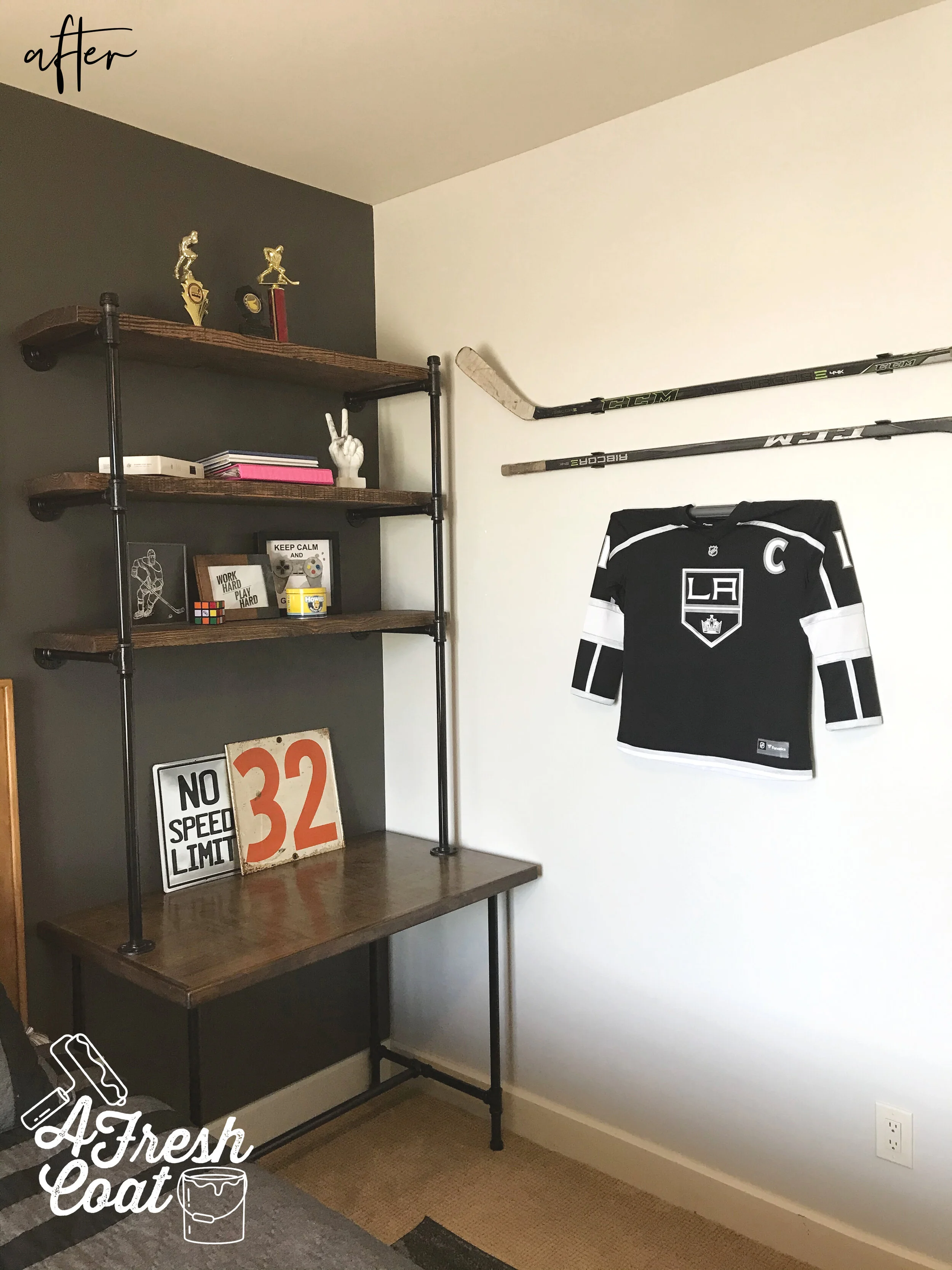
This room really has the “wow factor” now. The amazing industrial wood shelf and pipe units are so striking up against that charcoal wall (thanks, Nate Koogle). The series of canvasd arts offer a bright, yet simple area for the eye to land, and enough contrast so that the room doesn’t look smaller.

You might of noticed (and this was intentional), that each of these rooms only has one throw pillow. When working with teenage boys, one thing is certain: they do NOT have the innate need to express themselves through throw pillows. Girls are another story, and the more pillows the better. But guys? No. One pillow and I’m lucky to get that. LOL

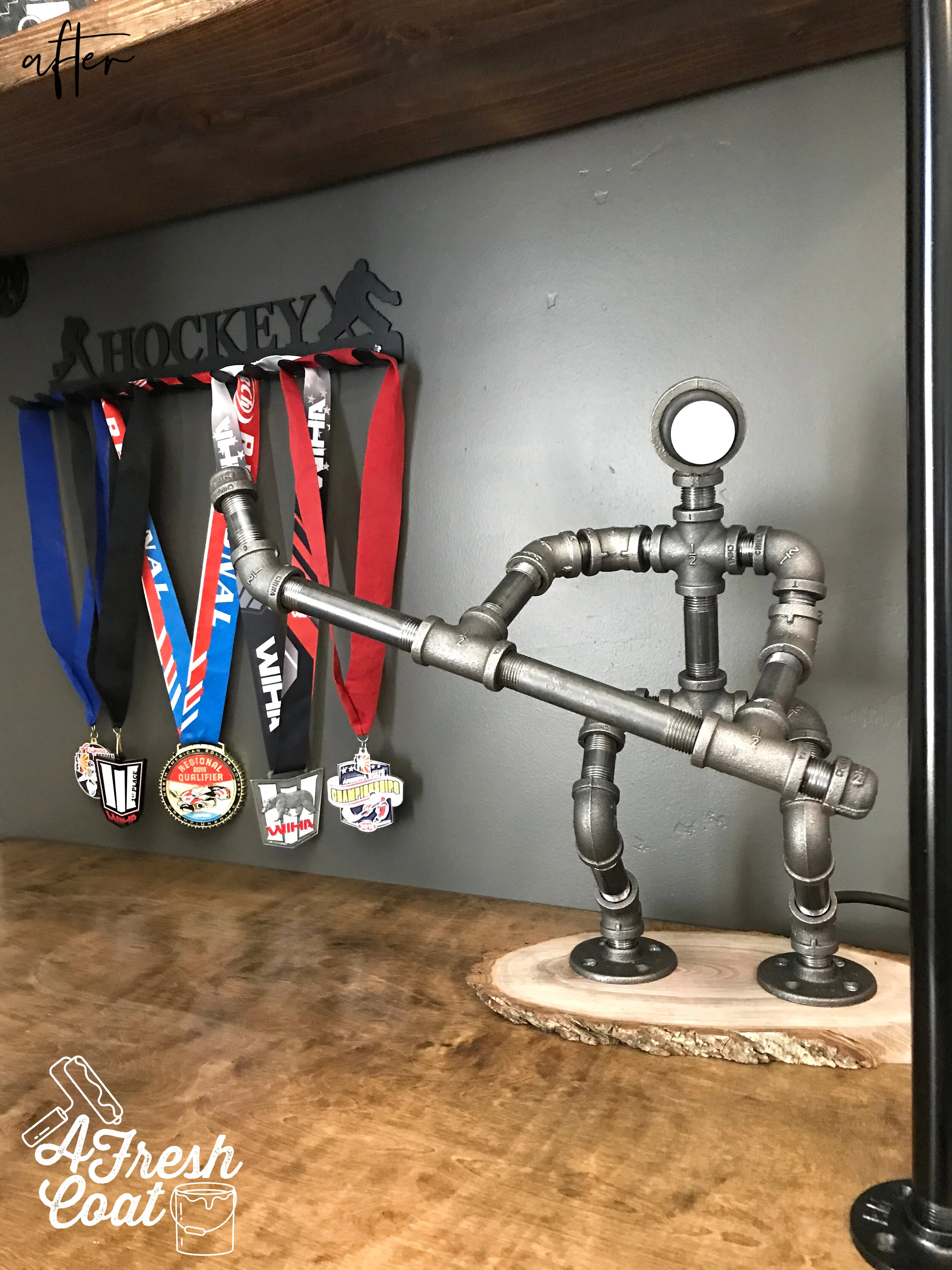
Oh! And did you spot that super cool lamp up above? Here it is up close:

House of Hockey Room 2 6.jpg

“T’s” mom found this on Etsy and I absolutely love it. The little details are what truly make a room and bring it to life. This piece is not only fun, but oh-so-creative. How ‘bout those hockey medals on display too? They pop off of that wall and really stand out.

One more shot…

House of Hockey Room 2 7.jpg

When styling these shelves, we kept it super simple. Trophies, a fave number, and a few decor items and that was all. Simple is (almost always) better.

Here’s the transformation one more time:

House of Hockey Room 2 2.jpg
House of Hockey Room 2 3.jpg

The Details:

Bedding: Pottery Barn Teen

Wall Decor: Etsy, Hobby Lobby

Paint: SW Iron Ore, SW Agreeable Grey

Paint Labor: A Fresh Coat

Rug: Wayfair

Throw Pillow: Etsy

Hockey Triptych: Etsy

Industrial Pipe Units: Nate Koogle

Love, J


House of Hockey...Room #1

Teen Boys RoomJenny SulpizioComment

This is actually a two-part blog post involving two different bedrooms, two teenage brothers, and two serious hockey fans—”B” and “T.”

We’ll start with “B’s” room first. A high school senior, “B” needed a room that reflected his fun personality, hobbies, interests, and likes. He liked the idea of using black in his room but also wanted pops of color throughout. He also needed a new gaming station area, seating, shoe storage and wall decor. Here is where we started:

House%20of%20Hockey%20Room%201%201.jpg
House%20of%20Hockey%20Room%201%202.jpg
House%20of%20Hockey%20Room%201%203.jpg

“B” had a great space to work with—large and capable of so much, including reassigning furniture and adding in elements that would make his room more functional and reflective of him.

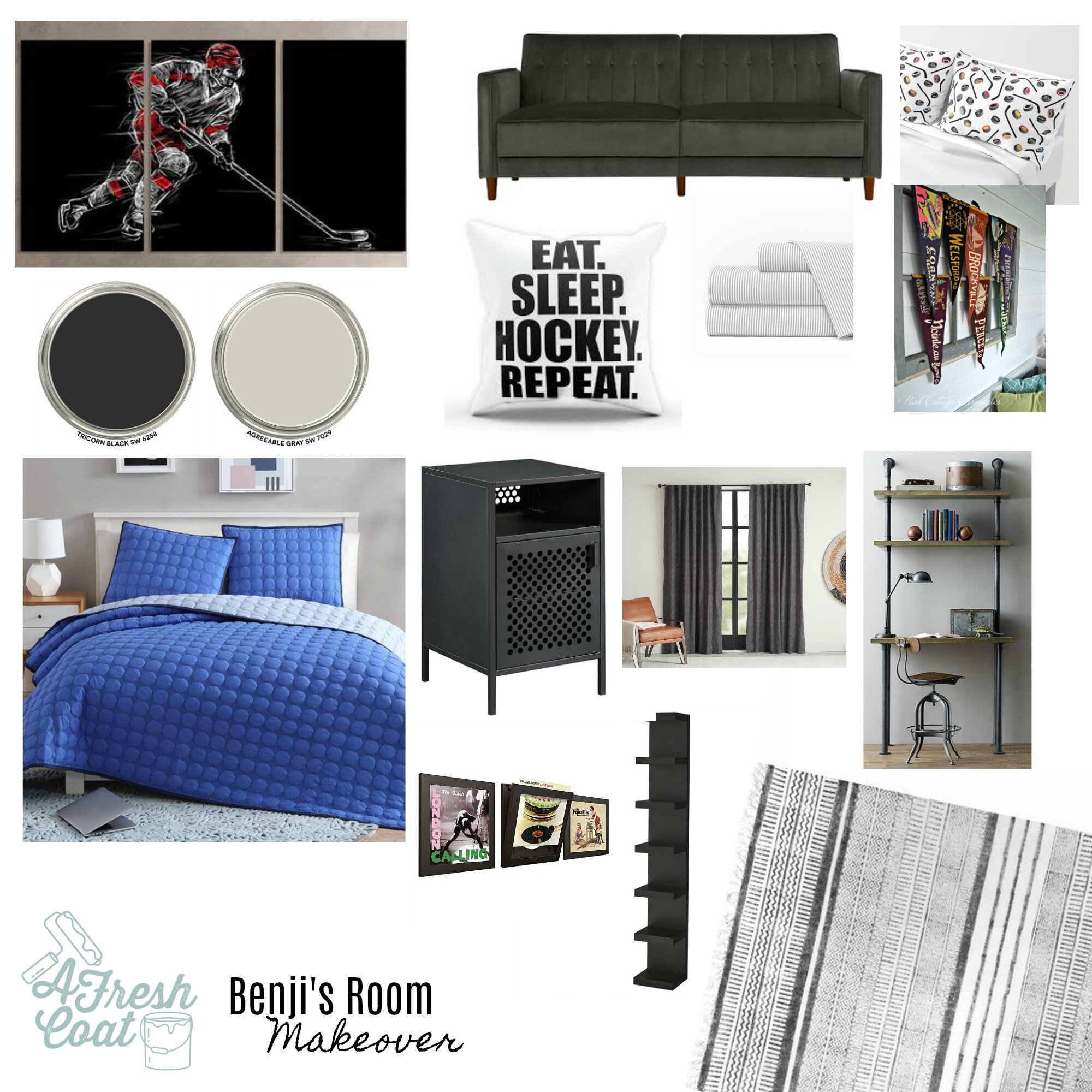
It started with the vision board. I immediately felt a fresh coat of paint would give this space an instant makeover. ..followed by some fun hockey pieces, new nightstands, lamps, bedding, and the likes. “B’s” mom was on board and the revamp got underway!

Benji's Room Makeover.jpg

Ready for the reveal?

House%20of%20Hockey%20Room%201%205.jpg
House%20of%20Hockey%20Room%201%207.jpg

This is one of my favorite reveals to date because of the major changes that took place, those bold pops of color against a black backdrop, the the super fun elements we added in to make this room into the finished product it is today.

House%20of%20Hockey%20Room%201%208.jpg

Remember the built-in desk unit? Gone! In its place is this sweet couch, side tables, industrial lighting with Edison bulbs, and great record collection on display.

Oh, and remember the shoe collection that needed a little bit of help? How ‘bout this?

House%20of%20Hockey%20Room%201%2010.jpg

These LACK units from IKEA are perfect!

Last but definitely not least was the gaming station that needed a little “umph.” Nate Koogle came in and constructed this awesome structure! Look at the pipe he sprayed black! Looks so good and is perfect for this little nook of “B’s” room.

House%20of%20Hockey%20Room%201%209.jpg

Want to see the before and after pics one more time? I seriously love this room makeover.

House%20of%20Hockey%20Room%201%202.jpg
House%20of%20Hockey%20Room%201%205.jpg

The Details:

YUMA Airport Terminal Pillow: Etsy

Throw Pillows: Etsy/Zazzle

Paint Colors: SW Tricorn/SW Agreeable Grey

Paint Labor: A Fresh Coat

Hockey Artwork: Etsy

Bedding: Wayfair

Table Lamps: Wayfair

Nightstands: Wayfair

Couch: Wayfair

Shoe Displays: IKEA

Rug: Wayfair

Gaming Station: Nate Koogle

Love, J


Market Ready

Interior DesignJenny SulpizioComment

Preparing to put your home on the market isn’t always an easy task. It means taking inventory of your home, consulting a realtor or designer to see what needs to be done prior to listing, and sometimes it can mean work needs to occur in an effort to garner top dollar.

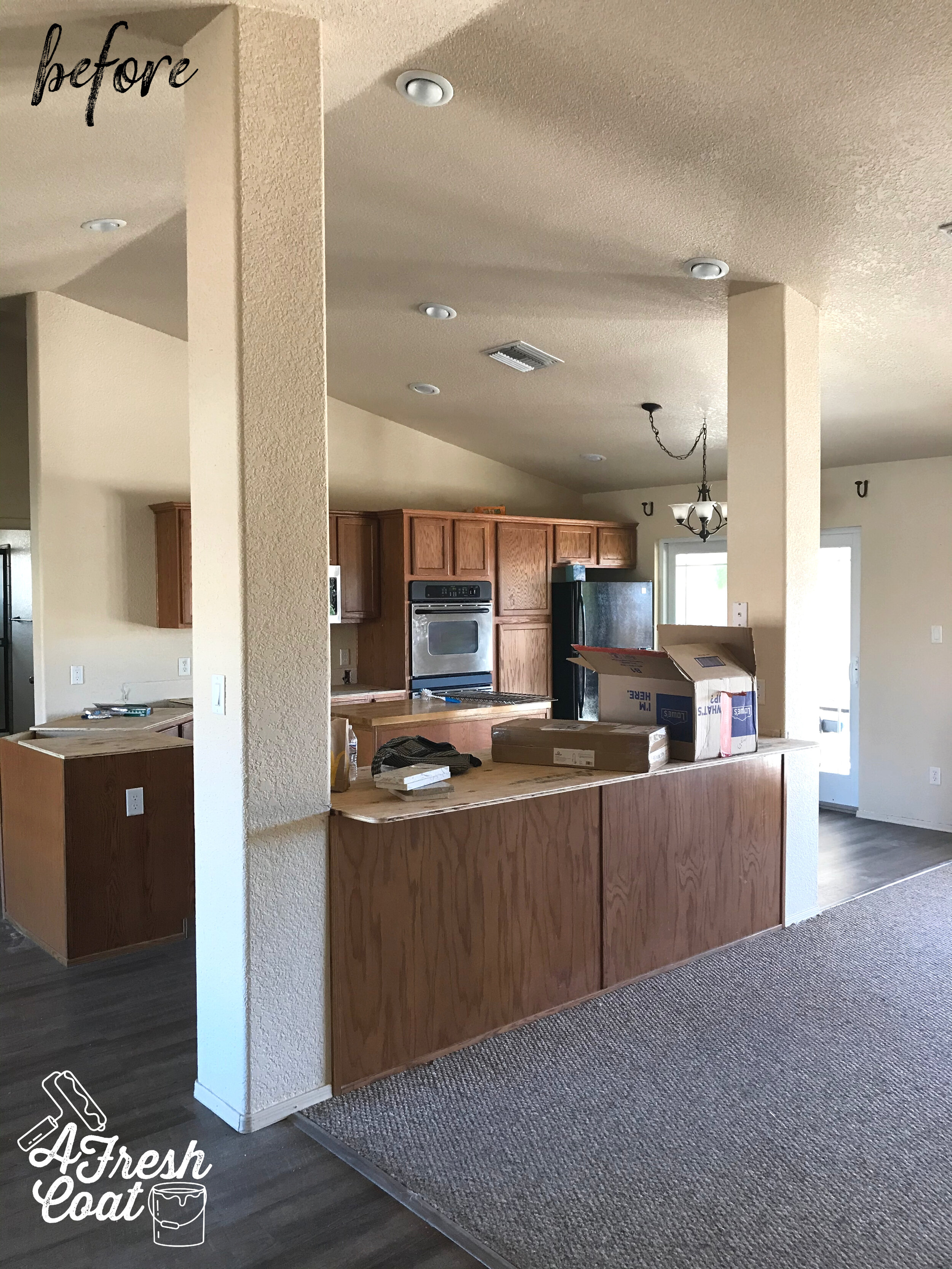
In the case of this 2005 Mesa del Sol golf course home, some updating was definitely needed. Builder grade oak cabinetry throughout, laminate kitchen countertops, tile flooring, and dated carpet were the main issues that needed to be tackled within this home. The layout was great and the bones were good, but the aesthetics were dated and in need of some fixing.

After discussing this with the homeowner (who also happens to be my mom), she was on board with the necessary changes and eager to get started.

Here are some before pictures.

Market Ready 1.jpg

Notice the yellowish paint color on the walls (ceiling and trim, too), not to mention the dated cabinetry.

Market Ready 2.jpg

There’s nothing like a good fireplace…except when it’s an ugly fireplace. In the case of this guy up above, he needed some help. Just a little facelift on this one feature would change the entire look of the home…and provide a serious return on investment.

The bathrooms weren’t much better. Not bad, but just outdated, you know? Nothing a little paint (or a lot) , and some new countertops couldn’t fix .

Market Ready 6.jpg

The first step in this remodel was changing out the countertop to quartz. Now, sometimes, with home improvements, things can go wrong. There’s a lot of wires that can get crossed and communication that can go South—fast. This was the case when it came to the countertop install. See the sample there on the left? That was what was selected. See the installed countertop underneath it? That is what was put in. Oy.

Market Ready 3.jpg

A lot busier with a lot more movement but it happens. And we were compensated for the mistake so we kept it. Still a nice choice (just not as nice as the sample we preferred).

Moving on. The walls were next. Every wall was treated with Sherwin William’s Agreeable Grey. It took that outdated yellowish hue (that was making the home look dingy), and kicked it up a notch. Check out my IG post a few weeks back:

Market Ready 4.jpg

It makes for a huge difference, just as the trimwork and baseboards being painted in Sherwin William’s Alabaster provided the perfect contrast between the two. Lighter and brighter

Next up came the painting of all the cabinetry throughout the home. Robert Reyes came in and sprayed those babies with the same Alabaster hue as the baseboards and trim work. A huge job but so worth it.

Market Ready 14.jpg

And what’s a white cabinet without sweet knobs and pulls to provide the finishing touches on them? Amazon always offers great deals on hardware, and these were no exception.

Market Ready 5.jpg

Ready for some after shots? These are always so fun! Oh, and thanks to SueAnn Harbolt of Room to Improve here in Yuma, AZ, this house is now perfectly staged and market ready.

Photo Courtesy of Craig Hieber/ERA Realty

Photo Courtesy of Craig Hieber/ERA Realty

Photo Courtesy of Craig Hieber/ERA Realty

Photo Courtesy of Craig Hieber/ERA Realty

Photo Courtesy of Craig Hieber/ERA Realty

Photo Courtesy of Craig Hieber/ERA Realty

Pretty cool, right? So many upgrades and such a beautiful transformation. And how about that fireplace? Kyle Hardin of Hardin Development did such a great job of creating a functional AND aesthetically pleasing unit for the new owners to enjoy.

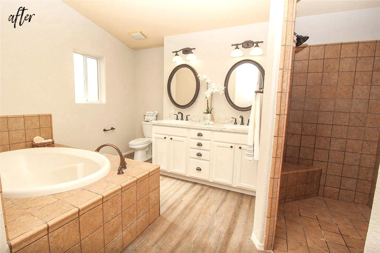
Oh, and let’s not forget about that master bath too…

Photo Courtesy of Craig Hieber/ERA Realty

Photo Courtesy of Craig Hieber/ERA Realty

The light fixtures were raised and turned the correct way, paint was changed out, along with new countertops and hardware. So. Much. Better.

Know someone in the market for a home in the Foothills? Go get this one before it’s gone!

Love, J

The Details:

Paint: Sherwin William’s Agreeable Grey/Alabaster

Paint Labor: A Fresh Coat Yuma

Countertops: Quartz-Latte

Cabinetry: Sherwin William’s Alabaster

Cabinetry Labor: Robert Reyes

Fireplace: Kyle Hardin/Hardin Development

Room Staging: SueAnn Harbolt-Room to Improve (yuma, AZ)


OFFICE OVERHAUL

Commercial DesignJenny Sulpizio

I love the opportunity to design commercial spaces just as much as I do residential areas. Commercial design offers different challenges and unique opportunities for decor, so when I got the call from Nova Home Loans here in Yuma, AZ to redesign their new offices, I was pretty eager to get started.

After my initial tour through the 4,000 square foot building, one thing was clear: there was a lot (and I mean, a LOT) of wall space to work with which presents a significant challenge when it comes to decorating. Basically, I needed to find industrial decor and artwork that worked well together without going overboard, all while implementing more warmth to tame the cool vibes running throughout.

Here is where we started: the lobby.

NOVA HOME LOAN OFFICE OVERHAUL 1.jpg
NOVA HOME LOAN OFFICE OVERHAUL 2.jpg

Recently painted varying shades of bluish-grey with grey luxury vinyl flooring, this office was predominantly cool (think color wheel here) without any warmth to balance it out and make it inviting. My immediate thought was to introduce deeper blues (navy) but also bring in pops of orange and hints of rust to create more of a balance. The furniture also needed to be reconfigured in order to define the space and make it work better overall.

NOVA HOME LOAN OFFICE OVERHAUL 4.jpg

In an effort to make this space feel more like home, we embellished those bare walls with a desert wall mural scene, framed out in a stained wood molding, with a laser cut wood sign to match (Lazy J Signs). The furniture was rearranged, a large area rug was added, along with matching end tables and coffee table, new lamps, and throw pillows.

The entryway also received an updated look. Originally sporting two small chairs and one accent table, this area needed to house more options for seating and become the welcome area it was designed to be.

NOVA HOME LOAN OFFICE OVERHAUL 3.jpg

One bench, four mirrors of varying sizes and styles, along with some fresh accent pillows, and it’s a whole new space.

The receptionist area also got a brand new look. Kyle Hardin of Hardin Development created this awesome accent counter piece that literally makes the whole room! Talk about adding some warmth and interest to an area? And texture?! Love it!

NOVA HOME LOAN OFFICE OVERHAUL 21.jpg

Next up? The second lobby in the back office space. We used the existing couches and spruced up the rest of the area by adding in throw pillows (they’re miracle workers, I swear), a (faux) floral arrangement, new coffee table, and a geometric area rug for some added character.

While the “before” pics got overlooked, the “after” shots did not …

NOVA HOME LOAN OFFICE OVERHAUL 5.jpg

Moving on to the office break room.

I really wanted to make this a fun, unconventional space because a break room implies just that—a break! I loaded this baby up with a whole bunch of clocks for the feature accent wall. Clocks in all different shapes, sizes, and colors because breaks are always limited and most definitely associated with time—so why not?! I also wanted to give a bit of encouragement/motivation by means of vinyl wall decor, and implement a few fun touches by means of oversized utensils and a (totally unexpected) dinosaur cookie jar. Fun, functional, but still adult and professional.

NOVA HOME LOAN OFFICE OVERHAUL 6.jpg
NOVA HOME LOAN OFFICE OVERHAUL 6-2.jpg
E338D39B-B913-4B8E-9440-8233801FAE25-1 copy.jpg

And what’s a break room without coffee and cool coffee mugs?

NOVA HOME LOAN OFFICE OVERHAUL 8.jpg

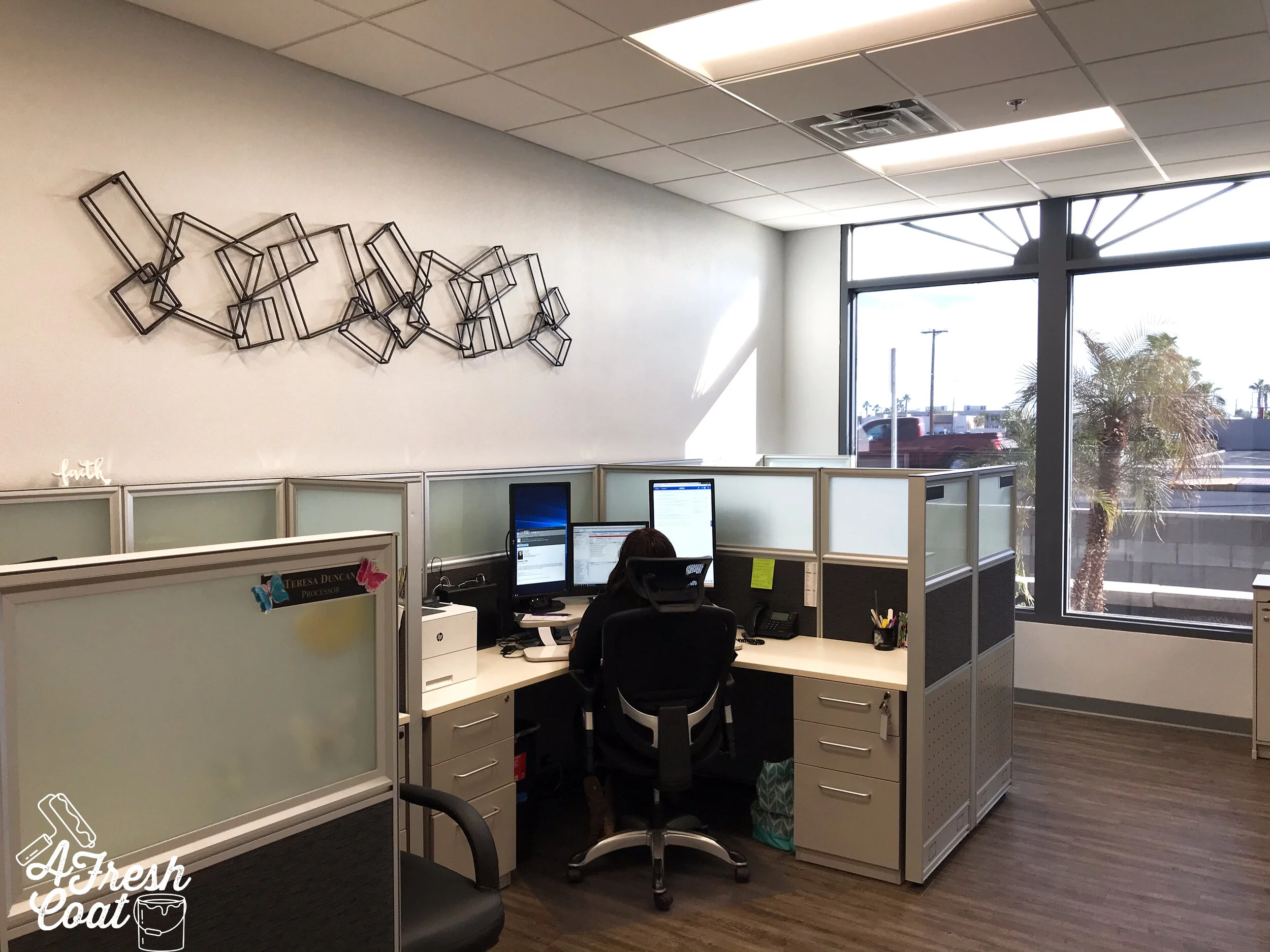
Remember all of that wall space I was referring to earlier? It took a decent amount of time curating the right amount of wall decor to define each space within this large office. I wanted to use pieces indicative of the Yuma area, along with elements that upped the cool factor.

Photos were a must and Yuma has a lot of landmarks and symbols that I wanted represented on the walls at Nova Home Loans. I asked the ever-awesome, Vanessa Brack of Vanessa Brak Photography for help and she captured my vision perfectly. Just beautiful.

NOVA HOME LOAN OFFICE OVERHAUL 9.jpg
NOVA HOME LOAN OFFICE OVERHAUL 10.jpg

Now, there are a number of hallways throughout Nova, so I thought a corner gallery wall would be a great option. A number of the images and artistry featured in these frames were found on Etsy while the collage of different-sized frames are from Pottery Barn. So fun!

NOVA HOME LOAN OFFICE OVERHAUL 11.jpg
NOVA HOME LOAN OFFICE OVERHAUL 13.jpg
NOVA HOME LOAN OFFICE OVERHAUL 14.jpg
NOVA HOME LOAN OFFICE OVERHAUL 16.jpg

See what I mean about wall space? Lots of it—but that’s what makes the challenge so fun!

Moving on to the cubicle section of this office, there are two identical areas that needed attention. I knew in one of these sections I wanted to create some interest using skeleton keys. Skeleton keys are really neat and since this was a home loan office, it just made sense. I was able to purchase a large and small set (Amazon, Etsy) to use for this specific wall treatment. The smaller set was spray painted copper and Hobby Lobby mounted and matted these babies for me. Love how they turned out!

NOVA HOME LOAN OFFICE OVERHAUL 18.jpg

Opposite of the skeleton keys was a small space to create some added interest using clay pots, succulents, concrete elements, and industrial pipe shelving. Simple but effective.

NOVA HOME LOAN OFFICE OVERHAUL 19.jpg

In our second identical cubicle space, we used two large decor pieces and placed them together to use up most of the upper wall space shown here. Still gives the industrial feel and adds some texture to the area as well.

NOVA HOME LOAN OFFICE OVERHAUL 17.jpg

And then a really cool rustic map from my stockpile found it’s way on the wall opposite of this structure. Thanks, Dandy Home & Ranch!

Moving on, two more main walls were given a slight makeover. Just a few pieces and these spaces were complete. Again, the goal was not to overcrowd but to create a space that worked well together and would draw interest, as well as one that was inviting, fun, and functional.

Vintage bike wheels and a wooden/metal combo ladder for the win here.

NOVA HOME LOAN OFFICE OVERHAUL 23.jpg

So, before I close out this blog post, one more area was in need of a little help and that’s the conference room. This area is used quite a bit and was in need of a buffet/credenza/side table unit for luncheons and the likes. Using Walls of Wisdom (Etsy), this area got a custom Yuma sign, new buffet/server, side tables for some extra serving space, and custom Yuma street signs. All of this was pulled together just in time for Nova’s Open House event which was an awesome success.

NOVA HOME LOAN OFFICE OVERHAUL 22.jpg

Thanks to Jarrod Holiman and the whole Nova team for their patience and hospitality. Enjoy your new digs!

Love, J


The Details:

Moldings and Counter Accent Piece: Kyle Hardin—Hardin Development

Throw Pillows: Kirkland’s

Accent and Decor Pieces: Dandy Home & Ranch, Kirkland’s, Marshall’s, Hobby Lobby, Pier 1

Photography: Vanessa Brack Photography—Yuma, AZ

Furniture: Wayfair, Overstock

Succulents: Herb and Floral—Yuma, AZ

Custoim Yuma Street Signs: Etsy

Ladder: Kirkland’s

Vintage Bike Wheels: Dandy Home & Ranch

Vintage AZ Map: Dandy Home & Ranch

Metal Wall Structures: All Modern

Industrial Pipe Mini Shelves: Etsy

Lobby Wall Mural: Limitless Walls

Custom Yuma Wall Canvas: Walls of Wisdom

Vinyl Teamwork Decal: Etsy


Taking Flight

Teen Boys RoomJenny SulpizioComment

In the past few months I’ve had a number of teenage boys in need of teenage rooms. You know—a space that ditches the toys of old to make room for something new—their present interests and likes. Honestly, these are some of my most favorite rooms to do because as much as boys say they don’t care when it comes to what adorns their walls and goes on their beds—they really do. They have likes and dislikes, color preferences, and definite opinions when it comes to specific decor. And I love it! I love when they get a new space that’s fully customized to them.

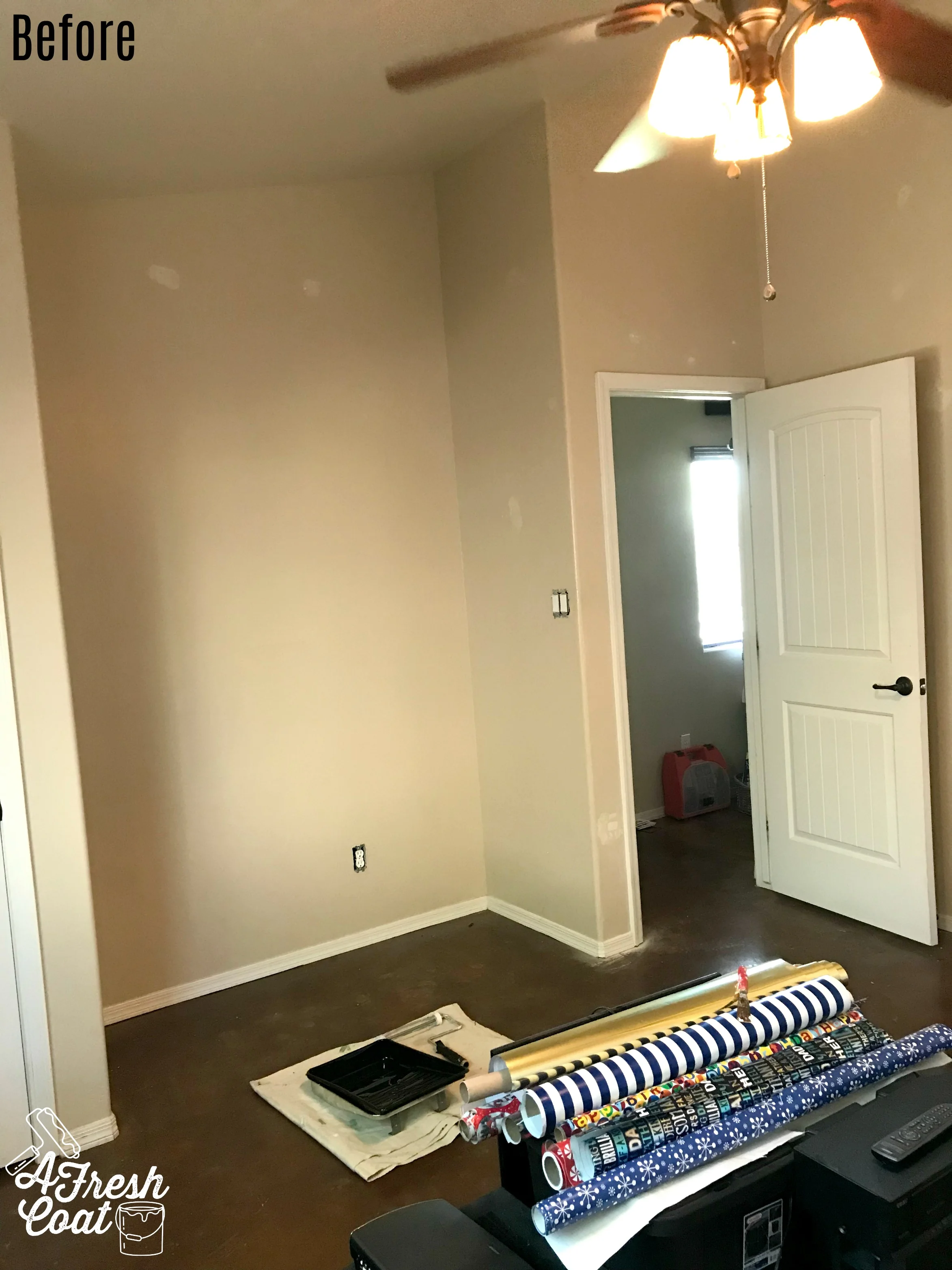
“D’s” room was no different. A World War II and all-things-avaiation-fanatic, “D” was actually switching to another room within his home. On the cusp of high school, he was ready for a whole new area to call his.

Here is where we started:

Taking Flight 1.jpg
Taking Flight 2.jpg

During our consultation, we discussed a number of ideas including a gaming station, loft bed, futon area, TV space, and the overall theme I discussed earlier: aviation. Now, I love me a good theme but I’ve found the most important rule one can abide by is to not go overboard (this can be hard). When it comes to themes, you can make a big impact with just a few key items.

If you’ve read my blog before then you all know, it starts with the vision board:

54255913_948972085305745_3736721100566953984_n.jpg

The goal was to create a loft bed with seating underneath for gaming and gaming with friends, a media area for the niche in his room, a large, oversized black and white aviation poster, industrial and rustic elements in furniture and decor, along with a deep green accent wall.

First step? The paint!

After sampling, the accent wall color selected was Sherwin William’s Dried Thyme, followed by Sherwin William’s Agreeable Grey for the three remaining walls.

Taking Flight 3.jpg

After a few hours, the room was completely painted and ready for the next stage: decor.

Taking Flight 13.jpg

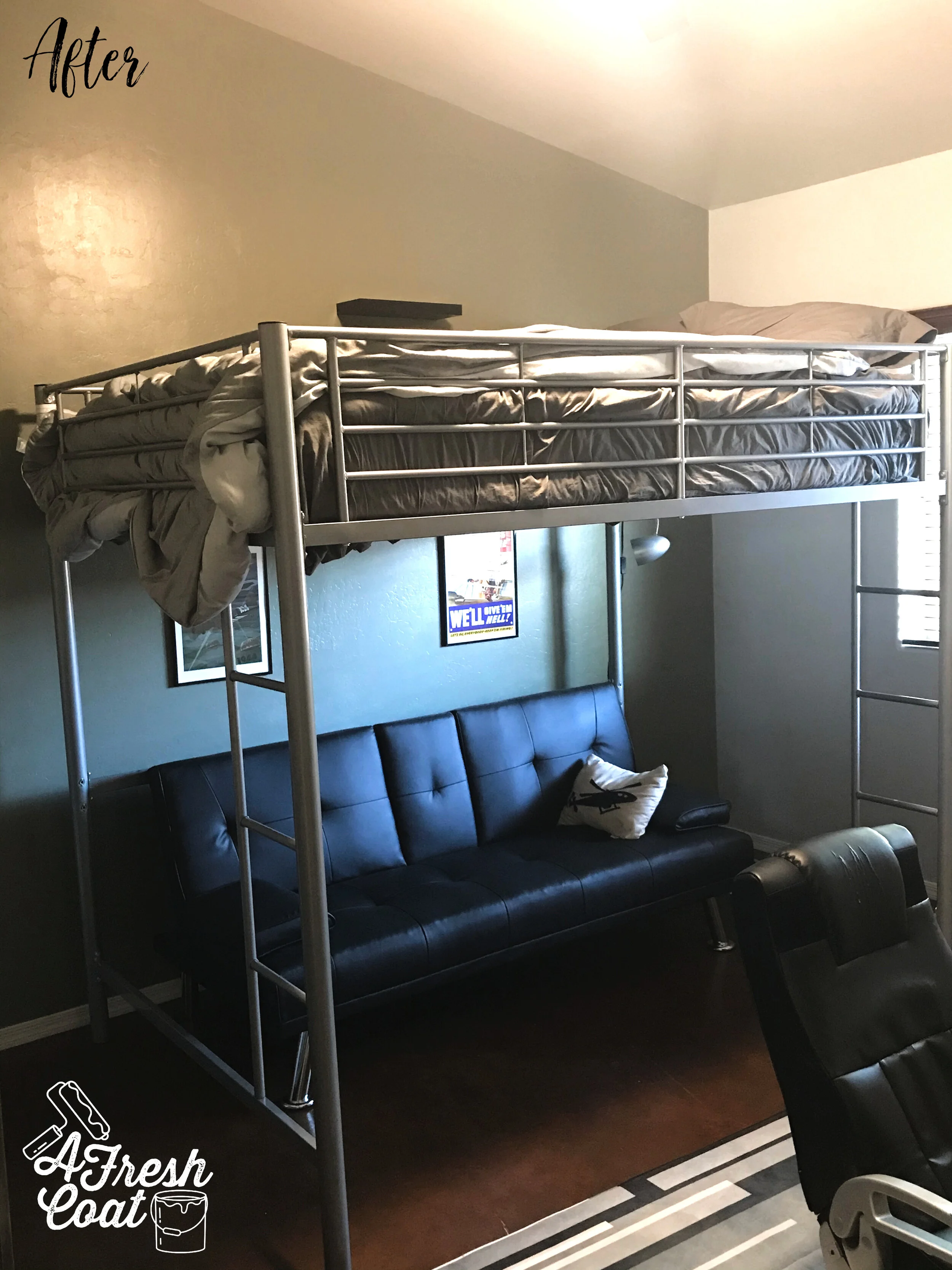
Ready for the “after” pics?

Taking Flight 10.jpg

Ignore the bed—I didn’t even realize while taking the pics that I needed to straighten the bottom of the comforter. Oy! Anyways, “D” opted for a loft bunk with a black metal futon below. He selected all of his own WWII inspired artwork (super cool), along with his new rug.

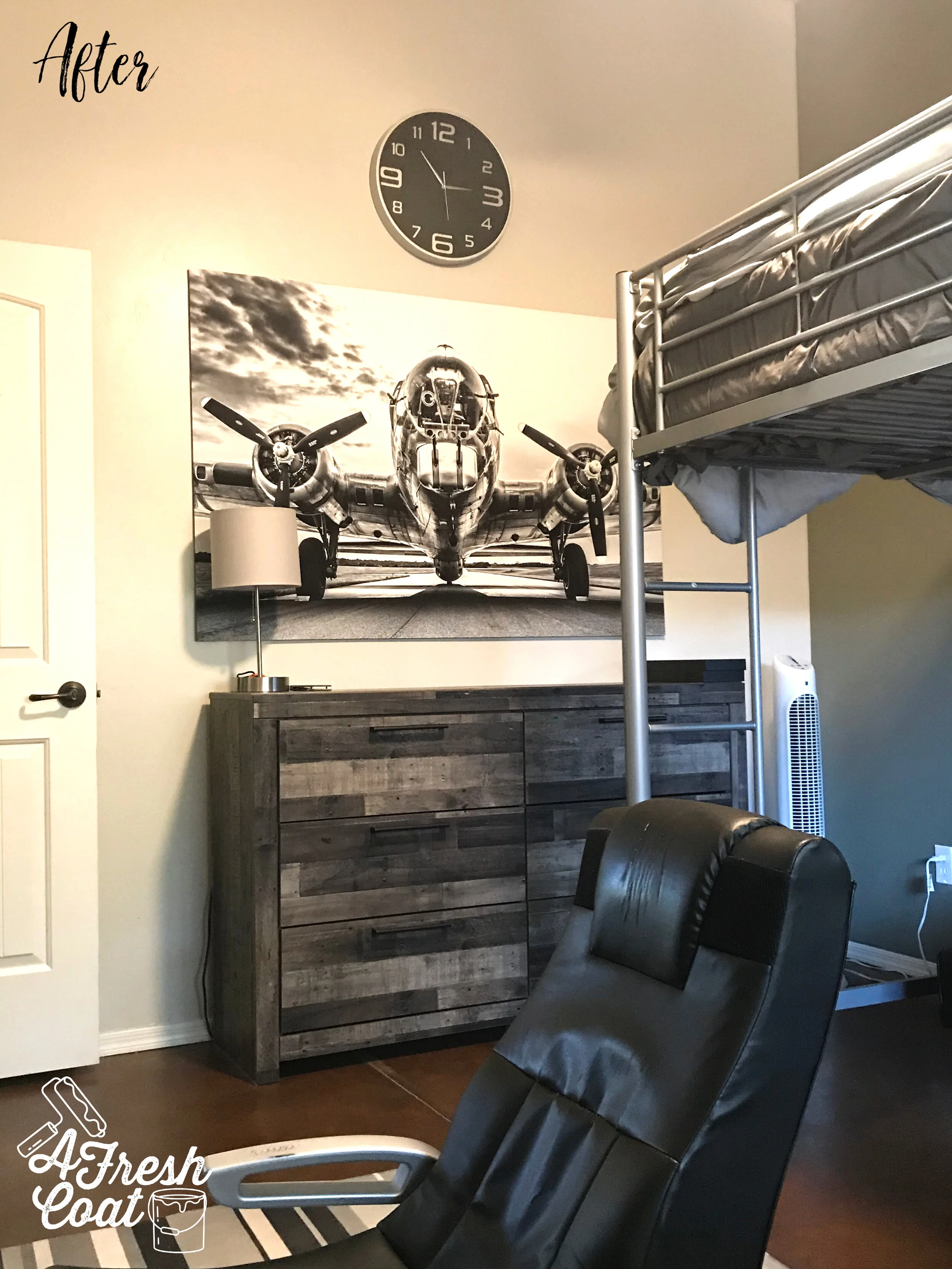
How cool is this? A brand new dresser and matching console in a weathered gray finish along with that SWEET(!) black and white oversized plane. Big impact. Huge!

Taking Flight 9.jpg

How ‘bout this for a gaming area? This space is functional, fun, industrial, rustic, and just plain cool.

This room is officially flipped and I love how it turned out. Even better? I love that “D” loves how it turned out.

The Details:

Oversized Plane Photo: Etsy

Paint: SW Agreeable Gray/SW Dried Thyme

Paint Labor: A Fresh Coat Yuma

Clock: Amazon

Furniture: N/A

Rug: Amazon

Smaller Plane Photo and Frame: Hobby Lobby

Cactus Plant: Dream Gift Shop-Yuma, AZ

“D” Initial: Michael’s

Futon: Amazon

Love, J