A Fresh Coat

Urban Bathroom Makeover

BathroomJenny SulpizioComment

I’ve mentioned before that I love brick paneling, right?

I do.

Like, love-love.

The reason? You get a whole bunch of bang for your buck, without the commitment either. Don’t like it in a few years? Take it down, patch the holes and you’re good. Sure, it’s not the real stuff, but sometimes that really doesn’t matter.

Take the “H” bathroom for example. Mrs. “H” hated it. It was the one area of her home that she desparately wanted to re-do, and a space that her guests needed to use most of the time. After our consultation, it was clear that she wanted a unique overall vibe with one-of-a-kind elements that you just don’t see everywhere. With four girls in her home, she desired to keep this space gender neutral, yet fun and hip (does using the word “hip” make me sound un-hip? Thought so). Anyways, here is where we started:

Urban Bathroom Makeover 2.jpg

A terra cotta color was painted on two of the bathroom’s walls, while greige adorned the remaining two. A pedestal sink was in place with a basic vanity sconce and mirror. As Mrs. “H” will tell you, this bathroom was lacking character…but all that was about to change.

With high ceilings and enough room for a larger vanity, this loo just needed to be re-worked.

Ready for the after?

Urban Bathroom Makeover 4.jpg
Urban Bathroom Makeover 5.jpg

Such a big change and I kind of love it.

Now, when I originally designed the mood board for this space, I knew I wanted to find an epic (yes, epic) piece to be used as the vanity. What I found was actually a buffet/sideboard that was then painted and converted specifically for this bathroom. There were a lot of moving pieces and people that had to come together to make this finished room, finished (so make sure to check out the details below for all of the specifics).

In the meantime, here’s some more info.

Once the vanity was a done deal, lighting and that sweet round mirror were the next elements to configure.

BUT, because the only light source in this bathroom was a sconce, I needed to make sure the light given off wasn’t being cast downward by the selected piece. So we went with the glass/matte black finish combo you see below.

Urban Bathroom Makeover 6.jpg

The vessel sink and faucet were also key players in this bathroom makeover. I provided Mrs. “H” with a few options of each of these elements and love what she ended up choosing; a rectangular porcelain white vessel sink trimmed in black with a distressed black matte uni-lever faucet to accompany it. So pretty.

Urban Bathroom Makeover 7.jpg

Last but not least came the decor. Jaxon Blvd signs were selected in black and white paint finishes and rustic wood trim. Monograms were added as were industrial shelves (not pictured). Mrs. “H” introduced her own rugs and a sweet faux tree in addition to.

Urban Bathroom Makeover 8.jpg

One unique, urban bathroom makeover completed.

The Details:

Brick Paneling: Home Depot (installed by Nate Koogle)

Vanity/Buffet: Odds n’ Ends (Imperial Valley)

Vanity Paint: Robert Reyes (SW Tricorn Black)

Buffet Reconfiguration/Plumbing: Nate Koogle

Mirror: Kirkland’s

Vessel Sink: Wayfair

Light Sconce: Wayfair

Vessel Faucet: Wayfair

Signage/Decor: Jaxon Blvd

Drawer Pulls: Anthropologie


Modern Farmhouse Bathroom Makeover

BathroomJenny Sulpizio1 Comment

Whoa! It’s been a long time since I’ve posted here but a number of projects are still underway, while others are wrapping up, and some are just getting started. It’s busy but awesome and I can’t wait to share what AFC has been up to.

For instance, this bathroom—my bathroom, actually. Well, make that the full guest bathroom that sits right off our kitchen and the one that everyone uses. The problem? It was majorly ugly. As in: “it got beat by the ugly stick too many times to count and then came back for more,” kind of ugly. It needed help and was at the top on the list of priorities of projects that needed tackling.

Currently, my daughter claims this bano as her own but since she’s already sixteen and a junior in high school, I didn’t feel the need to fully personalize it or gear it towards her. Instead, I wanted to keep it more of a neutral space, yet give it a modern farmhouse feel.

Here is where we started:

Modern Farmhouse Makeover 1.jpg

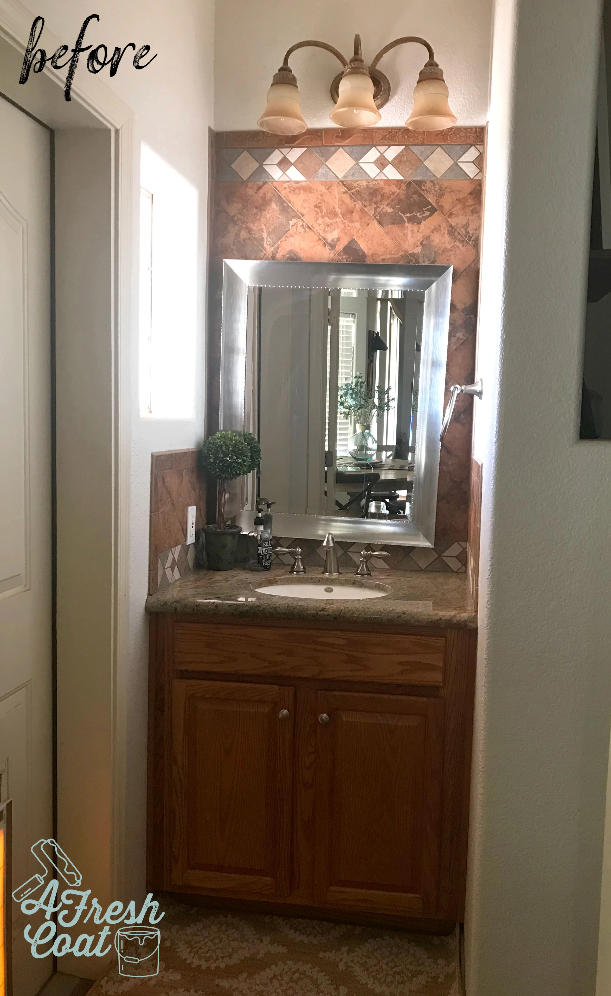
When we first looked at this home, one thing was for certain: the previous owners really liked orange tile. So much so that they placed it up the walls, in the showers, encased mirrors with it, created backsplashes with it, and selected this same tile to serve as the flooring for the whole home. That’s commitment for sure. But it’s also what I dislike most about my home. Not only is it NOT my signature color, but it totally dates and darkens our space, and doesn’t fall in line with my design style…like, at all.

Looking at the pic above, there were a number of issues I wanted to address right off the bat. They are as follows;

  1. Rip out the orange tile (given).

  2. Remove that vanity sconce light and re-route the electrical to the ceiling.

  3. Close off the ice block window with a more functional option.

  4. Update the sink/granite countertop and faucet.

  5. New mirror.

  6. Paint the vanity cabinetry instead of replacing.

  7. Redo the tile flooring and shower areas (future project).

One of the main issues I wanted to tackle in this space was storage. My daughter only has the limited area under the sink for all of her toiletries, makeup, and hygiene items. Not good. I decided that rather than hold on to the ice block window that was originally installed, I would close it off with a medicine cabinet instead. This would take away all natural light coming into the space but it really didn’t bother me. I was much more excited at the prospect of a frameless recessed storage cabinet than I was a window.

See what I mean?

Modern Farmhouse Makeover 2-2.jpg

This area just screamed “close me off and give me storage.” So I did.

Ready for the reveal? Now keep in mind—as I was planning this room in my head, I wanted to marry traditional farmhouse elements with a more modern feel, yet provide masculine AND feminine touches.

Modern Farmhouse Makeover 3-2.jpg

I know, I know—I got in the pic by accident, but still. Isn’t she pretty?!

Here’s another angle. Not the best but the space is so narrow that it’s hard to get a high quality image without yours truly front and center..

Modern Farmhouse Bathroom Makeover 4.jpg

This bathroom was completed in a number of steps. First, I busted out the tile (side backsplash) on both the left and right walls. It was therapeutic for sure but left gaping holes that needed to be patched and drywalled. I left the back wall of tile in place since that was going to be shiplapped over.

Next came the painting of the vanity (SW Tricorn Black), along with the construction of the concrete sink. I’ve always wanted to implement concrete into a bathroom or kitchen surface and thought this would be the perfect space to test it out. Look at this baby up close ( thanks to Kyle Hardin of Hardin Development):

Modern Farmhouse Bathroom Makeover 5-2.jpg

Mind blown.

I then implemented a modern black matte faucet (Jacuzzi). Simple and yet super sleek and pretty.

Shiplap was next. Kyle Hardin attached the panels and added the trim, and then hung the mirror that I’ve had in storage for over a year (Kirkland’s).

Last but not least, the pendant light. This is one of those feminine touches I was mentioning before. With bold selections in both color and elements throughout this makeover, a bit of feminine was needed to balance it out. This was achieved in the shape of the glass pendant and the element of glass itself.

You can find this exact one on Wayfair. Her name is Nadine. Go get ‘er.

Nadine+1-Light+Single+Schoolhouse+Pendant.jpg

Oh! And I almost forgot: knobs! The knobs on the vanity needed to be changed out and honestly, one of the best places to find really fun knobs (aside from Amazon) is Hobby Lobby.

Modern Farmhouse Bathroom Makeover 6.jpg

Just what I wanted. Kind of a muted copper (like an old penny), and at $3.99 with 50% off this past week, it was meant to be.

Ready for the before and after shots one more time? Always so fun to see.

Modern Farmhouse Makeover 1.jpg


Modern Farmhouse Bathroom Makeover 7.jpg

THE DETAILS:

Vanity Re-paint: My guy, Robert—SW Tricorn Black, Satin finish

Concrete Sink: Kyle Hardin (Hardin Development)

Faucet: Jacuzzi brand found at Lowe’s

Pendant Light: Nadine Schoolhouse Pendant Light—Wayfair

Knobs: Hobby Lobby

Mirror: Kirkland’s

Shiplap: Lowe’s. Installation-Kyle Hardin

Frameless Medicine Cabinet: Wayfair

Electrical Work: Mike Fredricks

Inspiration: Ragnarok

Teen Boys RoomJenny SulpizioComment

I’ve completed a slew of teenage boys rooms lately…four to be exact! Cool thing though? Two of these boys have wanted black walls. But we’re not talking about just one black wall. No, these guys desired every wall in their room(s) painted black.

Whoa.

Usually such a request causes a raised eyebrow (or two) from mom and dad, and is also met with some major disgust and a whole lot of resistance to say the very least. It’s as if you can see my clients calculating in their heads how much money they’re going to lose at resale.

Believe me, I get it. I do. But black paint gets a bad rap because as I’ve said time and time again—done right, a black wall (or walls) can look all sorts of awesome!

Take “V’s” room for instance. At his consult, he was adamant that he wanted four black walls. No way around it. However, mom and dad weren’t too keen on the idea. Considering the size of his room and the amount of natural light coming into the space (this is a huge factor to consider), I felt the same way. I advised he do one feature wall only, paired with adjacent grey walls, and a punch of color, too.

It took a bit of selling but compromise is key. Especially with teenagers…and husbands…and, well—you get the point.

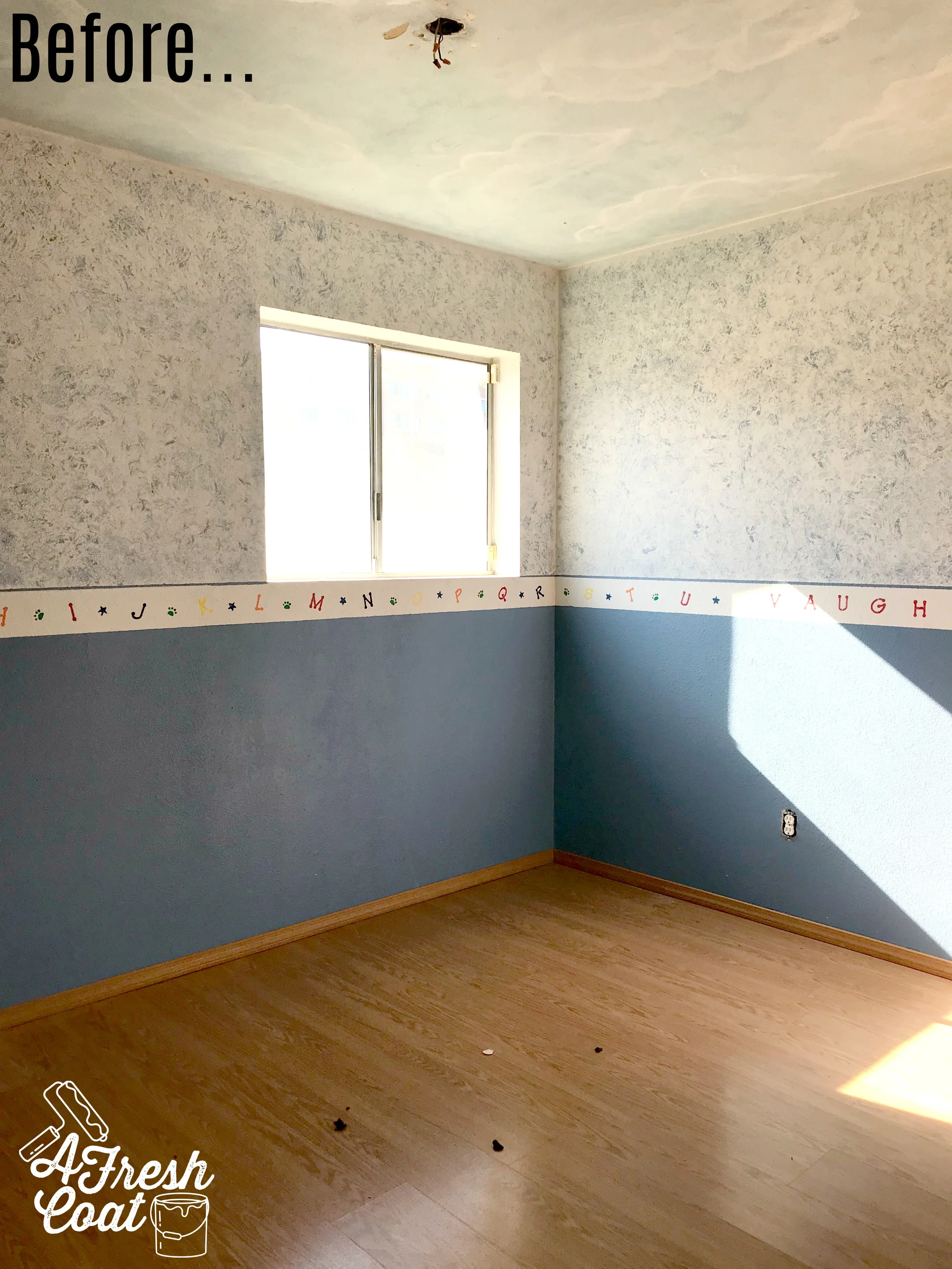
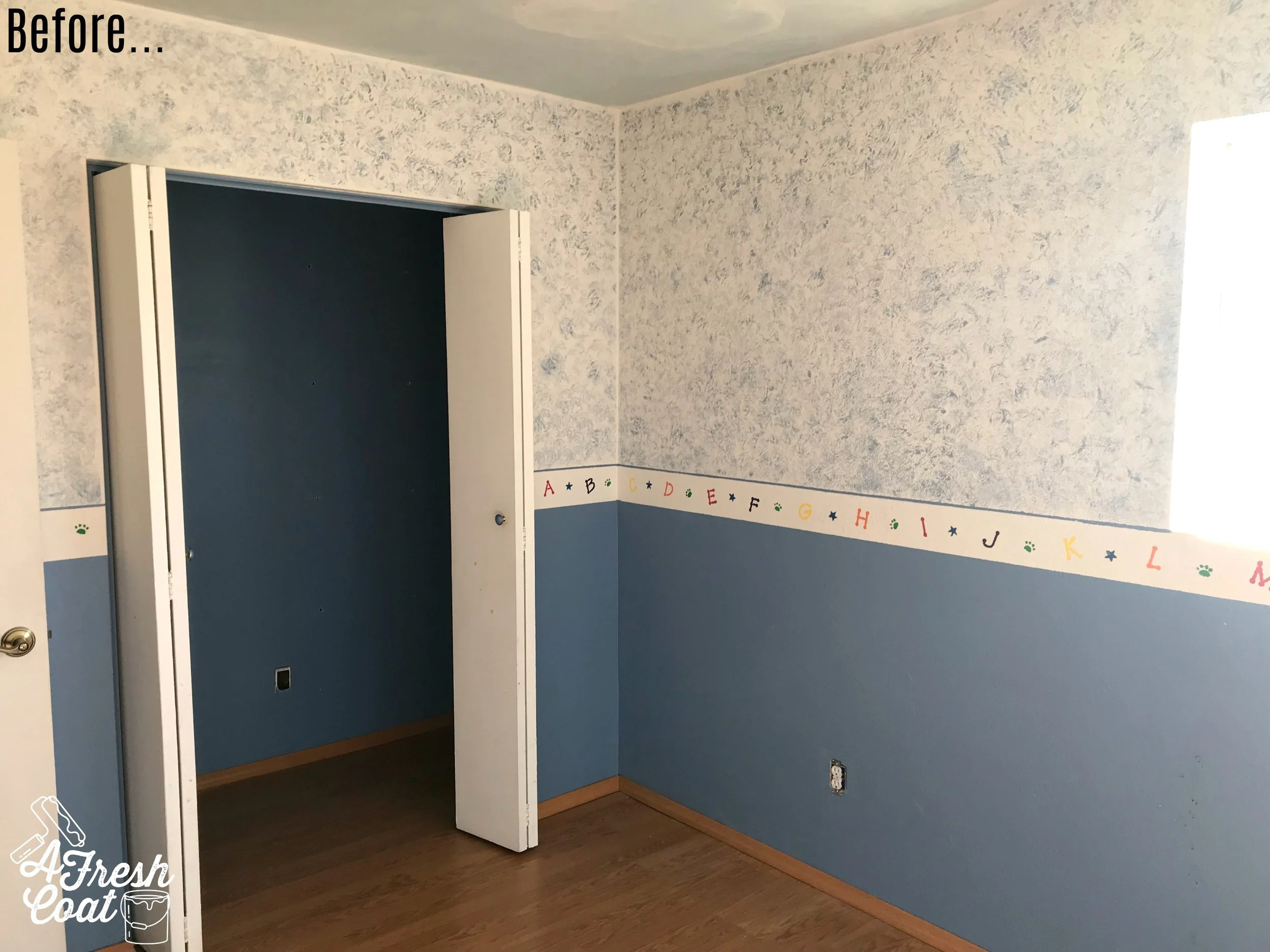
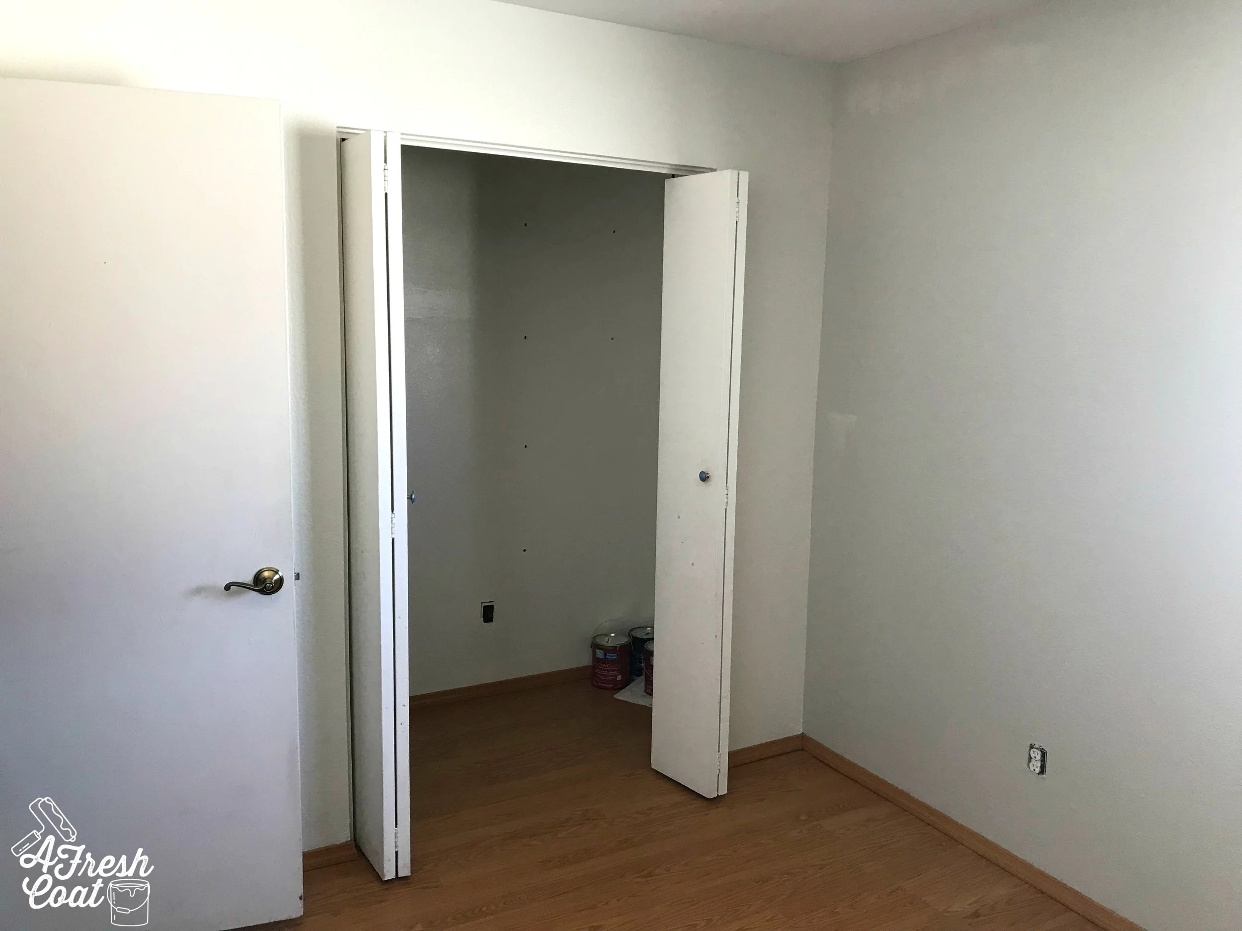
“V” was totally transforming his room from his days as a tike to that of a teenager. Here is where we started:

Inspiration_ Ragnarok 1.jpg
Inspiration_ Ragnarok 2.jpg

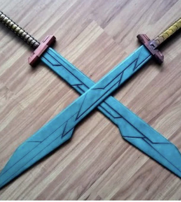
He was ready to move on from the two-tone walls and border into something more mature and reflective of his personality and interests. In fact, the main inspiration for this room and the accent/feature wall that was about to go down was none other than Thor’s sword from Ragnarok.

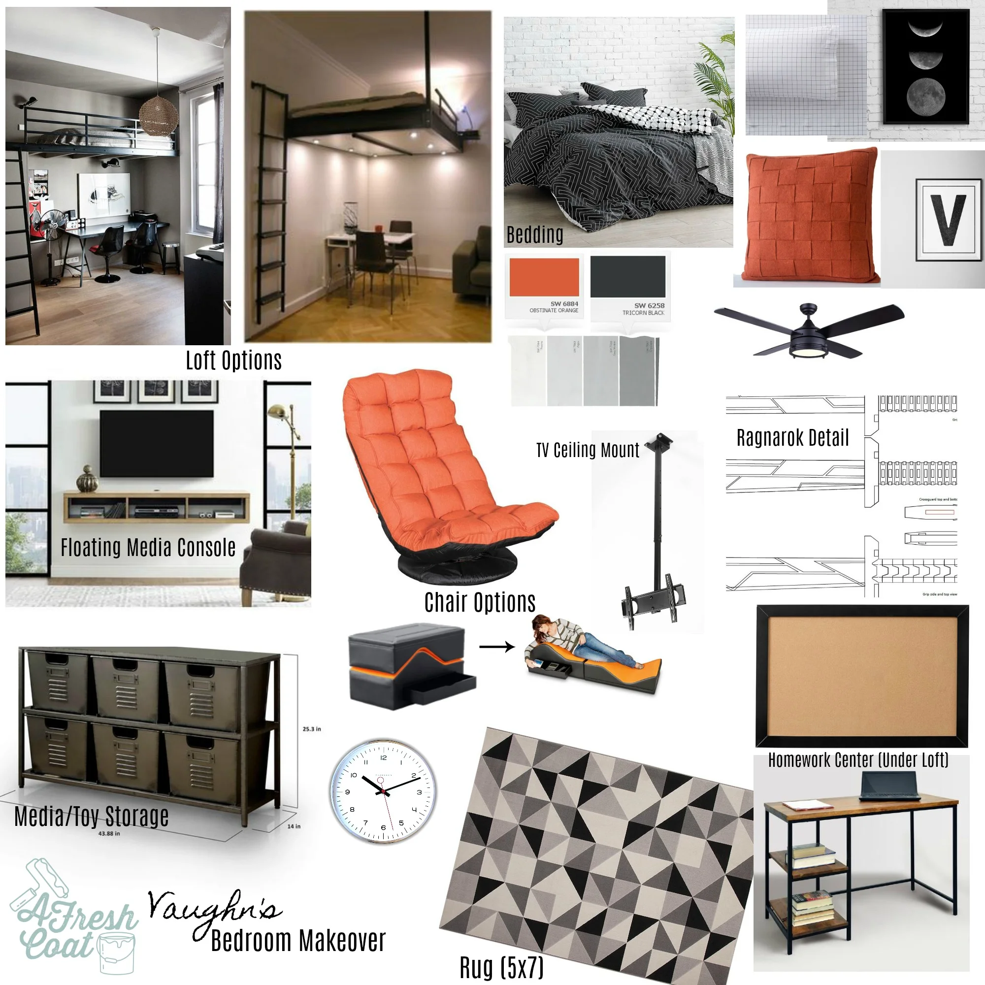
I love that. And after chatting at our consult about likes/dislikes, here is the vision board I constructed:

Ragnarok detail: COARTandProps—Etsy, loft images courtesy of Pinterest

Ragnarok detail: COARTandProps—Etsy, loft images courtesy of Pinterest

“V” wanted a loft bed, media unit, new gaming chair, space under his bed for a desk, a Ragnarok-inspired accent wall, and pops of orange everywhere. With this bold color palette, I also wanted to infuse some cool storage options as well as geometric patterns throughout.

Fun, right?

First step? Paint! For this room especially, the paint was going to be the major transforming factor. Using three different paint colors, in addition to ceiling paint, this room took seven hours to transform. Three coats of SW Alabaster inside the closet and on one wall, two coats of SW Agreeable Grey on two more walls, followed by three coats of Valspar’s Dark Kettle Black on the main feature wall. Oh, and two coats of ceiling paint to cover up those clouds and start anew.

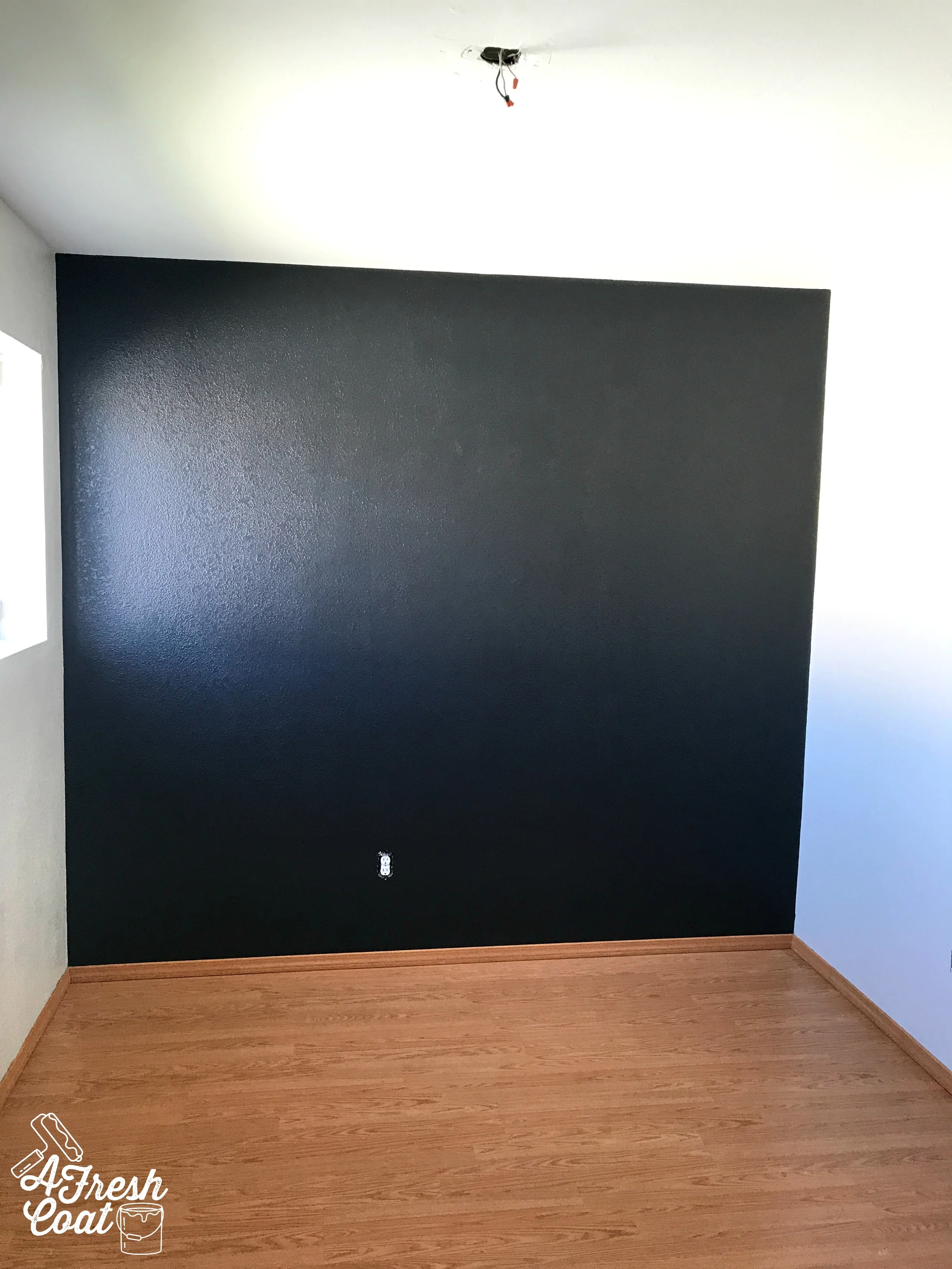
Look at the difference:

Inspiration_ Ragnarok 3.jpg
Inspiration_ Ragnarok 4.jpg

Once the paint had a few days to cure, it was time to hit up that accent wall and deck it out, Ragnarok-style.

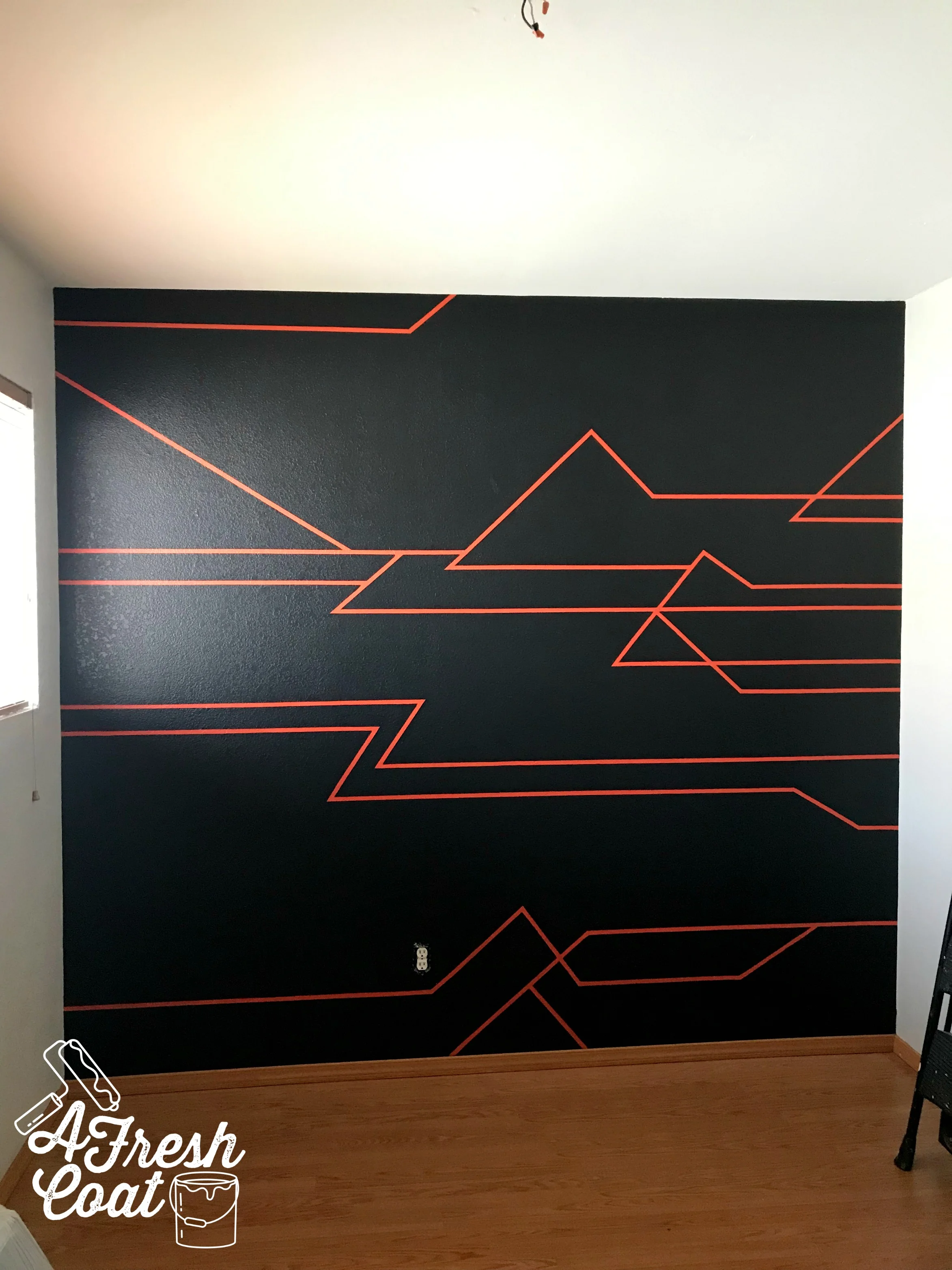
You’re probably wondering what Ragnarok-style is because I was wondering the same thing when asked to create this wall. However, I learned that the sword used by Thor in the movie (it is by Thor, right?), there is a specific pattern etched within it. This exact pattern is what “V” wanted on his freshly painted accent wall…but in orange.
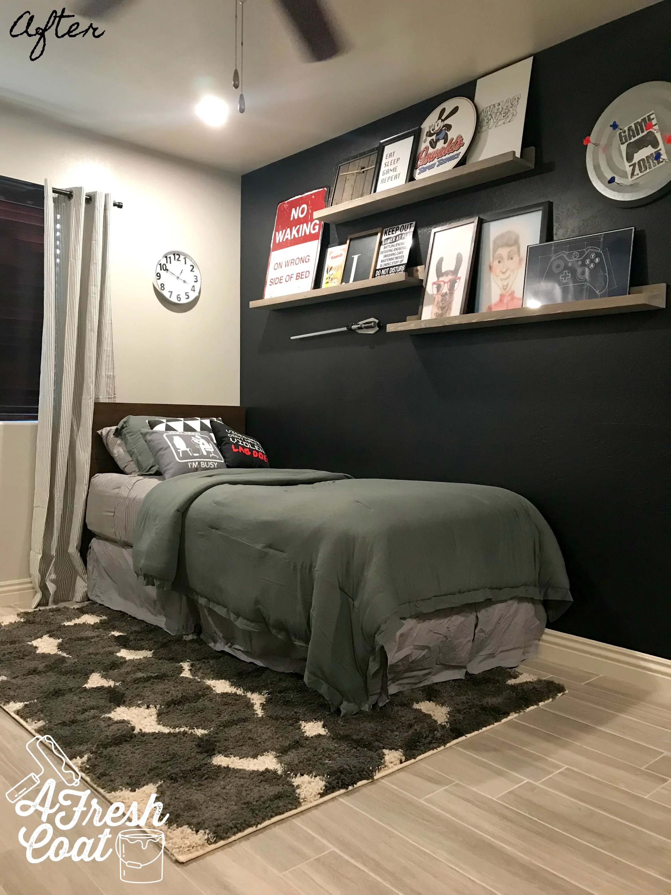
Photo courtesy of BonesPlace on Etsy

Photo courtesy of BonesPlace on Etsy

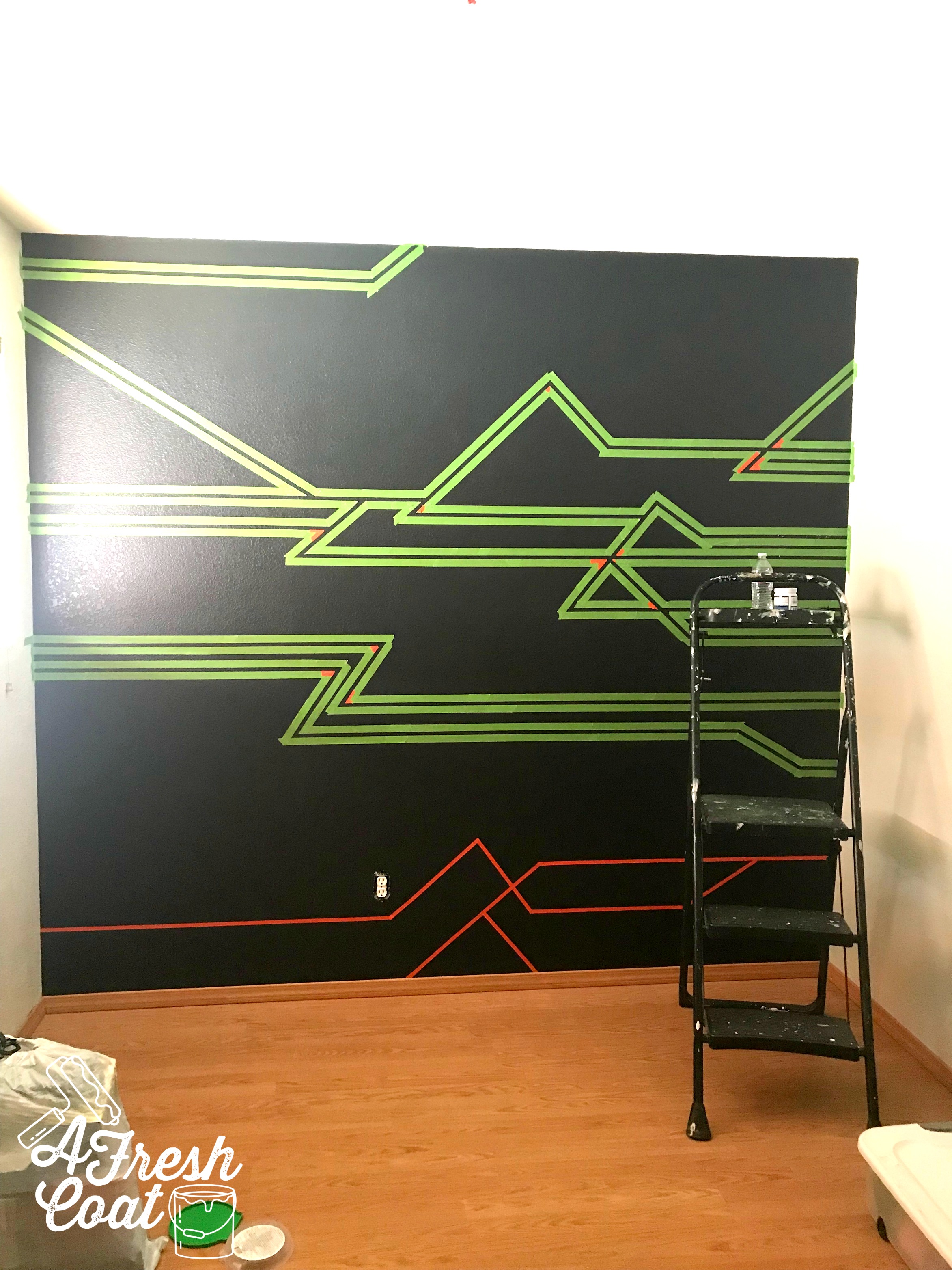
Initially, I thought about using painted thin wood strips in order to achieve this pattern, but I didn’t necessarily want to make this a permanent feature with tons of holes in the wall. I also didn’t want to add an additional expense to the budget either. So after randomly viewing a video tutorial on washi tape, I decided this would be the best option. Plus, it’s totally inexpensive.

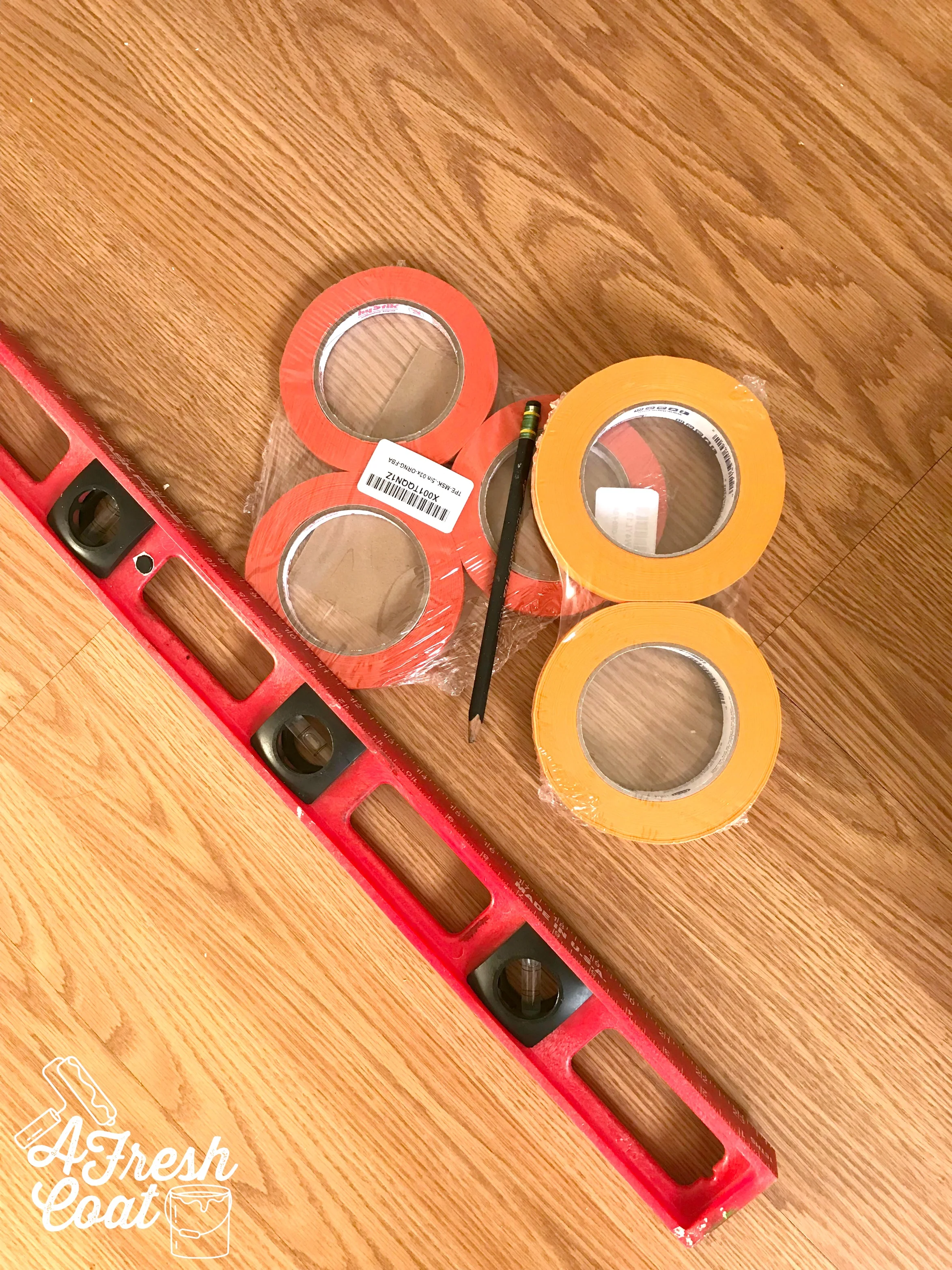
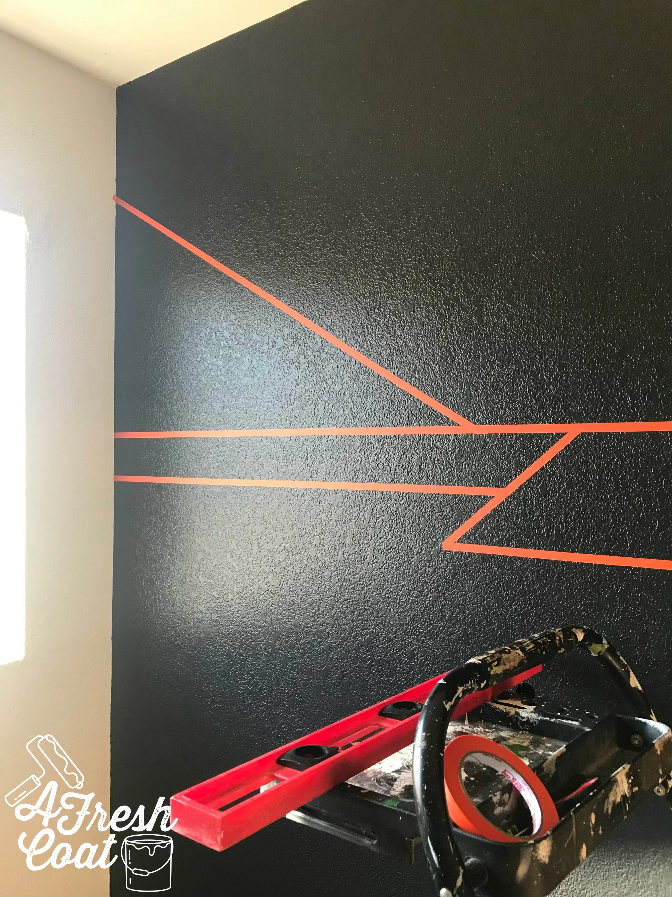
All I needed was the tape, a pencil, and a level to make this feature wall happen. Nice!

Ragnarok 5.jpg

Once started, it really began to take shape.

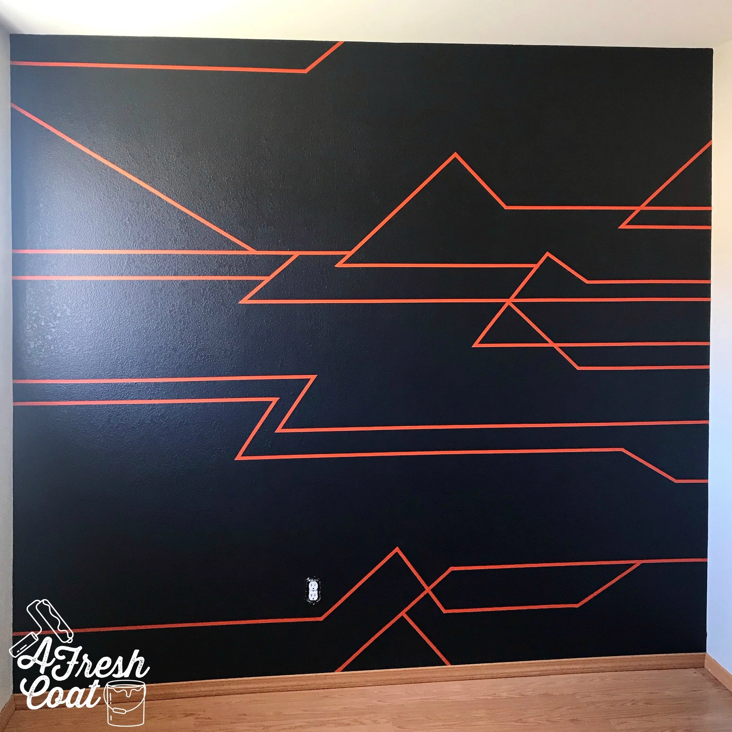
Three hours later, the wall was complete.

Ragnarok 6.jpg

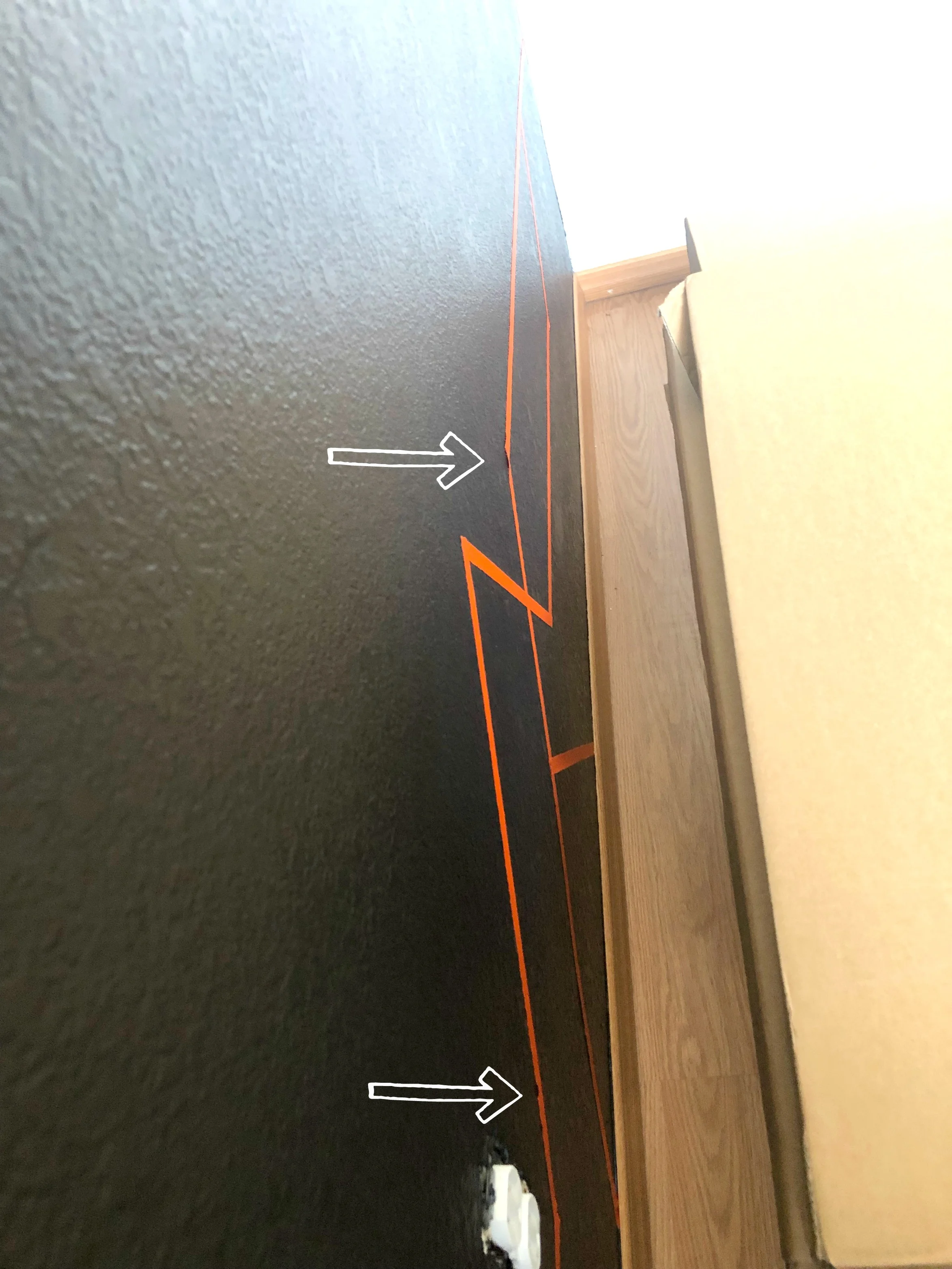
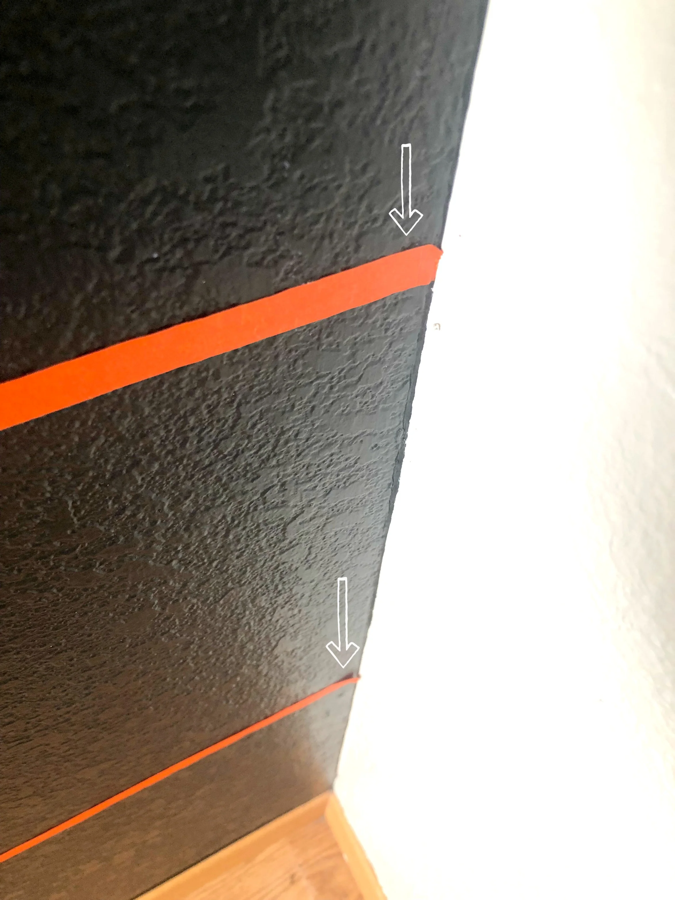
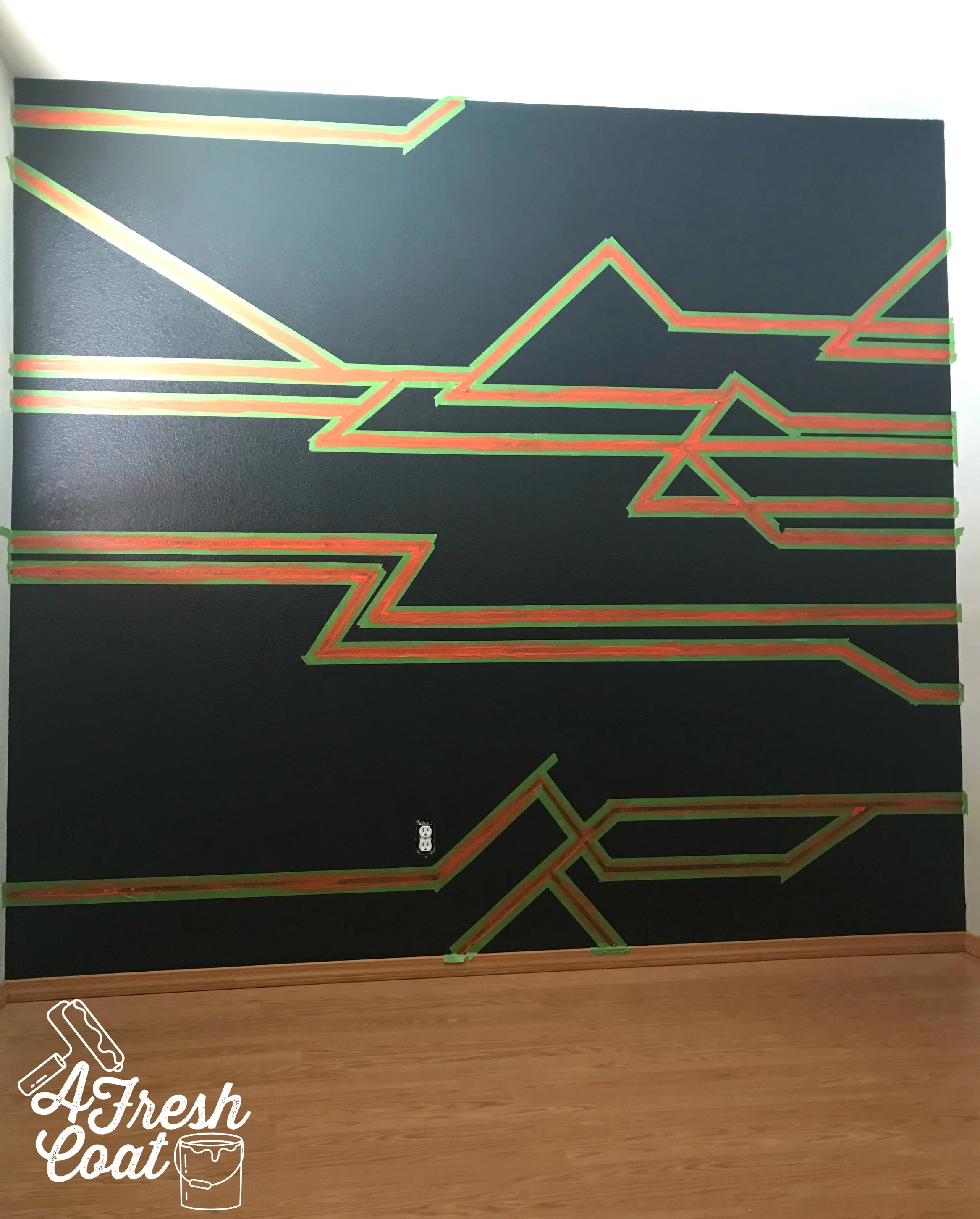
Buuuuuut hiccups happen. Especially when you’re working with textured walls—because even though I used TWO layers of tape to ensure these pieces wouldn’t peel, some of them started to.

Photo courtesy of G. Grosse

Photo courtesy of G. Grosse

Photo courtesy of G. Grosse

Photo courtesy of G. Grosse

This meant the washi tape was a no-go. It just wasn’t going to last (enter sad face).

But paint would.

I headed back to “V’s” house, with a sample size of bright orange paint (sorry, the color choice totally escapes me at the moment), my level, and some Frog Tape.

Using the lines I created with the washi tape, I then outlined them with Frog tape. Next, the unruly washi tape was removed.

Ragnarok 4.jpg

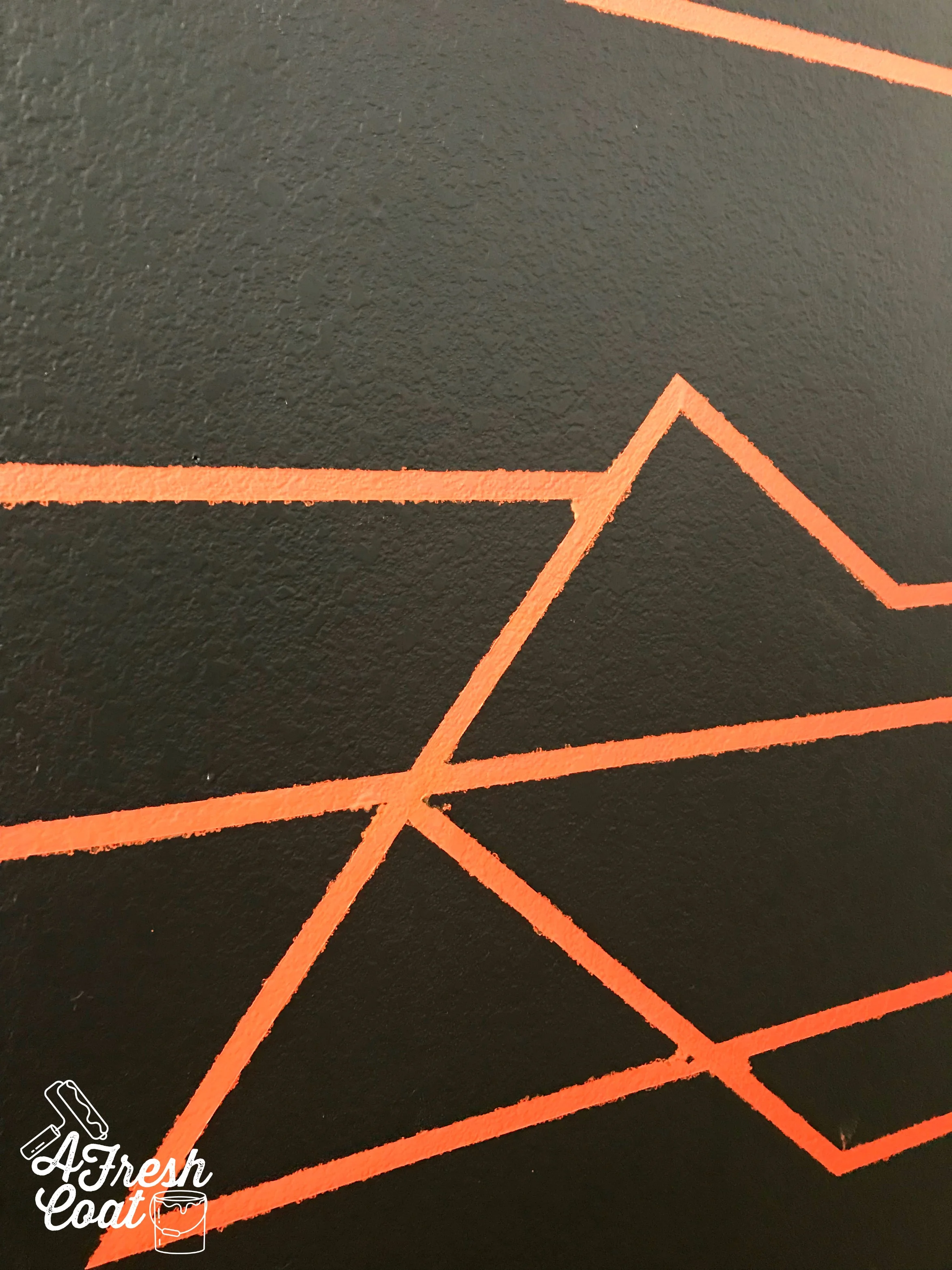
The next step to finishing this feature wall was the paint. I added three coats of the “orange-color-that-I-can’t-think-of-the-name-of.”

Ragnarok 10.jpg

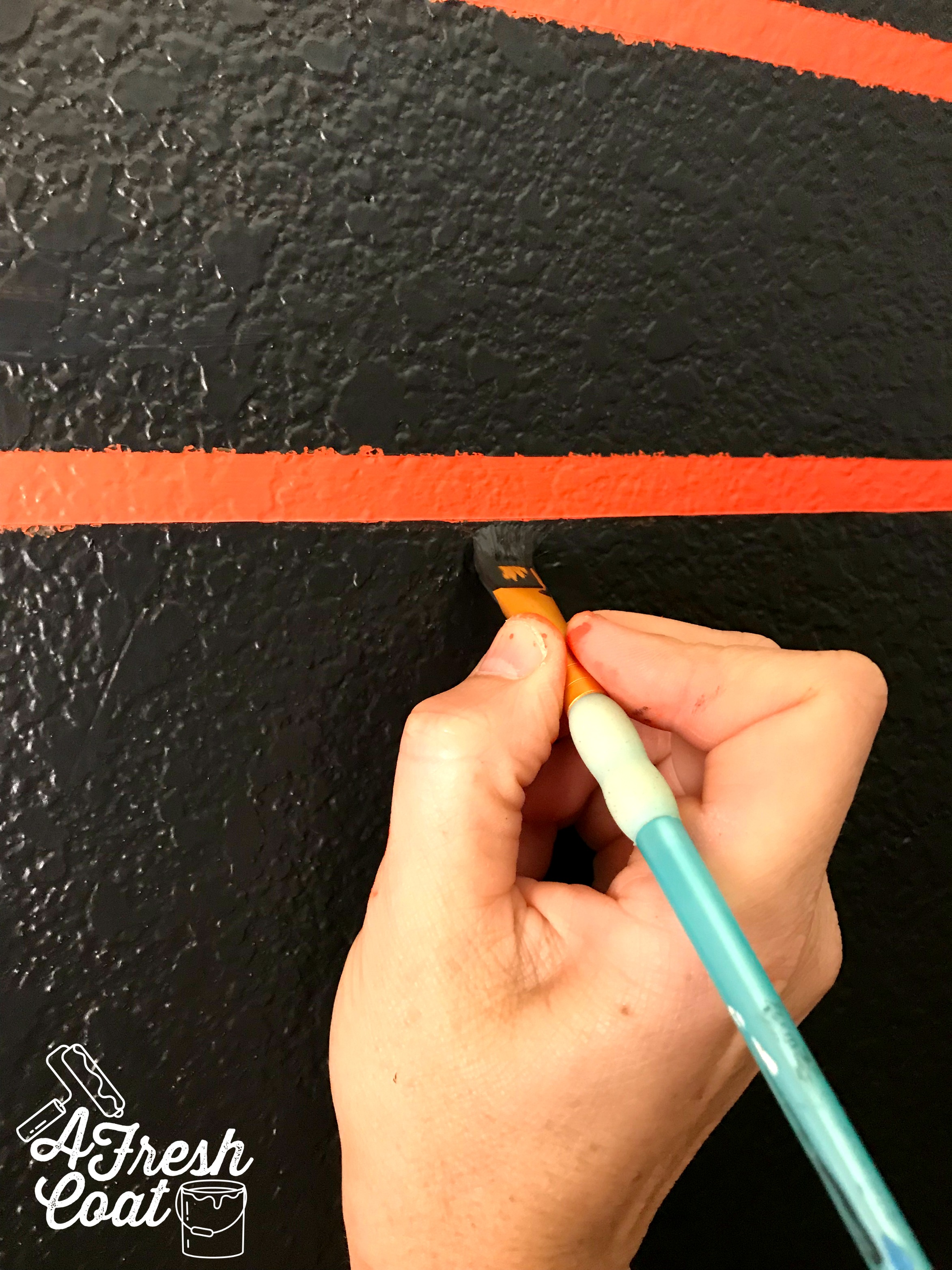
Now, there are a few tricks out there to get you nice, clean lines when creating stripes such as these. But they seriously haven’t worked for me. Ever! I’ve always had to clean up my lines—free-handed—and honestly, I’m okay with that. It is what it is.

Ragnarok 11.jpg

Once I peeled off all the Frog Tape, I used a flat, angled brush for the detail work.

Ragnarok 12.jpg

A few hours later and the wall was finished…finally. ;)

Ragnarok 13.jpg

Phew!

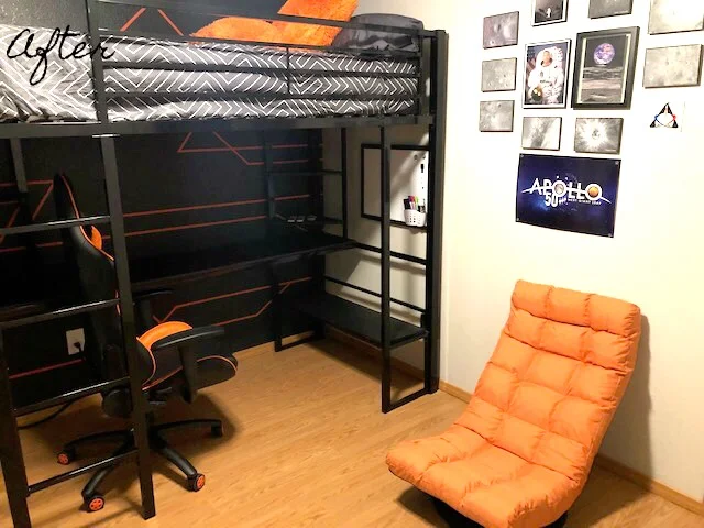
“V’s” parents wanted to put the room together and finish up all the detail work themselves. However, they did send me an “after” pic of what they accomplished and I think “V” will be one happy camper.

Mission: Complete.

Photo courtesy of G. Grosse

Photo courtesy of G. Grosse

The Details:

Orange Gaming Chair: American Furniture Warehouse

Bedding: Wayfair

Bed: Furniture Row

Ceiling Fan: Wayfair

Washi Tape: Amazon

Paint: Valspar’s Drak Kettle Black, Sherwin William’s Agreeable Grey, Sherwin William’s Alabaster, and the orange color I don’t know the name of anymore…sorry!

Paint Labor: AFC

Feature Wall: AFC

Rug (not pictured): Home Depot

Decorative Pillow: Etsy

Love, J


Got Game?

Teen Boys RoomJenny SulpizioComment

Shortly after finishing my own son’s teen bedroom, I was messaged by his good friend’s mama to do the same thing for her son. These boys are just about to enter high school so it was time to get rid of all those elementary items in order to make way for more mature spaces.

Well, for the most part. We don’t want them growing up too fast. ;)

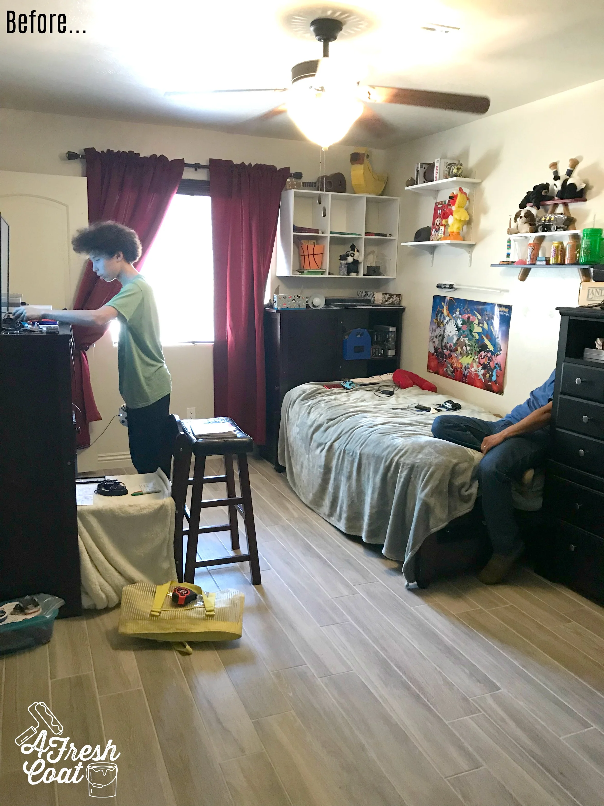
At the consultation I snapped some before pics to document where we started:

Got Game 1.jpg
Got Game 2.jpg

As most of us parents know, our kiddos tend to collect a lot of stuff over the years. They go through different phases and stages to say the very least. I know I get really sentimental over certain items and the memories attached to them. To part with these items is hard, but also necessary in order to move forward. Sniff.

However, having a teen doesn’t necessarily mean you have to part with ALL of their youth. Some pieces can and need to stay. They add character without “babying” the room. I’ll show you exactly what I mean when revealing this redesigned space.

After talking with “J,” it was evident he wanted black paint on his walls—something his parents weren’t too keen on. But as we know with teenagers, it’s all about compromise, right? So, one black accent wall got the green light and so did this vision board:

J.Lopez.jpg

Necessary elements included: 1.) A gaming media center that would be small enough to not get in the way, but large enough to hold his TV and gaming components neatly. 2.) New bedding. I chose a deep green comforter to play off of that back wall and wood elements I planned to add. 3. Long shelving units. four feet long to be exact in order to display some cool decor and a number of his collectibles. 4.) Fun decor pieces to include his love of gaming and Oswald (love Oswald!) 5.) A hat storage pegboard unit his Dad would build. 6.) new drapes, seating, and lighting.

We started with the paint. My “go-to” for black paint is always Valspar’s Dark Kettle Black. However, I switched it up a bit this time when it came to the perfect greige and went with Sherwin William’s Wintersweet Grey. A smidge darker than SW’s Agreeable Grey to add a hint more warmth into this already cool-colored room.

Got Game 5.jpg

“J” was obviously deep in thought when it came to his gaming, but I grabbed this shot anyways in an effort to show the drastic difference that black accent wall really makes.

Ok, ready for the after pics?

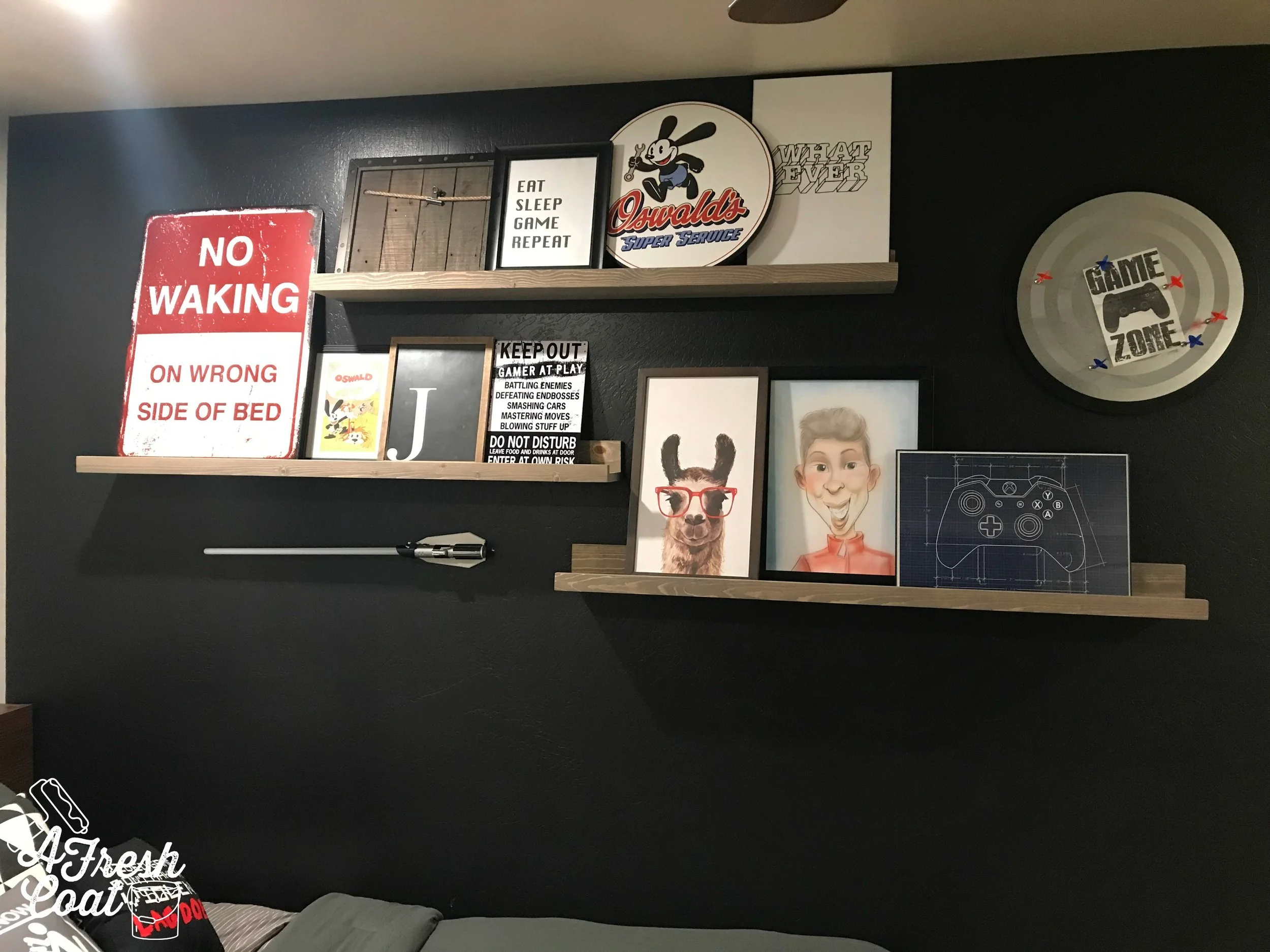
Tracy Haifley of HSB Woodworks constructed and stained the beautiful four foot long shelving to display some of the old mixed with some of the new. Some cool new signs, a caricature, a monogram, as well as a number of other fun pieces which can’t help but pop against that cool black wall.

And remember when I mentioned implementing of those items from days of old? Oswald is “J’s” favorite and earned a special spot on these shelves.

Got Game 9.jpg

With teenage rooms especially, I like to introduce geometric patterns in a number of different ways. Whether it’s the round magnetic dartboard up against the wall, the pattern on a throw pillow or two, or the really fun “dot”ted plush rug underneath “J’s” bed, shapes create interest in a room. I also think they’re pretty bold and masculine to boot. Win-win!

Next up? The gaming/media unit. This was a little bit of a beast to assemble but look at the finished product! Tons of storage for games and controllers, not to mention extra seating underneath, and a super sleek/modern finish on top of it all.

Got Game 8.jpg

This kiddo also needed a storage area for his hats as well so his dad built this great unit using a tutorial found on Pinterest. “J” hung his hats and this piece works in his room perfectly.

Got Game 11.jpg

This room was so much fun to put together. Wanna see the before and after pics again?

got game 12.jpg
Got Game 10.jpg

The Details:

Paint: provided by AFC in Sherwin William’s Wintersweet Grey and Valspar’s Dark Kettle Black

Rug: Bed, Bath & Beyond (5x7)

Jersey Comforter: Amazon

Sheets: JCP

Drapes: Pottery Barn (84”)

No Waking Sign: Pottery Barn Teen

Magnetic Dartboard: Pottery Barn Teen

Gaming Unit: AllModern.com

Throw Pillows: Zazzle & Etsy

Drapery Rod: Amazon

Printable Art: Etsy

Clock: Amazon

Stools: Wal Mart

Love, J


Homeroom Homerun

Home OfficeJenny Sulpizio

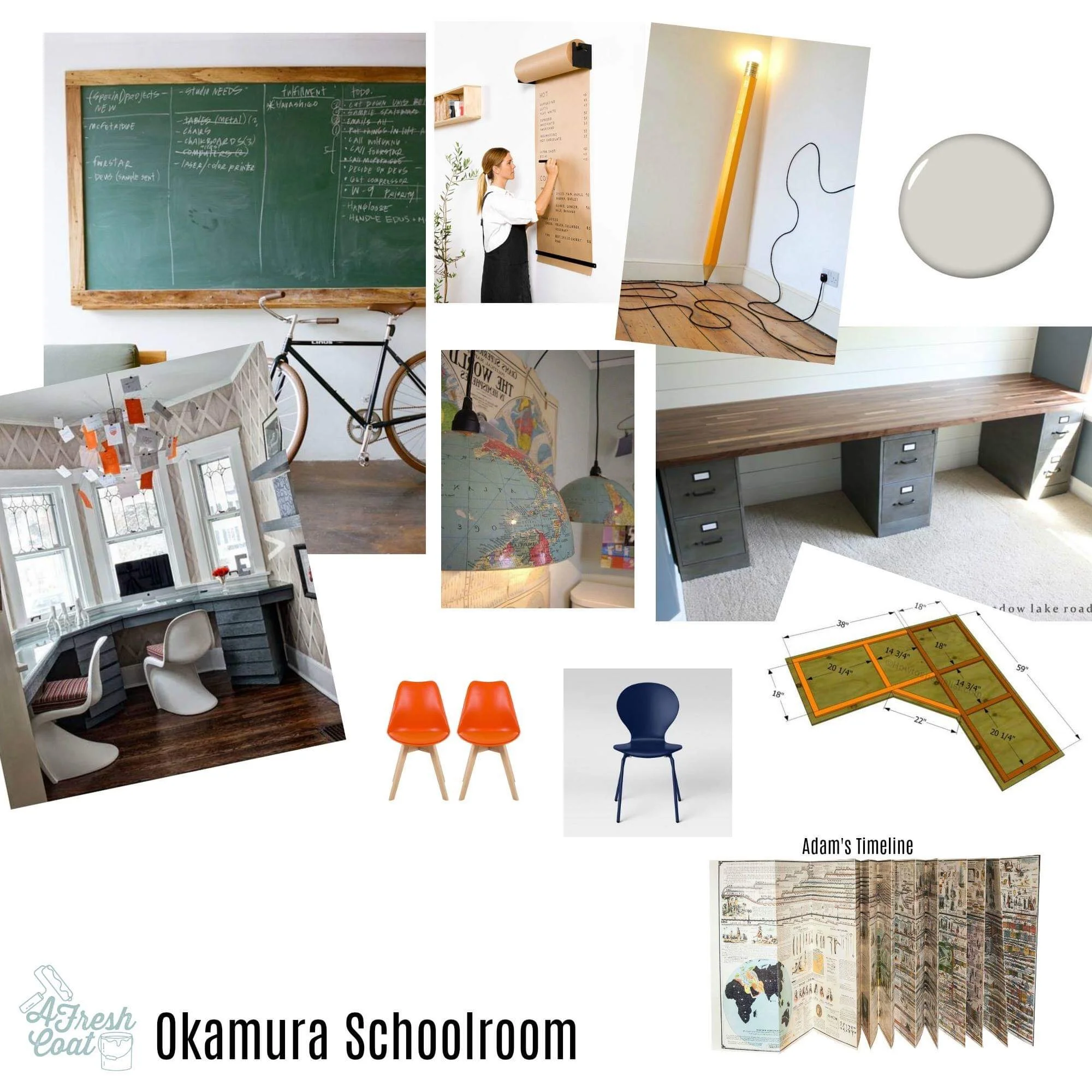
I get the coolest requests. For reals. When the “O” family asked me to help put together their homeschool schoolroom, I was super excited. I mean, an actual schoolroom? There were so many possibilities of what we could do in such a space. After setting up a consult and listening to Mrs. “O’s ideas, I completed the vision board of what this room should look like.

But first things first, here is where we started:

Homeroom Schoolroom 1.jpg

Disclaimer: Mrs. “O” had moved all of these items to the center getting prepped for me to paint when this photo was snapped. I assured her I would let all of you know that prior to moving on with the details of this remodel. Anyhoo, here was the vision board for this dining room-turned-schoolroom:

IMG_8204.JPG

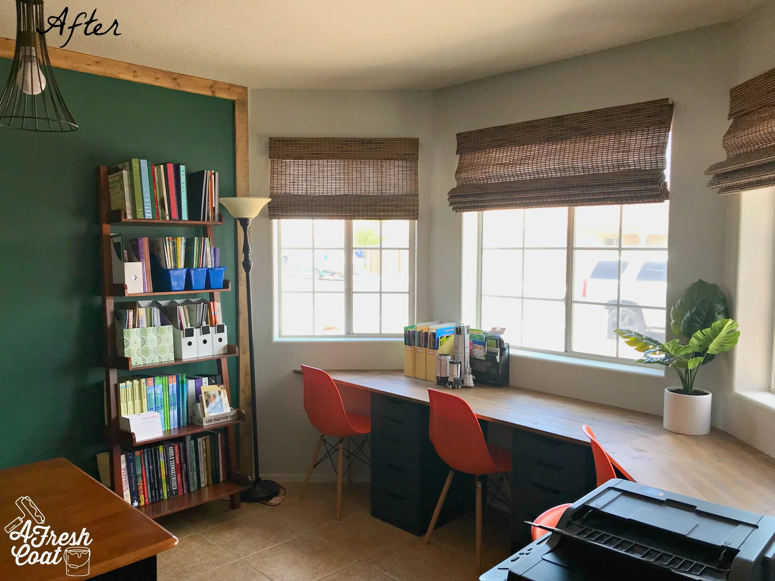
Elements include a bay window built-in desk feature (enough spots for four—yes, four(!)—boys), a rustic wood desktop housing four cabinetry bases for extra storage, bright colored desk chairs, a feature accent wall consisting of a framed magnetic green chalkboard (epic!), followed by some Icy Avalanche (Sherwin Williams ) paint, and a cool light fixture as well.

Once the adjacent walls were painted and our feature wall/chalkboard was skim coated smooth, I put the first layer of magnetic paint on. Now, I’ve used magnetic paint in the past and never had any issues. However, this time around? It was a hot mess. HOT! Not only is this stuff super thick, but it’s a huge pain when trying to paint on the wall. Huge. It also required some sanding down once it was on. I forever loathe this stuff. Also? It’s hard to get off.

Just look at poor little “K” below who managed to find his way into the magnetic paint. Messy!!!!

Homeroom Homerun 2.jpg

We made the best of it though and now “K” has his footprints forever enshrined upon the wall. Nice. After the magnetic paint episode, four quarts of GREEN chalkboard paint went on the wall. This stuff is pricey and needs a serious mixing upon arrival for the color to be consistent but look at the outcome:

Nate Koogle—expert carpenter—framed out this bad boy and now mama and her four students can use this all year long. Oh, and of course we had to try it out and season it up a bit.

Homeroom Homerun 3.jpg
Homeroom Homerun 4.jpg

However, we ran into a snag. Because of the thickness of the magnetic paint, it created areas that were uneven and and since this mama is using said board to teach on, it needed to function and function well. Even after the chalkboard paint went up, no bueno. Even after a light sanding? Still no good.

I called in for back-up.

Nate came to the rescue and sanded this wall back to square one. We ditched the magnetic paint in round two. Total bummer but necessary. Sigh. AFC then primed and repainted the chalkboard in that infamous schoolhouse green finish. Voila!

Homeschool Homesrun 14.jpg

And “M” got to seasoning it right away.

Photo courtesy of L. Okamura

Photo courtesy of L. Okamura

Photo courtesy of L. Okamura

Photo courtesy of L. Okamura

Once the chalkboard wall was completed, the room just needed to be put back together. Mrs. “O” grabbed Ikea’s Billy bookcases from the old playroom (turned nursery) in order to gain more storage in the schoolroom. A new rug was set in place, and all learning components added back into the room.

Ready for the finished product?

A new lighting fixture was added as well. Since this area was originally intended for a dining room, the fixture mount isn’t centered perfectly over this table, but that’s an easy fix should Mrs. “O” want to do so later.

Homeroom Homerun 9.jpg
Homeschool Homerun 14.jpg

“M” was into it for sure!

HOmeschool Homerun 12.jpg

And so were his brothers!

Homeschool Homerun 13.jpg

This homeschool schoolroom is all ready for the new school year!

The Details:

Paint: Sherwin William’s Icy Avalanche

Green Chalkboard Paint: Amazon/Home Depot (4 quarts)

Magnetic Paint (ugh!): Amazon (2 quarts)

Desktop: Lowe’s; custom stained (AFC), custom cut (Nate Koogle)

Desk Base Units: Ikea

Orange Desk chairs: Home Depot

Bamboo Shades: Lowe’s

Octopus Rug: Wayfair

Light Fixture: Amazon

Love, J