A Fresh Coat

Home Office

MODERN COLONIAL OFFICE MAKEOVER

Home OfficeJenny SulpizioComment

Modern Colonial.

I think it’s my new fave style.

Okay, I’m not even sure if that’s truly a style but I dig it anyways.

For reals.

A few months back, I had the pleasure of working with the “C” family (and their brand new, beautiful home) when we created their daughters’ awesome playroom. Seriously, it’s one of my most favorite transformations. Like, ever. And when they asked me to come back and help create a special space for “Mr. C.” in his office, I couldn’t wait.

But, it gets better.

See, I love the opportunity to create spaces that blend styles. Rooms that are truly custom not because of the furniture, or lighting (I love those elements, too), but because of the items brought to life within that room—-the decor that is super sentimental—whether it be pictures (new and old), artifacts, pieces from one’s childhood, books, and the list goes on and on.

Such was the case with this space—blending old with new and creating a room that was all his.

Here is where we started:

PC: Kayla Comella

PC: Kayla Comella

This room with its beautiful French doors is right off the home’s entryway. It’s actually one of the first spaces you see upon walking in and we wanted to make it big and bold. The challenge? Mr. C’s safe needed to be included in the design. If you don’t already know, gun safes are big, bulky, and H E A V Y ! Once they are in place, they aren’t moving without a whole lotta effort, that’s for sure. And that’s a good because I loved the idea of keeping it in this room.

It’s always my goal to create a beautiful room that works with the owner’s must-have list. That might include decor they want to implement, furniture they have to include, or even melding my own ideas to the overall vision they have in their minds. It is their home, afterall.

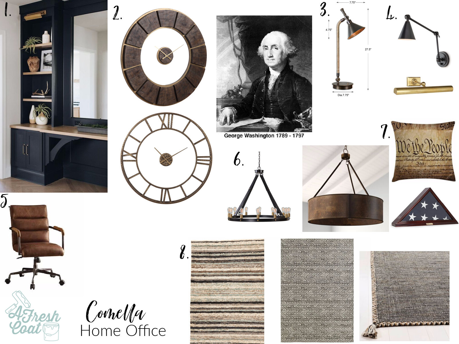
But before we get too far, you know what comes first—the vision board:

Comella Home Office.jpg

The idea was to introduce deep black built-ins from floor to ceiling with a medium-light finish butcher block counter and shelving. The safe would be housed within this main unit to give a super custom, uniform look.

After purchasing a few decor pieces, a huge wall clock, some sweet lighting, and a new area rug, this room came together quickly. Oh, and we can’t forget George. George Washington served up some major inspo for this masculine, modern colonial office.

Here come the “after” pics:

PC: Kayla Comella

PC: Kayla Comella

PC: Kayla Comella

PC: Kayla Comella

PC: Kayla Comella

PC: Kayla Comella

PC: Kayla Comella

PC: Kayla Comella

PC: Kayla Comella

PC: Kayla Comella

PC: Kayla Comella

PC: Kayla Comella

Pretty fun, right? Sky’s the limit with design and blending different styles to create a custom, sentimental yet fun, functional space.

And how about that clock?!!

Yum.

Tell me—what keeps you from venturing out and taking risks with your own home decor?

THE DETAILS:

Custom Cabinets: Master Finishes—Yuma, AZ

Drum Pendant: Wayfair

Library Light: Target (spray painted gold)

Wall Clock: Dandy Home & Ranch

Decor: Goodwill, Hobby Lobby, HomeGoods, Marshall’s, Target, IKEA, Owner’s collection

Rug: Wayfair

Pillow: Amazon

Desk: Wayfair

Mud Globe: Teresa Kerley

Cabinet Hardware: Amazon

Love, J


Home Office & Teen Room Redo

Home OfficeJenny SulpizioComment

I’m having a moment for sure…maybe a number of them at this point.

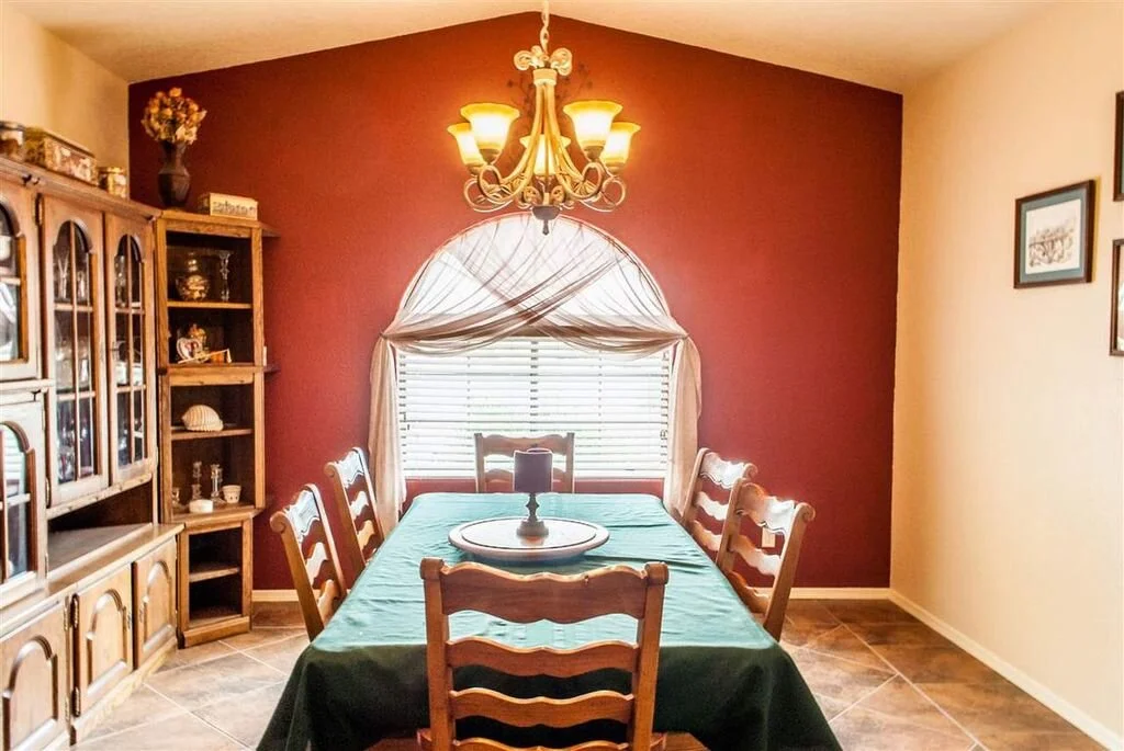
Prior to moving into our home almost three years ago, I knew exactly what I wanted to do with this space. Built as a dining room for the original owners, my goal was to revamp it into something bigger and better. Since I couldn’t enlarge the space (the dimensions are too small for a true dining room), and we were in need of an office/gathering spot for ourselves AND our kids, I decided to make this a multi-purpose room of sorts—an office and teen room combined.

Check out the before pic here.

PC: Andrew Knizley

PC: Andrew Knizley

You guys! This room was in desprate need of some serious updating. I mean, for reals. From the red accent wall, to the draperies, the oversized oak furniture, and the orange tile floor—let’s just say this baby was stuck in a serious rut…and then some.

Once we moved in, I got to work and immediately removed those draperies for my own sanity. And even though this particular space was (a little) less dated without the previous owners furniture in it, it still needed a lot of love.

Office redo 2.jpg

Paint was the first thing on the list. After tackling the ceiling with a bright white, the walls came second with a cool grey (Behr Tanglewood -25%). I then replaced the fan and added recessed lights to create more evenly distributed lighting throughout the room.

Next up? Covering the window!

Office Redo 3.jpg

Yep, you read that right. I had the window closed off and up. The main reason being that any desk I put in there would sit too high and actually block a portion of the window. This wasn’t going to work long term, so away it went.

But(!) totally removing it would have cost a lot and made the outside aesthetic wonky and weird. So, we just closed it off inside and left the outside just as it was.

Next step? The tile floor. If you follow my Instagram stories, you know I have this orange tile ALL over my home. Removing it in steps has been a process…a messy but super satisfying one.

Office Redo 4.jpg

P-R-O-G-R-E-S-S !

Out with the old and in with the new.

Office Redo 5.jpg

Once the flooring was finished, it was time for the brick accent wall. Since I wanted to keep costs down to make room for the next phase (built-in cabinetry), I decided to use brick paneling as opposed to brick veneers. Plus, if there were ever any issues with that window being closed off, I wanted something semi-permanent so we had access to it.

Nate Koogle rocked it again!

Office Redo 6.jpg

It was just starting to come together…

Office Redo 7.jpg

The next phase was construction of the built-in units. I contracted Master Finishes in Yuma, AZ, provided them my drawings, explained my vision, and they got to work while I began treatment on the brick wall. I knew I wanted black cabinetry with a medium stained butcher block counter in order finish this room off right. They completely exceeded my expectations and then some…

Office Redo 8.jpg

The final step before the built-ins were installed was adding a treatment to the brick accent wall. I wanted a more vintage-y/urban vibe and got a hold of a big bucket o’ joint compound in order to produce the final result I originally envisioned.

Office Redo 10.jpg

Slapping this stuff on using a straight edge was the easiest thing ever. Easy but a little messy. Once dry (and using a wet rag), I removed any excess. The end result? A super fun faux brick wall.

Office Redo 9.jpg
Office Redo 11.jpg

Getting closer…

While waiting for the built-ins, I also wanted to tackle a couple of projects I’d been meaning to get to. The main one involved my husband’s (and mine) letterman jackets. After years of just sitting in our closets, I dusted them off and got to work disassembling them.

Office Redo 1.jpg

I think I enjoy demo work a little too much.

office 7.jpg

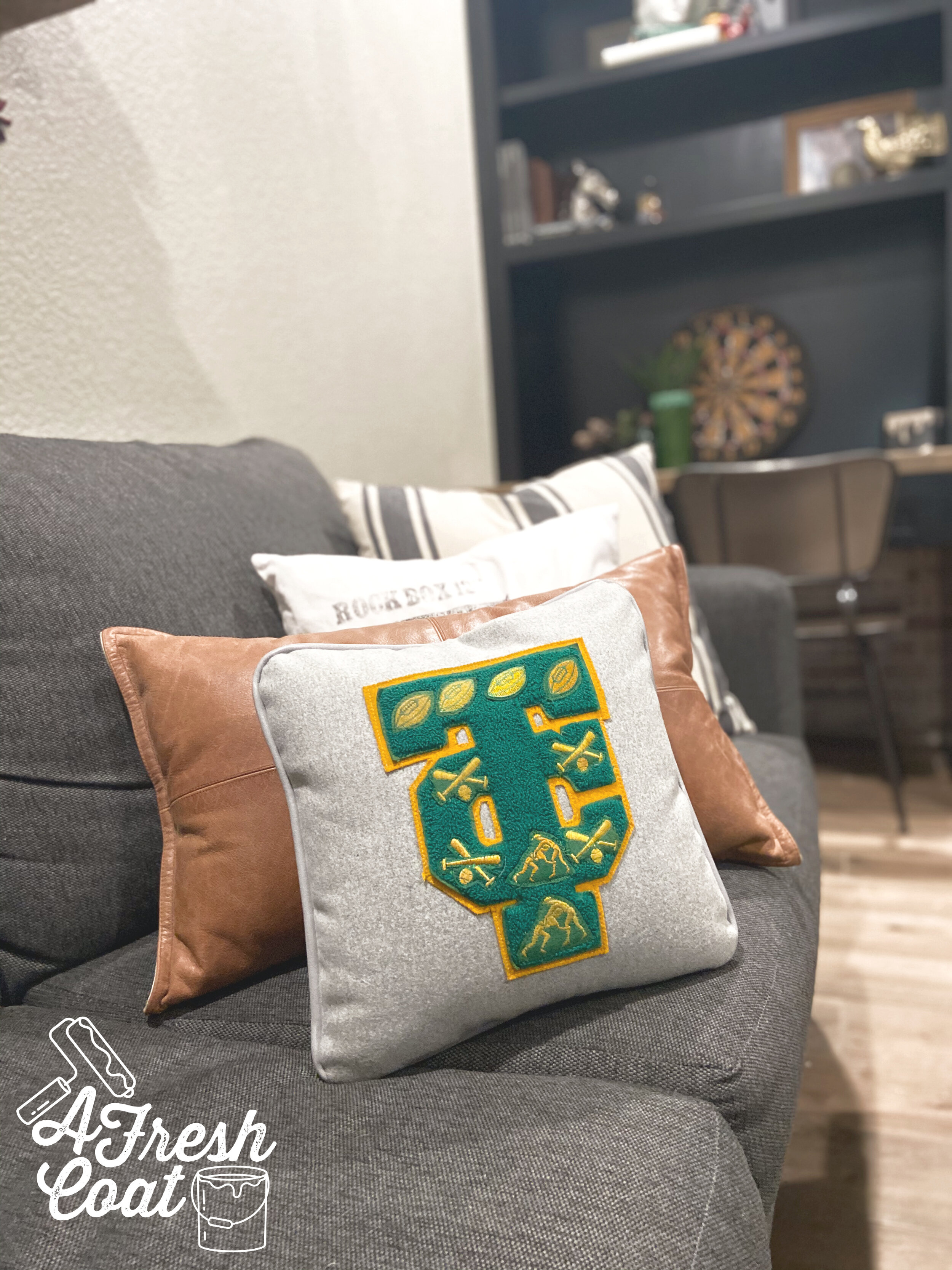
Anyways, once all of my numbers and patches were removed, I sent hubby’s letter off to make a super fun and crazy special throw pillow—a throw pillow he would actually like!

Just look at what Letterman Supply Company—based out of Utah—did. Wow!

PC: Letterman Supply Company

PC: Letterman Supply Company

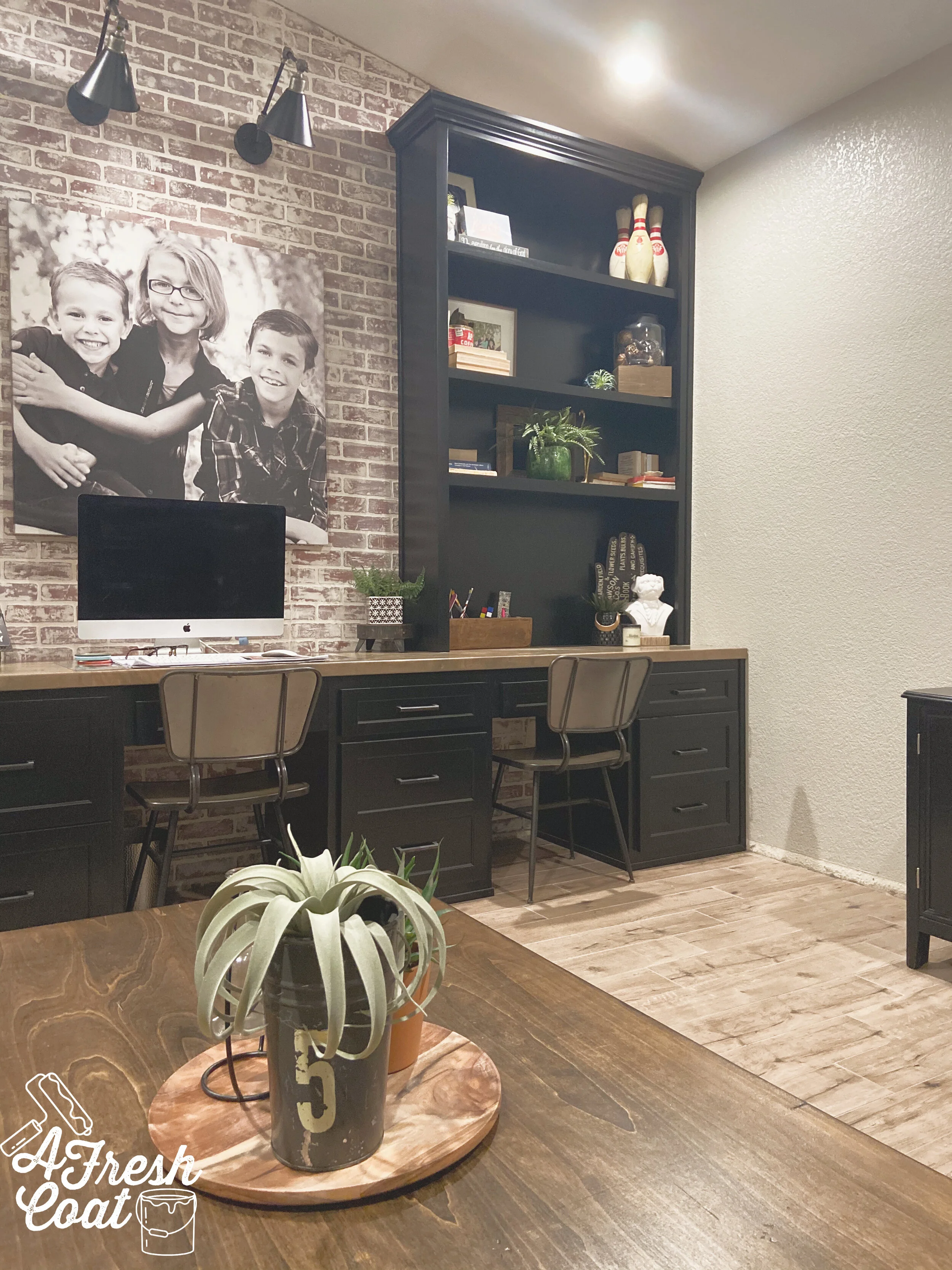
Okay, here we go. After curating items for over two years, planning, saving, and working hard towards the refinishing of this room, here it is.

office 2.jpg
office 9.jpg
office 4.jpg
office 3.jpg

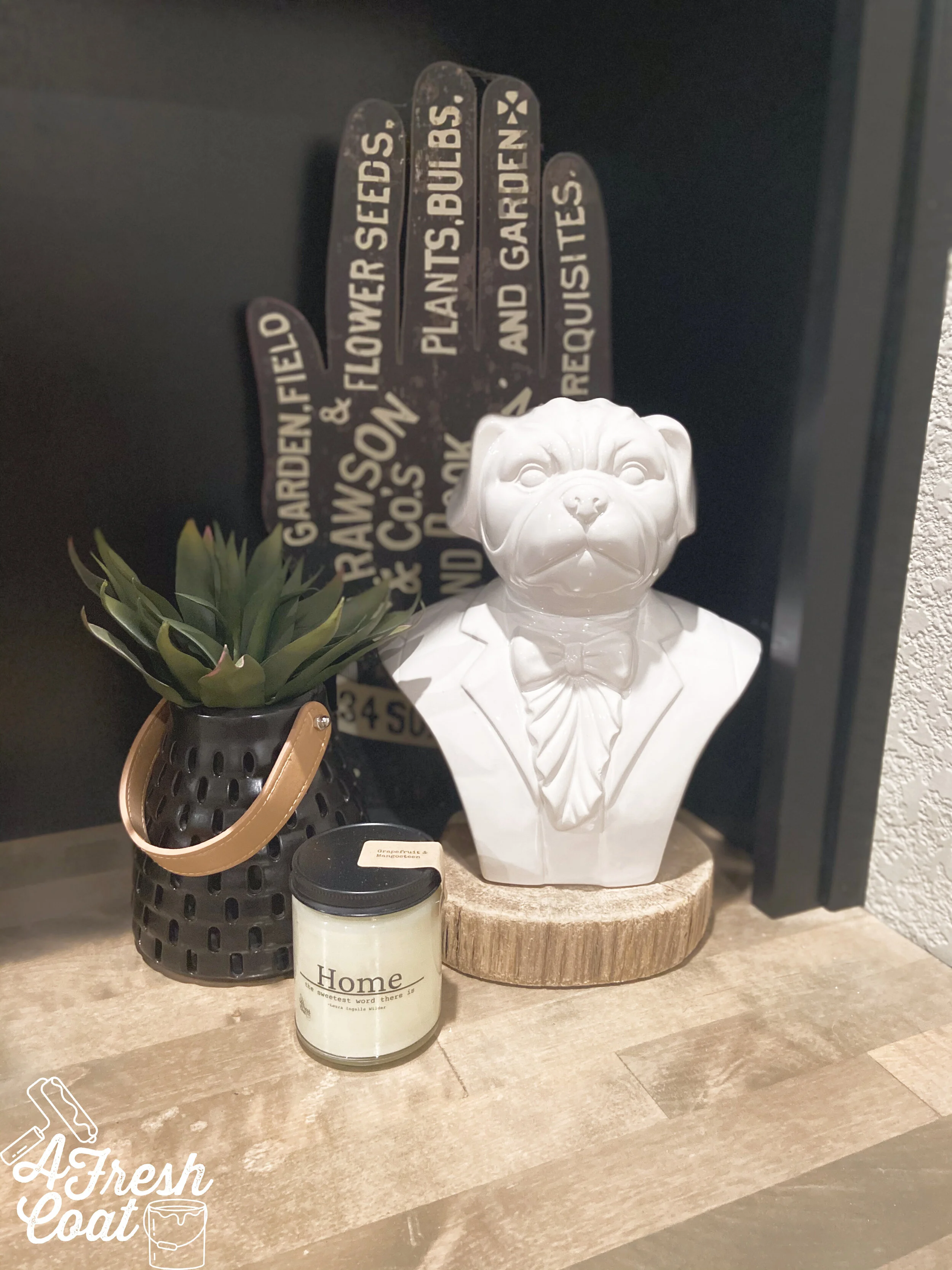
I am so, so proud of every element and every detail of this room…especially the decor. From the pug bust, the oil can, the collection of books and Bibles, to the unique planters and other items, this room’s unique decor is a mixture of old and new. Numerous trips to the Goodwill, Dandy, Hobby Lobby, Junk in the Trunk, and Rebel and Rove made everything you see here come together. I even have my daughter’s ceramics projects (back when she attended school), along with framed photos she entered in last year’s fair, and knick knack’s special to me.

I love it. I really, really love it.

office5.jpg
office 10.jpg
office 11.jpg

One more before and after comparison. I’m still amazed it’s finished—it’s a reality.

PC: Andrew Knizley

PC: Andrew Knizley

office 2.jpg

THE DETAILS:

Paint: Tanglewood (Behr), Valspar Ceiling Paint

Paint Labor: A Fresh Coat-Yuma

Window Closure: Kyle Hardin

Flooring: Julio Martinez

Built-ins: Master Finishes

Custom Stained Butcher Block: Master Finishes

Chairs: Wayfair

Throw Pillows: Pottery Barn Teen, Ashley Home Store, Hobby Lobby

Letterman Pillow: Letterman Sullpy Compant

Furniture: American Furniture Wharehouse

Cowhide: Dandy Home and Ranch

Decor: Junk in the Trunk, Dandy, Hobby Lobby, Rebl and Rove, Pier 1, Goodwill, Kirkland’s, Annie Sulpizio

Love, J


Homeroom Homerun

Home OfficeJenny Sulpizio

I get the coolest requests. For reals. When the “O” family asked me to help put together their homeschool schoolroom, I was super excited. I mean, an actual schoolroom? There were so many possibilities of what we could do in such a space. After setting up a consult and listening to Mrs. “O’s ideas, I completed the vision board of what this room should look like.

But first things first, here is where we started:

Homeroom Schoolroom 1.jpg

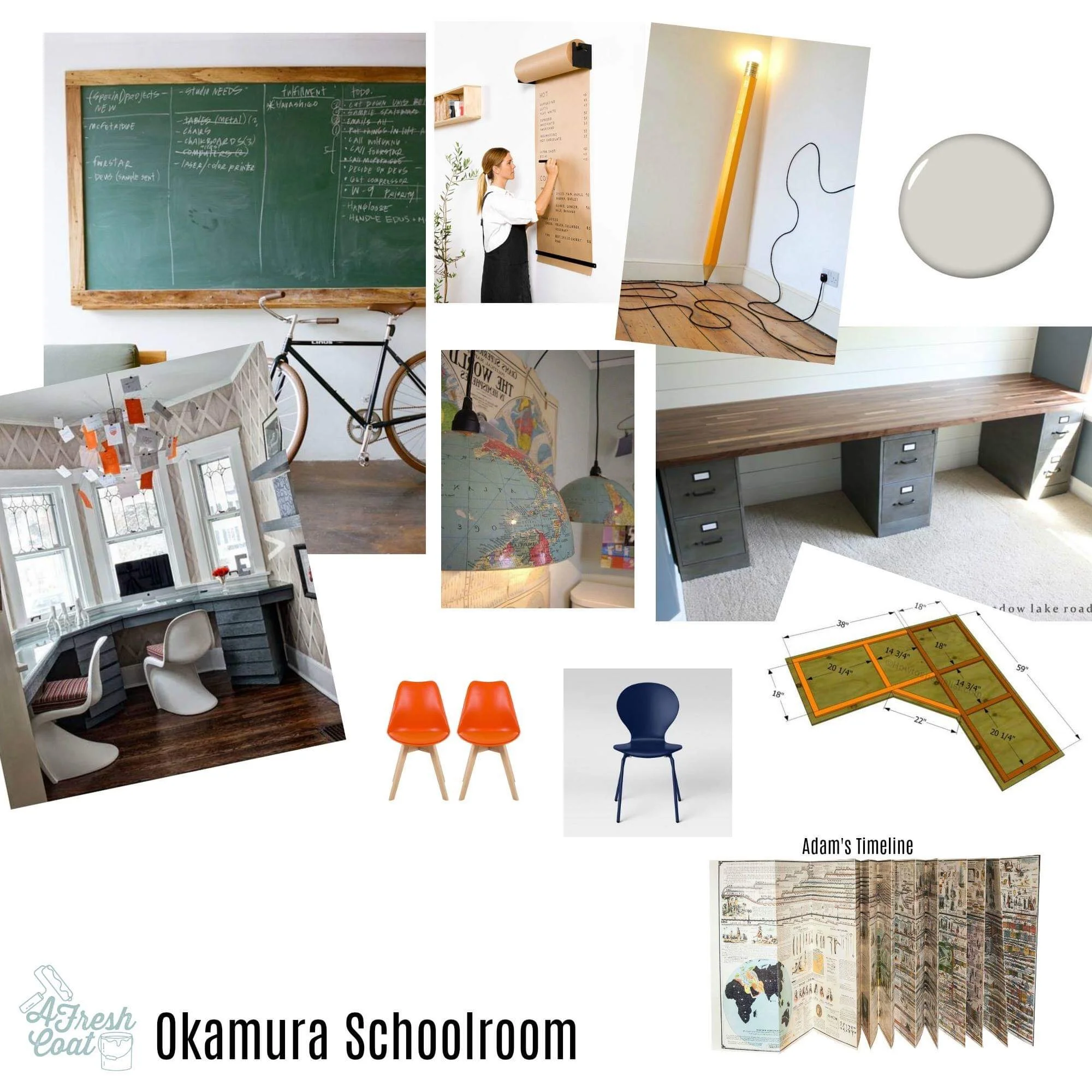
Disclaimer: Mrs. “O” had moved all of these items to the center getting prepped for me to paint when this photo was snapped. I assured her I would let all of you know that prior to moving on with the details of this remodel. Anyhoo, here was the vision board for this dining room-turned-schoolroom:

IMG_8204.JPG

Elements include a bay window built-in desk feature (enough spots for four—yes, four(!)—boys), a rustic wood desktop housing four cabinetry bases for extra storage, bright colored desk chairs, a feature accent wall consisting of a framed magnetic green chalkboard (epic!), followed by some Icy Avalanche (Sherwin Williams ) paint, and a cool light fixture as well.

Once the adjacent walls were painted and our feature wall/chalkboard was skim coated smooth, I put the first layer of magnetic paint on. Now, I’ve used magnetic paint in the past and never had any issues. However, this time around? It was a hot mess. HOT! Not only is this stuff super thick, but it’s a huge pain when trying to paint on the wall. Huge. It also required some sanding down once it was on. I forever loathe this stuff. Also? It’s hard to get off.

Just look at poor little “K” below who managed to find his way into the magnetic paint. Messy!!!!

Homeroom Homerun 2.jpg

We made the best of it though and now “K” has his footprints forever enshrined upon the wall. Nice. After the magnetic paint episode, four quarts of GREEN chalkboard paint went on the wall. This stuff is pricey and needs a serious mixing upon arrival for the color to be consistent but look at the outcome:

Nate Koogle—expert carpenter—framed out this bad boy and now mama and her four students can use this all year long. Oh, and of course we had to try it out and season it up a bit.

Homeroom Homerun 3.jpg
Homeroom Homerun 4.jpg

However, we ran into a snag. Because of the thickness of the magnetic paint, it created areas that were uneven and and since this mama is using said board to teach on, it needed to function and function well. Even after the chalkboard paint went up, no bueno. Even after a light sanding? Still no good.

I called in for back-up.

Nate came to the rescue and sanded this wall back to square one. We ditched the magnetic paint in round two. Total bummer but necessary. Sigh. AFC then primed and repainted the chalkboard in that infamous schoolhouse green finish. Voila!

Homeschool Homesrun 14.jpg

And “M” got to seasoning it right away.

Photo courtesy of L. Okamura

Photo courtesy of L. Okamura

Photo courtesy of L. Okamura

Photo courtesy of L. Okamura

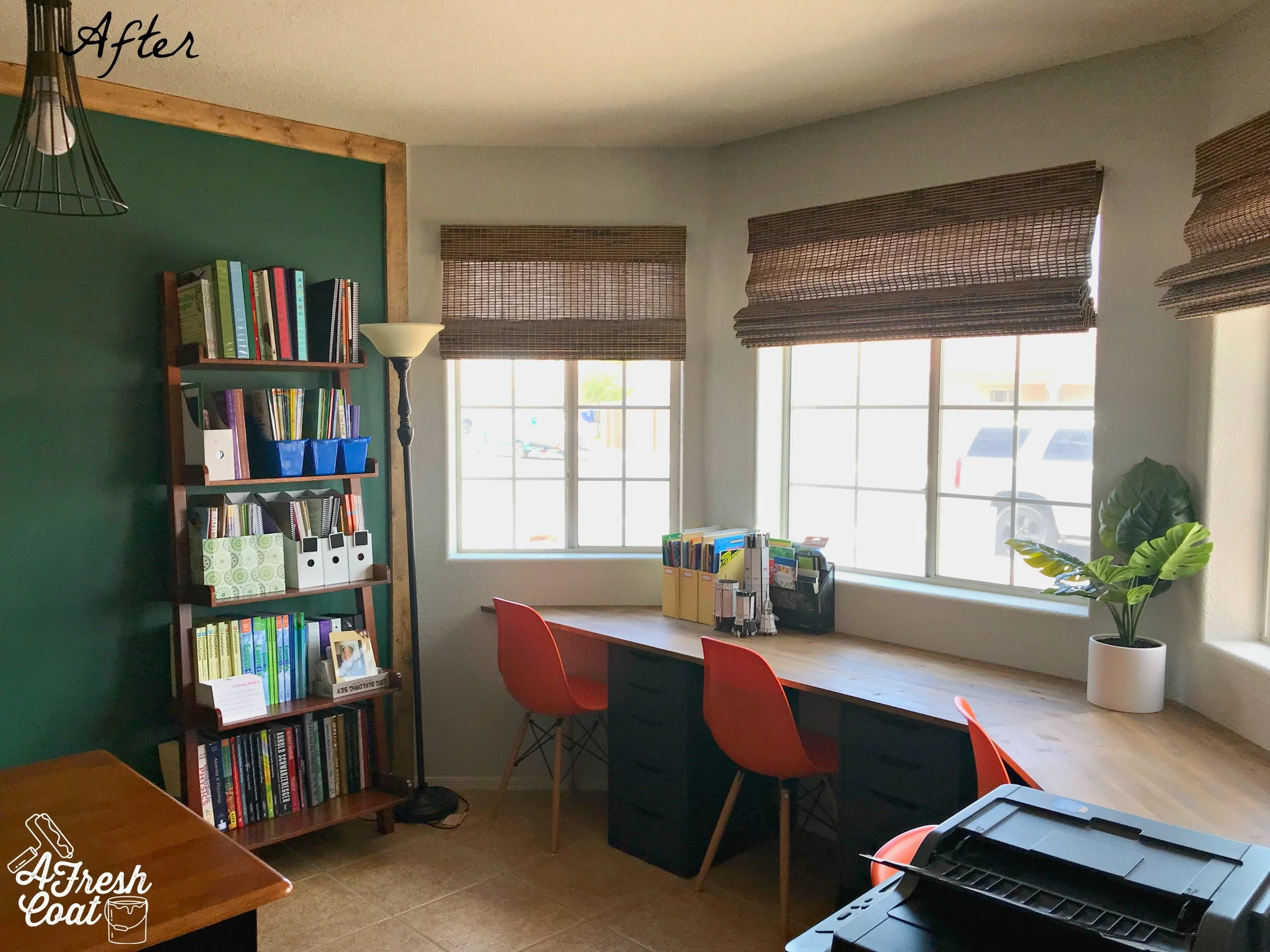
Once the chalkboard wall was completed, the room just needed to be put back together. Mrs. “O” grabbed Ikea’s Billy bookcases from the old playroom (turned nursery) in order to gain more storage in the schoolroom. A new rug was set in place, and all learning components added back into the room.

Ready for the finished product?

A new lighting fixture was added as well. Since this area was originally intended for a dining room, the fixture mount isn’t centered perfectly over this table, but that’s an easy fix should Mrs. “O” want to do so later.

Homeroom Homerun 9.jpg
Homeschool Homerun 14.jpg

“M” was into it for sure!

HOmeschool Homerun 12.jpg

And so were his brothers!

Homeschool Homerun 13.jpg

This homeschool schoolroom is all ready for the new school year!

The Details:

Paint: Sherwin William’s Icy Avalanche

Green Chalkboard Paint: Amazon/Home Depot (4 quarts)

Magnetic Paint (ugh!): Amazon (2 quarts)

Desktop: Lowe’s; custom stained (AFC), custom cut (Nate Koogle)

Desk Base Units: Ikea

Orange Desk chairs: Home Depot

Bamboo Shades: Lowe’s

Octopus Rug: Wayfair

Light Fixture: Amazon

Love, J


Office Overhaul

Home OfficeJenny SulpizioComment

The "H" Family was in need of a new den space and office overhaul. A farming family, they wanted to incorporate the numerous produce signs they'd collected over the years, along with their piano, some family heirlooms, a hint of rustic, and a touch of navy.

The first part was establishing the feature wall of the room. The office/den is the first area you see after entering the front door, so it had to pop. Mrs. "H" was totally on board with this simple molding construction (see below) that I think made a huge impact.

These inexpensive pieces of wood went straight on this textured wall (backer board is optional), and A Fresh Coat got to work painting them a brilliant navy blue. The rest of the room received the greige treatment in SW Agreeable Grey.

Unknown.jpegOffice Overhaul/A Fresh Coat Yuma 1

Next up? The drapes and accent pieces. The side table pictured below provided the perfect resting place for numerous frames of family members as well as a few accent pieces. Drapes (Pier 1) were a great find and the subtle navy paisley print manages to pick up the office feature wall perfectly.

Notice those shelves? Plumbing pipe and a piece of lumber from one of the big box stores was all it took to complete these. And how about those produce signs!! They look perfect and provide a pop of color perched above that new reclining chair.

Office Overhaul/ A Fresh Coat Yuma 2

Last but not least was this little corner of the room where the family piano was located. Alternating seed signs were hung to coordinate with those sitting on shelves opposite wall, and this beautiful piece of Scripture (Hobby Lobby) got some special treatment. By framing this canvas piece in black, it really makes it stand out. And by pairing it with the large key, a smaller piece of Scripture, and some greenery, it all works together. Finally, a few more accent pieces and this office was officially overhauled!

Office Overhaul/ A Fresh Coat Yuma 3

The Details:

Paint: SW Agreeable Grey and Valspar's Indigo Streamer--A Fresh Coat-Yuma

Shelving: A Fresh Coat Yuma

Drapes: Pier 1 Imports

Frames & Decor: Hobby Lobby, JoAnn's, Kirkland's

Produce Signs: provided by owner (Yuma, AZ produce)