This was a fun project for sure!
“D’s” room was in need of an update. On the cusp of high school, this teenager needed a space that not only matched his fun personality (he loves cacti and cats—not sure in which order), but one that was geared more towards his age. After setting up a consultation, ideas of implementing a wood accent/feature wall, new shelving, and basically a total room overhaul were all discussed.
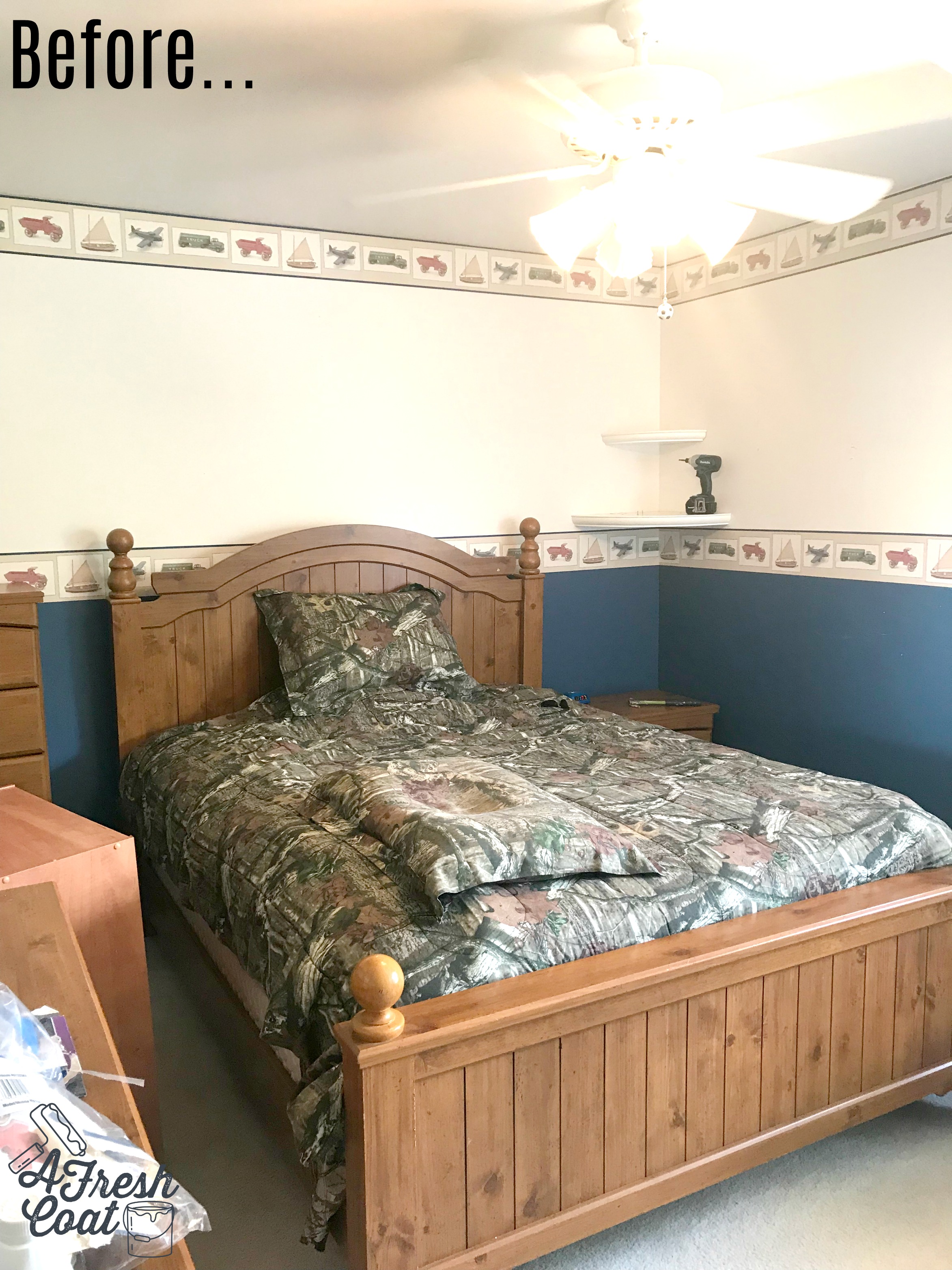
Here is where we started:
All room components (furniture) needed to stay for storage purposes, and even though this room was a bit on the smaller side, I knew we could make it work. Further, after noticing the camo bedspread, as well as the cacti decorations (not pictured), I knew this room needed a deep gray/green wall color throughout. Not too dark, not too light…and masculine to boot.
Here is the approved vision board:
A rustic wood feature wall with varying shades of stain, 2. A rustic wood and metal awning in lieu of traditional drapery, 3. Rich, textured bedding with geometric linens, 4. Fun cacti art and understated decor, followed by 5. Metal shelving.
Sherwin Williams Green Earth ultimately won in the sample contest, however, when using a darker color, I actually like to lighten them by 25%. Other decorators may do the exact opposite but I like to play it on the safe side. Oftentimes, and especially in smaller rooms (with limited natural light), colors appear darker on the wall. Therefore, the entire room looks darker…and smaller. In order to avoid this, I lighten these hues and it works every time!
Once the room was painted, it was time to tackle the wood wall. Nate (the amazing carpenter), got me some sweet 1x8 pine lumber and I got to work using and mixing a slew of stains. The variation in stain colors would add more interest to the wall and truly make it the focal point of the room. Plus, with the rich oak furniture “D” already had in place, I wanted to pick up that color to make the overall look of his space more cohesive.
P.S. I love getting creative with stain! And I love Minwax!
Photo courtesy of Melissa Perry Photography
A wood feature wall adds so much warmth to a space—especially when the selected shade of paint on the adjoining walls is a “cool” color (think color wheel here). Lots of texture and warmth going on in this room now! Love it (and I think “D” does too. Pictured below.).
Photo courtesy of Melissa Perry Photography
With the paint and rustic wood wall completed, it was time to introduce some new decor. Simple and bold would be the two words I wanted to describe the remaining elements of the room. Since “D” loves cacti, I located a number of prints off of Etsy that I thought would look amazing on those walls. Some were enlarged while the other was placed on canvas.
That rich blue canvas with pops of green Saguaro really stands out. Mixed with a fun Yuma map, AZ piece, and rustic Route 66 sign and this metal shelf is complete.
We were almost done…almost.
However, we needed to address the bedding. While the camo was cool, I thought this amazing comforter set (because let’s face it, boys and duvets do not mix), from Pottery Barn Teen would really take the room to the next level:
Black and white ticking stripe sheets combined with a deep green and camel (it’s reversible) comforter lightens, brightens, and looks way cool.
But before showing the before and after pics, I forgot about the drapes. Reason being? There aren’t any! Instead, Nate Koogle resurrected this sweet design (used in another teen boy bedroom AFC completed) to create a custom look that again, makes the elements of this room cohesive.
Fun, right? Ok, now for the before and after. This is always my favorite part.
“D” is all ready to tackle high school. Loved this project and I love my clients!
The Details:
Paint: Sherwin Williams Green Earth (-25%)
Paint Labor: A Fresh Coat
Shelving: Pottery Barn Teen
Decor: Amazon, Dandy Home & Ranch, Etsy, Hobby Lobby
Bedding: Pottery Barn Teen, Dandy Home & Ranch
Carpentry Work: Nate Koogle


